
Data exploration reimagined.
Instant chart dashboards from your raw data that you can segment, pivot & share without
formula, code or setup.

What people say
“I've been using AddMaple since this June to help the ReOps community analyze a survey to improve the experience of members. AddMaple has been a game changer to help my team members read insights quickly and democratize survey analysis without the hassle of using R to code. Thank you again for creating such a wonderful tool.”

“AddMaple came at a great time when I was gearing up to spend hours in spreadsheets and pivot tables. AddMaple simplifies my survey analysis process by giving me easy ways to analyze and pivot my responses. When I'm looking for interesting insights and cuts in the data, the first place I check for initial leads is AddMaple.”


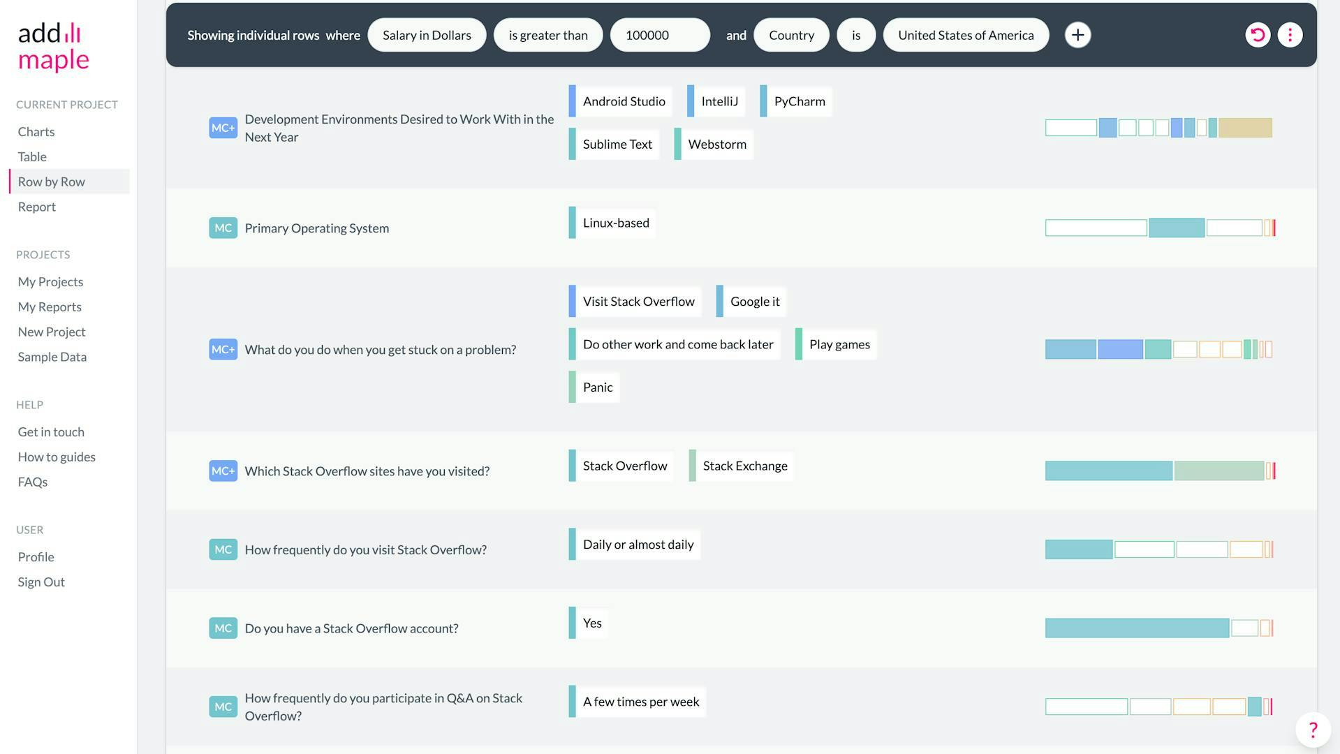
Analyze your data visually
Transform large unwieldy survey, customer support, sales, web/app analytics datasets into an explorable chart dashboard in seconds.
We use engineering, automation and AI to democratize data analysis.
Zero time to insights
AddMaple pivots each column automatically giving you chart summaries in an explorable dashboard. Don’t wait for the data team to get answers.
AI Thematic Analysis
Work with an AI Copilot to quickly and accurately code free text data and assign codes in bulk.
With your data coded, you can segment, pivot and explore for seamless qual and quant analysis.
Likert Scale Charts
No code, no effort. See all opinion questions within one series grouped together for easy analysis as a whole or by segment
Discover the relationships in your data
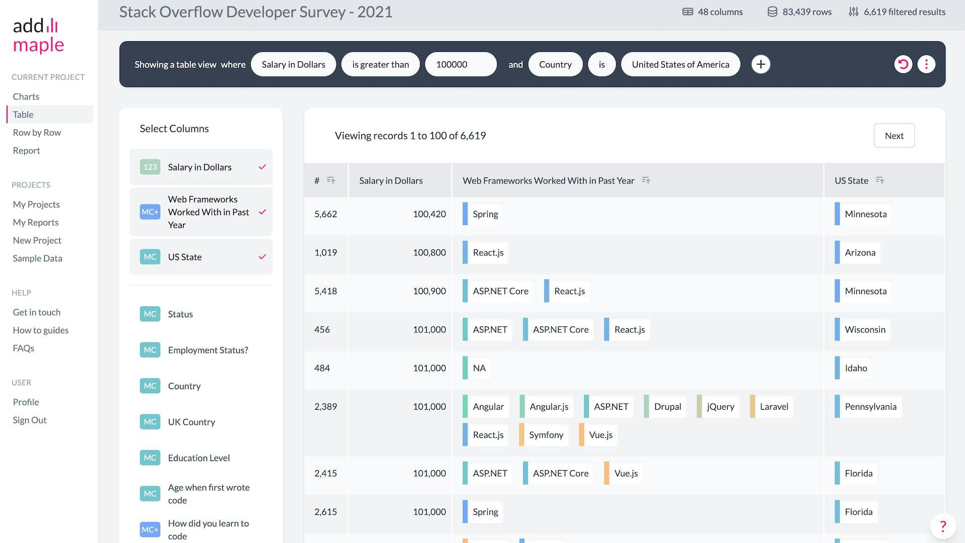
Forget the old way. Our data analysis tool lets you pivot, swap columns, filter and cross-tabulate without asking google how to VLOOKUP or COUNTIF 😉
Filter all data directly from a chart bar
See something interesting in a chart? Click on the bar to filter all your data.
Add multiple filters and watch as AddMaple summarizes your data in a new chart dashboard you can explore.
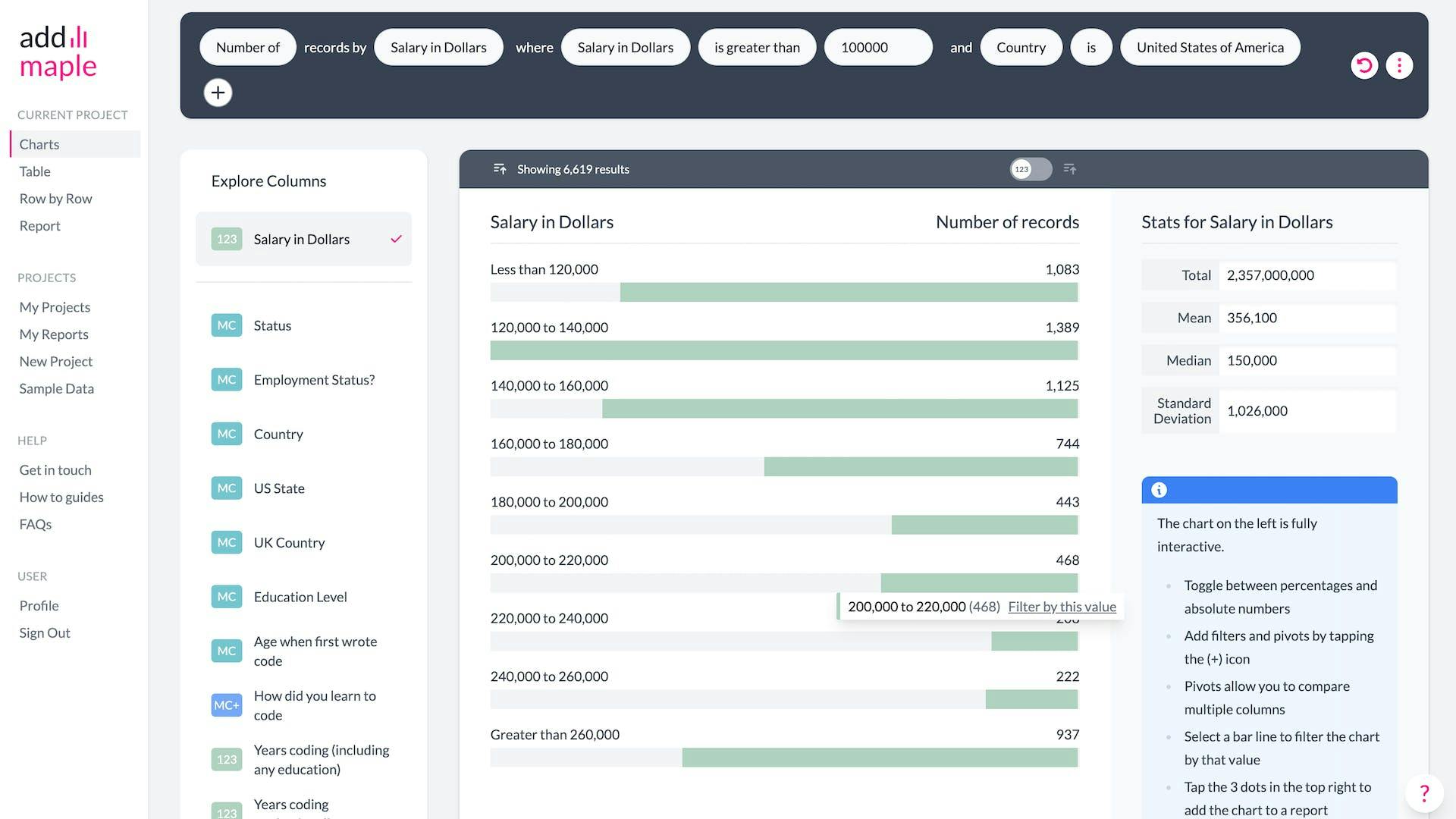
Skip the spreadsheet
Get the median, mean, totals and standard deviation from raw data without the clunky formulas of Excel or Google Sheets.
No painful set-up required
We automatically detect numbers, currencies, categories, dates and likert scales - no need to pre-prepare, format, label or clean your data.
Numeric data is automatically grouped into bins for you.

Import data from pretty much anywhere
Import your data from Typeform, Survey Monkey, Google Drive, Microsoft Excel, SPSS or any CSV. AddMaple is the quickest way to analyse survey results.


We really don't want your data
AddMaple runs on your system and this makes it much faster than cloud based software (you know who we are thinking of). You never upload your data, it stays with you.