AddMaple detects numeric data and automatically creates bins/buckets so that you can visualise the data in a histogram.
Numeric columns will show up in green on the chart dashboard. 
When you click on a numeric column, you will be taken to a pivot chart with relevant stats on the right. 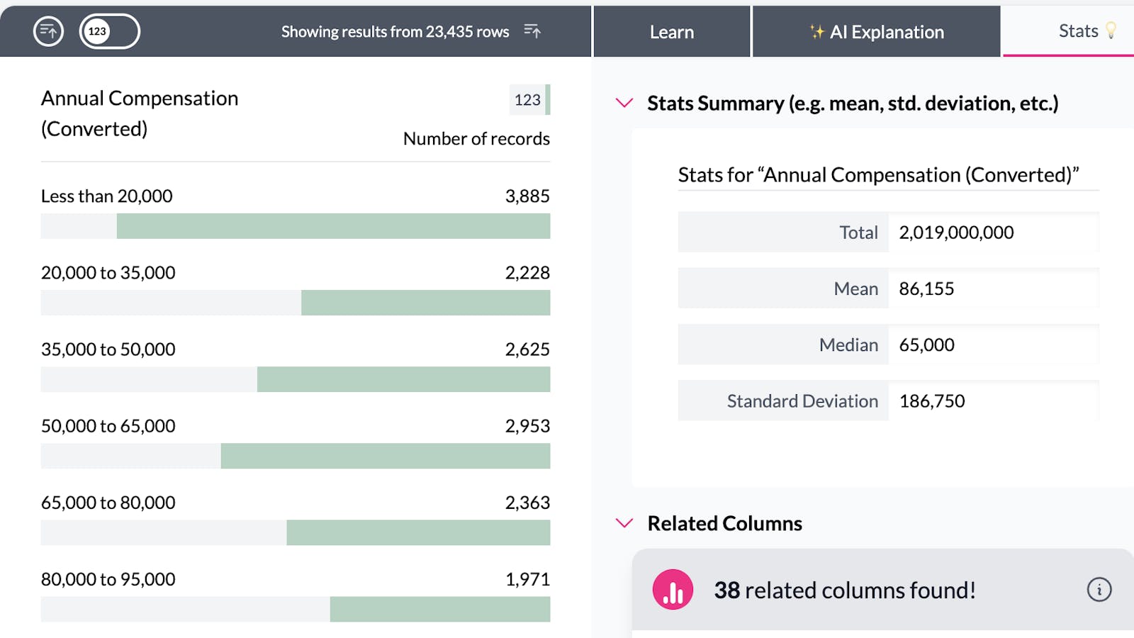
AddMaple will divide your data into between 8 and 10 groups. This happens automatically and will adjust dynamically based on the filters that you have set. If you would like to create your own custom groups (bins/buckets) you can create a segmented column.
You can click on a bar in the chart to filter your dataset. AddMaple will automatically calculate new groups for your numeric data. 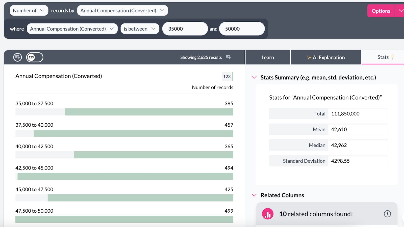
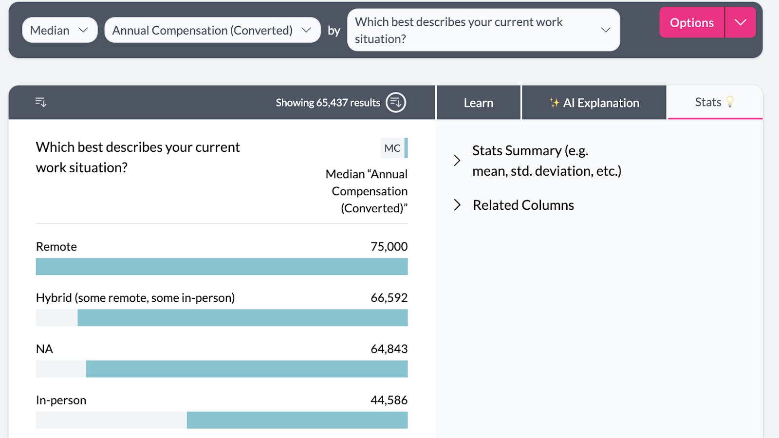
Numeric columns can also be used to aggregate other columns. For example this chart shows median compensation by work situation.