AddMaple won the Paddle AI Launchpad competition out of 77 startups!
AddMaple V3 is here! Learn more
Data exploration reimagined.
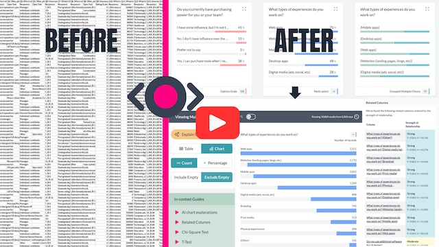
Instant chart dashboards from your raw data that you can segment, pivot & share without
formula, code or setup.
Our music video explains why we're different


“I've been using AddMaple since this June to help the ReOps community analyze a survey to improve the experience of members. AddMaple has been a game changer to help my team members read insights quickly and democratize survey analysis without the hassle of using R to code. Thank you again for creating such a wonderful tool.”


“AddMaple came at a great time when I was gearing up to spend hours in spreadsheets and pivot tables. AddMaple simplifies my survey analysis process by giving me easy ways to analyze and pivot my responses. When I'm looking for interesting insights and cuts in the data, the first place I check for initial leads is AddMaple.”

"AddMaple's AI-assisted coding is unique, giving me the control I want when tagging survey comments as opposed to simply a narrative output. Their recently released stats features are helping me get a first look into potential relationships between variables and serve as a nice jumping off point to dig in further."

“I was so glad when I found AddMaple, because it allowed me to quickly and easily explore data as part of finishing my PhD. I found it so much more intuitive and user friendly than the statistics program I was using (SPSS).”

“I thought your website was great and easy to use. I liked the AI explanation option a lot too it made the data easier to understand. Also being able to add pivots and analyse the data visually allowed me to find figures quickly. I would have bought AddMaple sooner if I knew about it and it was very helpful with my studies.”

"The most striking thing about working with AddMaple is that it just makes it easy to get going working with all kinds of data. It makes the basics dead simple, and lets you get on with the more in-depth, more interesting things. I found it easy to see the breadth, depth, and shape of the data. I've used it for surveys and analytics data too."

"I am so lucky I found AddMaple. It was incredibly easy to use, and I say that as someone who is usually hopeless with this stuff. Using AddMaple really helped to relieve some of my stress with the project and I was able to complete it in time. I would definitely recommend it to anyone, but especially students."

A few of the 20,000+ people cruising from data exports to reports


Live demo of AddMaple from Informed Insights
“AddMaple creates instant chart dashboards that let you analyze your survey data visually and is one of the best ways I’ve found to conduct AI-powered thematic analysis of open-ended results.”
Andrea Knight Dolan from Informed Insights
UX Research + AI Consultant, Ex-Google
Analyze your data visually
Transform large unwieldy survey, customer support, sales, web/app analytics datasets into an explorable chart dashboard in seconds.
We use engineering, automation and AI to democratize data analysis.
Zero time to insights
AddMaple pivots and calculates statistical significance for each column automatically giving you chart summaries in an explorable dashboard. Don’t wait for the data team to get answers.
AI Thematic Analysis
Work with an AI Copilot to quickly and accurately code free text data and assign codes in bulk.
With your data coded, you can segment, pivot and explore for seamless qual and quant analysis.
Likert Scale Charts
No code, no effort. See all opinion questions within one series grouped together for easy analysis as a whole or by segment
Discover the relationships in your data
Our Insights Compass uses a powerful stats engine to automatically find related columns for you to explore. With a click, you can pivot, segment, cross-tabulate and get statistical insights between columns and individual categories without code 😉
Filter all data directly from a chart bar
See something interesting in a chart? Click on the bar to filter all your data.
Add multiple filters and watch as AddMaple summarizes your data in a new chart dashboard you can explore.
Skip the spreadsheet
Get the median, mean, totals and standard deviation from raw data without the clunky formulas of Excel or Google Sheets. Dive deeper with ANOVA, Chi-Square and T-Tests to see the statistical significance instantly.
No painful set-up required
We automatically detect numbers, currencies, categories, dates and likert scales - no need to pre-prepare, format, label or clean your data.
Numeric data is automatically grouped into bins for you and we calculate Pearson or Spearman correlation coefficient when comparing numeric columns.
Import data from pretty much anywhere
Import your data from Typeform, Survey Monkey, Google Drive, Microsoft Excel, SPSS or any CSV. AddMaple is the quickest way to analyse survey results. We handle large gigabyte size datasets with millions of records.

We really don't want your data
AddMaple runs on your system and this makes it much faster than cloud based software (you know who we are thinking of). You never upload your data, it stays with you.


