
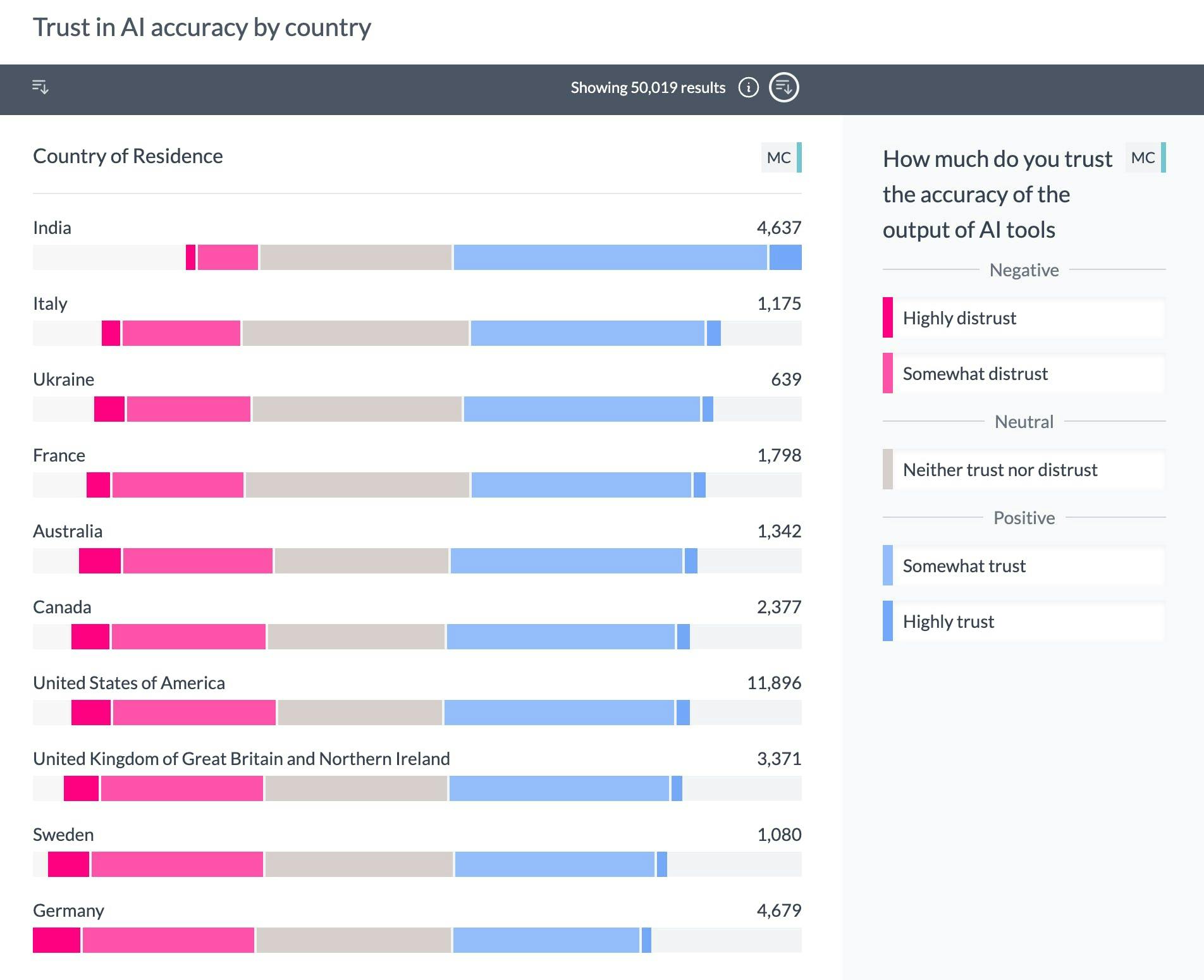
Trust in AI by Country from the Stack Overflow Developer Survey
Survey Analysis
See how the people who answered a question in a certain way, answered other questions. Slice all your data in one go.
Survey analysis can be a daunting task, especially when dealing with large datasets with complex questions such as "select all that apply". AddMaple simplifies this process with its user-friendly interface, specifically designed for survey analysis. Unlike traditional tools like Excel or Google Sheets, AddMaple provides a fast, visual-first approach to survey analysis - getting your from raw data to insights in seconds.
With features like interactive charts, powerful filters, and efficient on-system processing, AddMaple transforms survey data into engaging, accessible reports. Whether you're exploring free-text responses, analyzing Likert scale questions, or diving deep into individual entries, AddMaple offers a streamlined, intuitive solution for bringing your survey findings to life.
Speed up your survey analysis, sign up for free now

Easy-to-use
Our interface is designed for survey analysis, unlike Excel or Google Sheets. We automate the useful statistical functions you need to make sense of your data so you get answers faster.
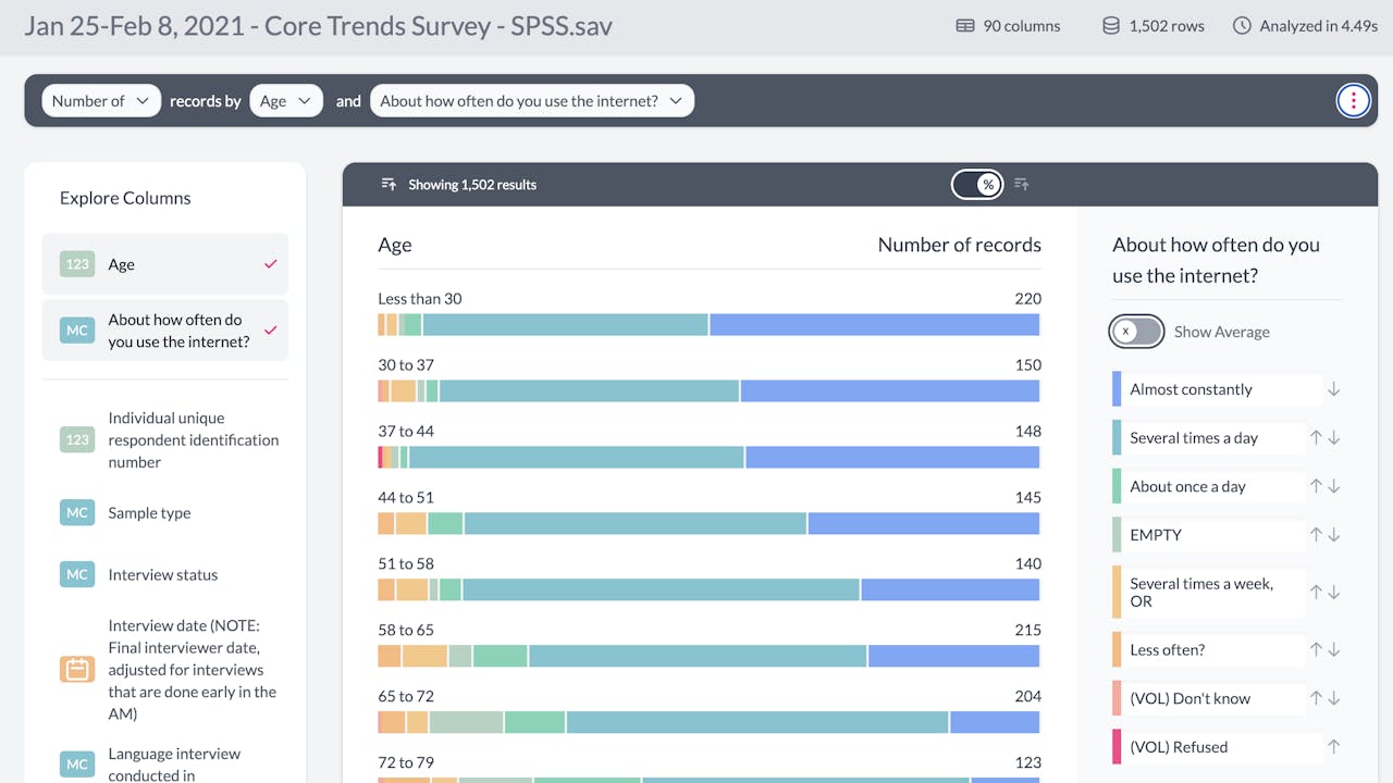
Instantly auto-summarize ALL your data
You let us read the raw data. We give you a summarized chart dashboard of all your data in seconds. Apply filters to the dashboard view and see how these affect ALL your data at a glance.
Create a report that hooks people into engaging with your survey findings
Tell the story of your data. Beautifully. With interactive charts your readers can explore further. Add humour or insider lingo to your reports by creating a unique password or passphrase everyone reading your report has to enter.
Powerful filters and zoom levels
Static exploration is over. Filter your data by a bar in a bar chart or drill down to view the raw data making up a bar in that chart. Or heck, create a table from that chart instead and select which columns to include.
Faster than I can type this
Cloud-run tools are clunky, slow and require you to upload your data. We run, no, we sprint On your system instead, making us safer and nimbler. We know some of you need compliance sign-off which is why we built AddMaple to work on your system.
Read individual data entries like a human
Reading data in a spreadsheet is frustrating. You can accidentally delete or edit data, and often times text might be hidden. That's the old way. No more left to right scrolling for days. No more wrapping and faffing just to read the data.
Free-Text Tagging (Coming Soon)
Delve into free-text responses with Word Clouds and Tagging in order to create themes etc. Use surveys as a means to conduct cost effective and insightful qualitative research.
Likert Scale Charts / Opinion Scale Charts
There is an easier way to create Likert Scales. AddMaple has the capability of detecting these survey questions and creating interactive Likert charts for you.
Integrations
AddMaple can pull in your Survey Monkey or Typeform data directly. We also support CSV and SAV import enabling us to work with survey data from pretty much any platform, including Google Forms. Export your summarized data as CSV or JSON or share in an explorable report.
EXAMPLE
Likert Scale Charts
AddMaple automatically detects and generates interactive Likert Scale charts