
Additional Charts
When viewing a single column in AddMaple, you can access additional chart types beyond the default horizontal bar chart. These specialized visualizations help you explore your data in different ways. Learn more about why AddMaple uses horizontal bar charts.
Accessing Additional Charts
To view additional chart options:
- Select a single column — Make sure you're viewing data for just one column (not multiple columns)
- Click "More Charts" — Look for the "More Charts" option on the left side of your screen
- Choose your chart type — Select from the available options
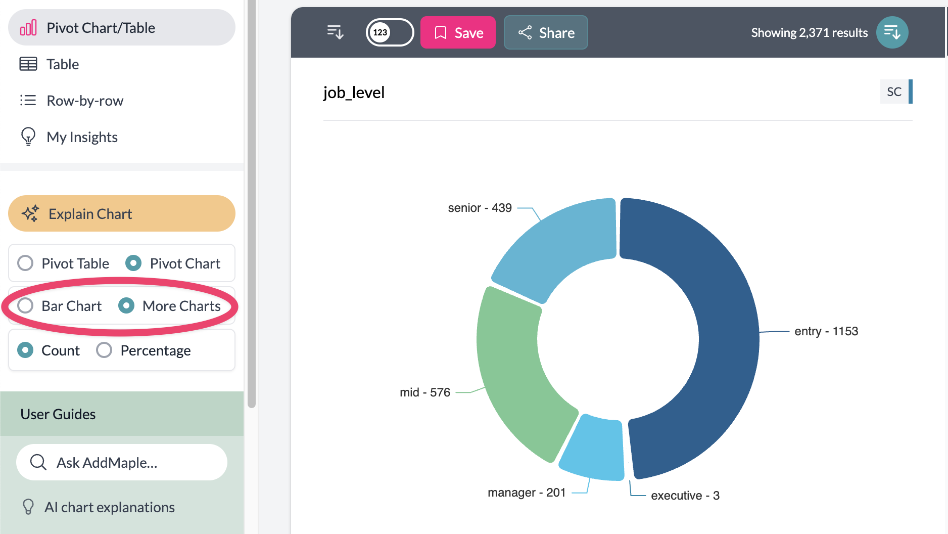
Available Chart Types
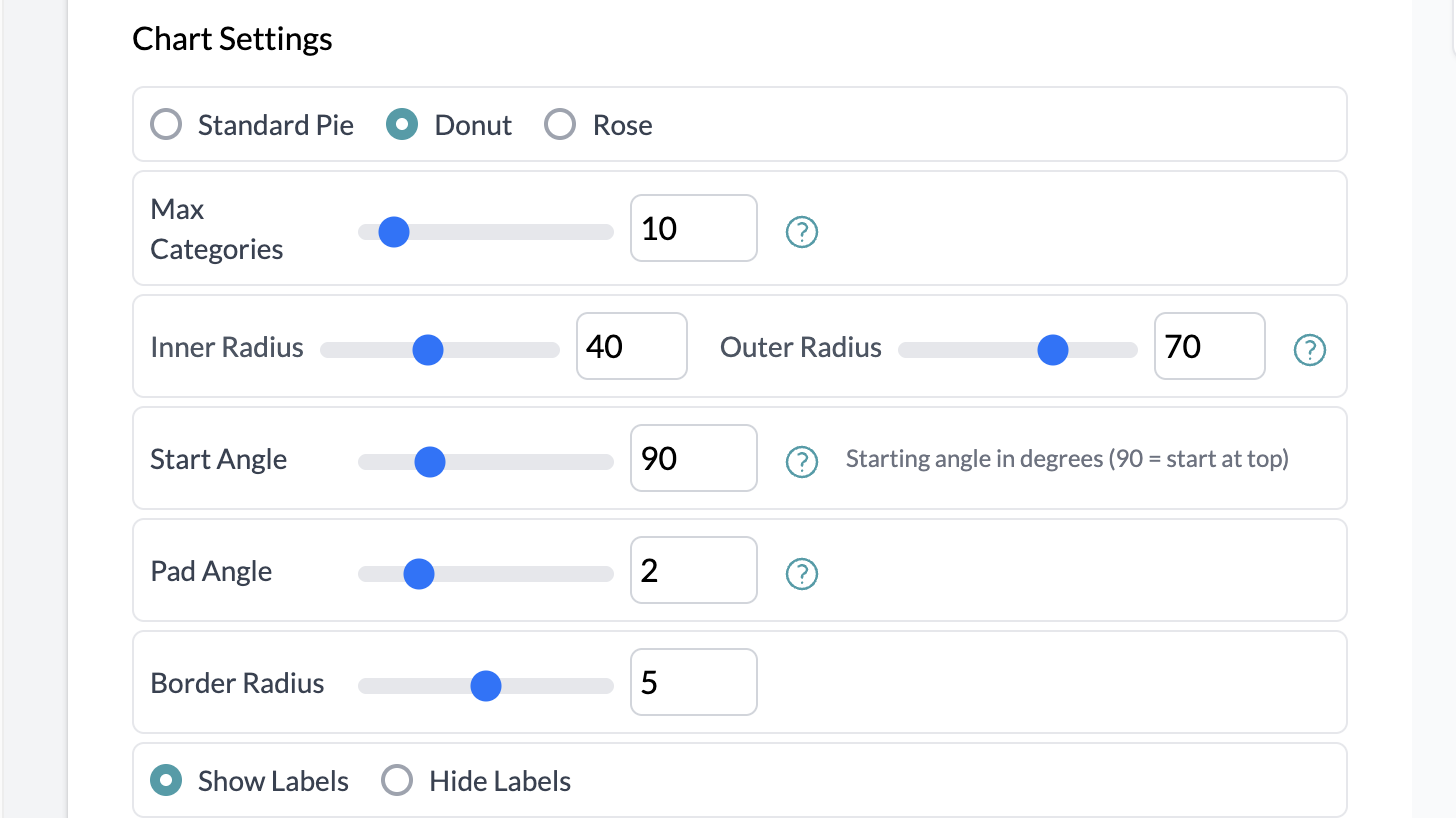
Pie Charts
Perfect for showing proportions and percentages. Includes three variants:
- Pie — Standard pie chart
- Donut — Pie chart with a hollow center
- Rose — Radial chart where segment radius represents values
Pie charts work best with categorical data and automatically merge smaller categories into "Other" to keep the visualization clean.
Using Aggregation with Additional Charts
You can combine additional charts with aggregation to create more sophisticated visualizations. For example:
- Aggregated pie charts — Show median salary by department, or average satisfaction by region
- Geographic maps with aggregation — Display total sales by country, or median income by state
- Rose charts with totals — Visualize sum of values across different categories
To use aggregation with additional charts:
- Set up your aggregation (Total, Average, Median, or Count Unique) using the "Number of" button
- Select your aggregation column (numeric columns for totals/averages/medians, categorical for count unique)
- Choose your additional chart type from "More Charts"
The aggregation will apply to your chosen chart type, giving you powerful ways to explore relationships in your data.
Geographic Maps
When AddMaple detects geographic data (countries, states, provinces), you'll see a map option. The system automatically:
- Detects geographic scope — Recognizes if your data contains countries, US states, Canadian provinces, or European countries
- Creates interactive maps — Shows your data overlaid on the appropriate geographic region
- Includes a bar chart — Displays the top 15 locations alongside the map for easy comparison
- Uses color coding — Applies your project's color scheme to represent data values
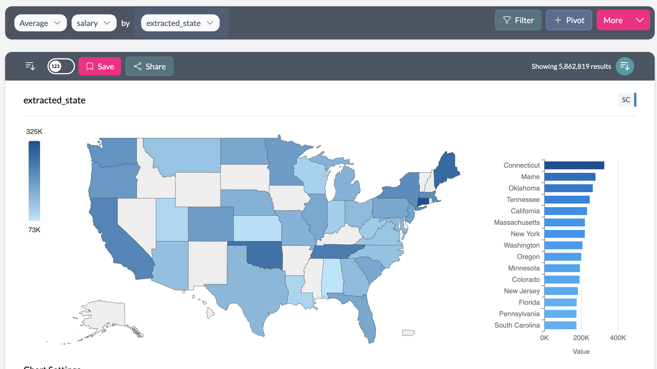
Key points
- Additional charts are only available when viewing a single column
- Geographic maps appear automatically when geographic data is detected
- All charts respect your project's color settings and weighting
- Chart settings can be customized for each visualization type