
Box Plots and Mean Dot Plots
Box plots and mean dot plots are powerful visualizations for exploring numeric data distributions. They help you understand the spread, central tendency, and outliers in your data.
When to Use Box Plots and Mean Dot Plots
These visualizations are available for:
- Single numeric column — Explore the distribution of one numeric variable
- Groups of numeric columns — Compare distributions across multiple numeric variables
- Categorical vs numeric — Compare numeric distributions across different categories
Box Plots
Box plots show the complete statistical distribution of your data in a compact format:
- Box — Shows the interquartile range (Q1 to Q3), representing the middle 50% of your data
- Median line — The white line inside the box shows the median (50th percentile)
- Whiskers — Extend from Q1 to minimum and from Q3 to maximum values
- End caps — Mark the actual minimum and maximum values in your dataset
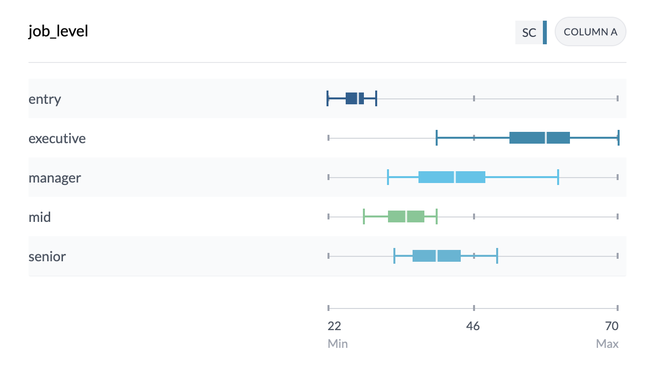
Understanding Box Plot Components
When you hover over a box plot, you'll see detailed statistics including:
- Mean — Average value
- Median — Middle value (50th percentile)
- Min/Max — Lowest and highest values
- Q1/Q3 — First and third quartiles (25th and 75th percentiles)
- Standard Deviation — Measure of data spread
- Count — Number of data points
- Non-Zero Count — Number of non-zero values
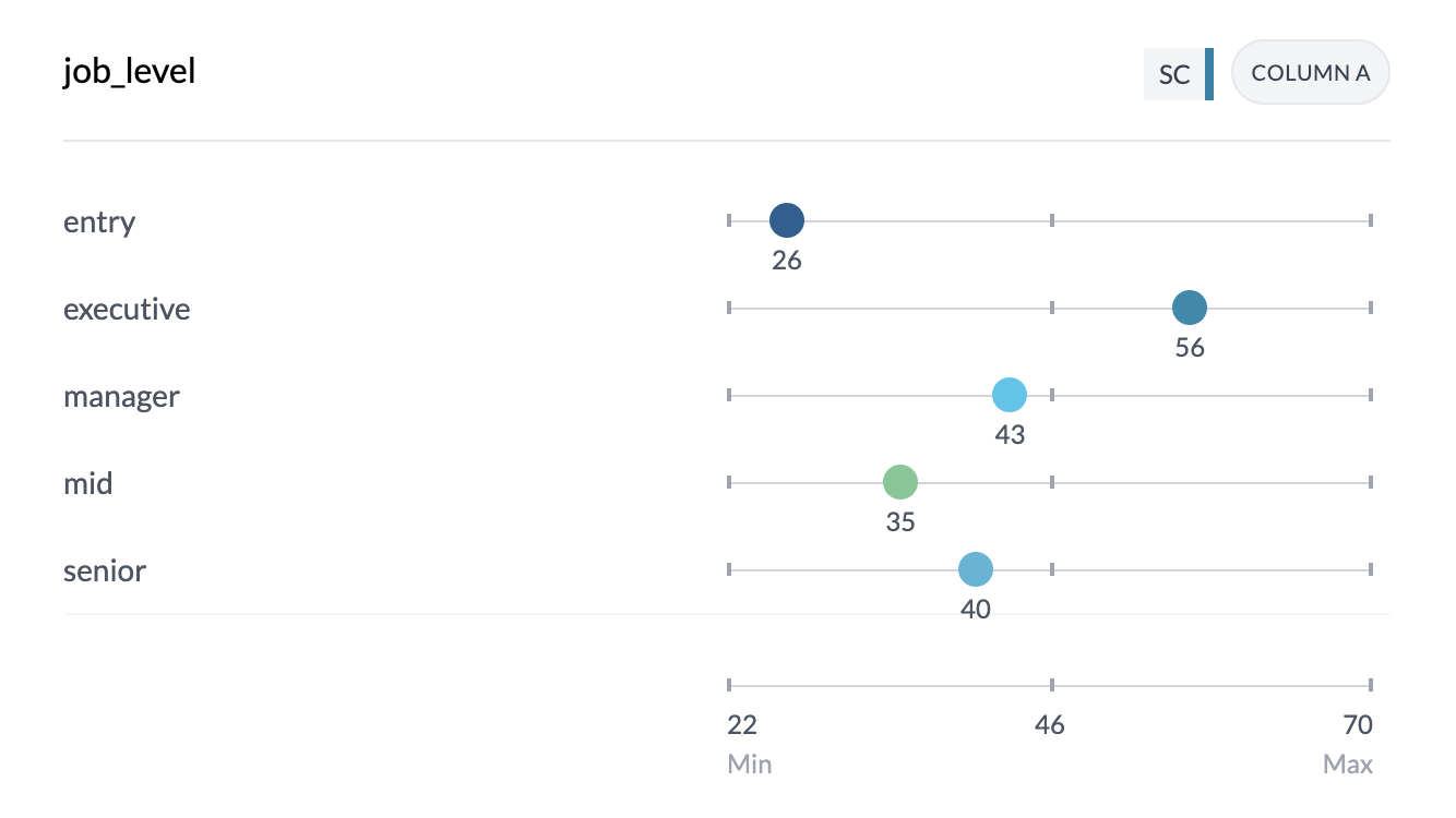
Mean Dot Plots
Mean dot plots show the average (mean) value for each category or group:
- Dots — Each dot represents the mean value for that category
- Position — Dot position along the scale shows the actual mean value
- Color coding — Uses your project's color scheme for easy identification
Accessing Box Plots and Mean Dot Plots
The controls and options vary depending on what columns you're viewing:
Categorical vs Numeric OR Single Numeric
When viewing categorical vs numeric data or a single numeric column:
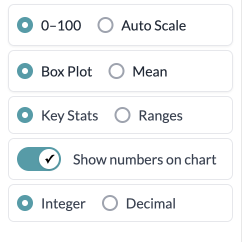
- Key Stats | Ranges control — Located on the left side of your screen
- Default is "Ranges" — Shows numeric data in bins (grouped ranges)
- Select "Key Stats" — This reveals additional visualization options
- Box Plot | Mean control — Appears after selecting "Key Stats"
- Choose Box Plot for complete distribution visualization
- Choose Mean for average value comparisons
Grouped Numeric Columns
When viewing multiple numeric columns together:
- Box Plot | Mean control — Located directly on the left side
- Default is "Box Plot" — Shows complete statistical distributions
- Alternative is "Mean" — Shows average values for quick comparison
Additional Controls
Display Format
- Integer | Decimal — Choose whether to show whole numbers or decimal places
- Show Numbers on Chart — Toggle to display actual values on the visualization
These controls help you customize how your data appears and make it easier to read specific values.
Interactive Features
Scale and Values
- Actual values — The scale shows real data values, not percentages
- Reference markers — Gray markers at 0%, 50%, and 100% help you read values
- Hover tooltips — Show exact values and complete statistical summaries
Sorting Options
You can sort your visualizations by:
- Label — Alphabetical order
- Value — By median (box plots) or mean (dot plots)
- Direction — Ascending or descending order
Color and Styling
- Project colors — Respects your project's color settings
- Alternating rows — Subtle background shading helps distinguish between rows
- Full width — Single-column box plots use the full width for better visibility
Best Practices
Choose the right visualization:
- Use box plots when you want to see the complete distribution, including outliers
- Use mean dot plots when you want to focus on average values and make quick comparisons
Interpret your results:
- Wide boxes indicate high variability in your data
- Narrow boxes suggest consistent values
- Outliers appear as points beyond the whiskers
- Skewed distributions show when the median is closer to one end of the box
Key points
- Box plots show complete statistical distributions with quartiles and outliers
- Mean dot plots focus on average values for quick comparisons
- Both visualizations work with single columns, grouped columns, or categorical comparisons
- Interactive tooltips provide detailed statistical information
- Sorting and styling options help you explore your data effectively