
How to use Manage Column(s)
AddMaple automatically detects and interprets your survey data when you first upload it. Most of the time this works well and you can start exploring right away. But sometimes survey exports are messy, and you may want to clean them up. For example, multi-select questions — those “choose all that apply” types — may be split into separate columns on export, and you may want to combine these into a single variable. Or grid questions may be displayed individually when you’d prefer to group them together to compare responses.
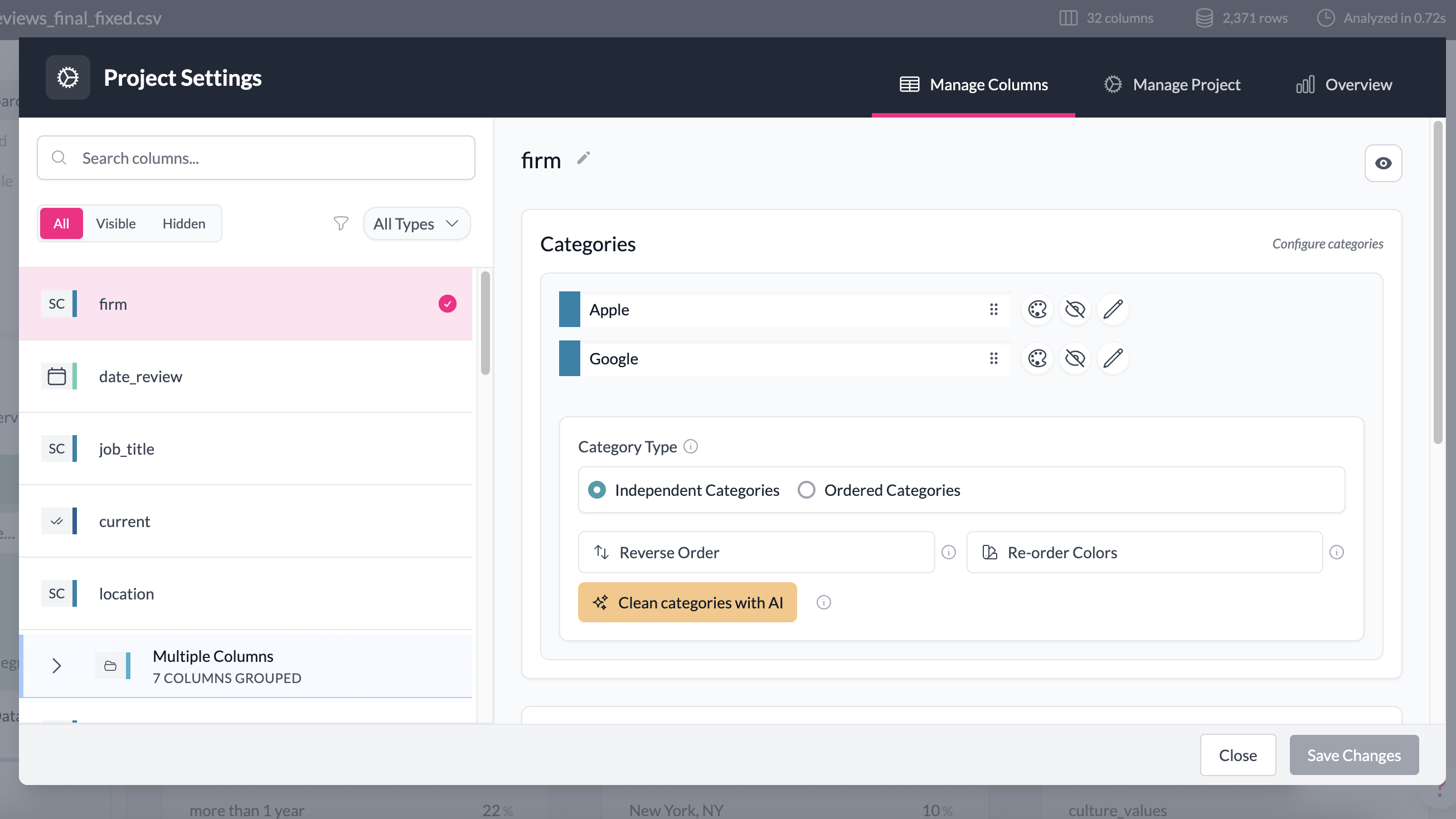
Manage Column(s) is where you adjust columns in your dataset. This doesn’t change the underlying data — it only affects how the data is presented in your project. Think of it as the place to fix messy exports and make your dataset easier to work with. Your raw data remains unaltered, you can always revert back to the original state of the data. We show you the original column and category labels, so you can see which changes were made, and revert to the original formatting, if you need to.
Use this feature to:
- Rename columns — shorten long question titles or replace cryptic labels like “Q12A_1” with something human-readable.
- Rename categories and values — if exported data contain numeric codes instead of useful labels, such as (e.g. 1, 2, 3), you can edit these with better labels (e.g. “Yes”, “No”, “Maybe”).
- Hide/unhide items from the dashboard — remove clutter from the Explore Dashboard and from drop-down menus (like filter selections).
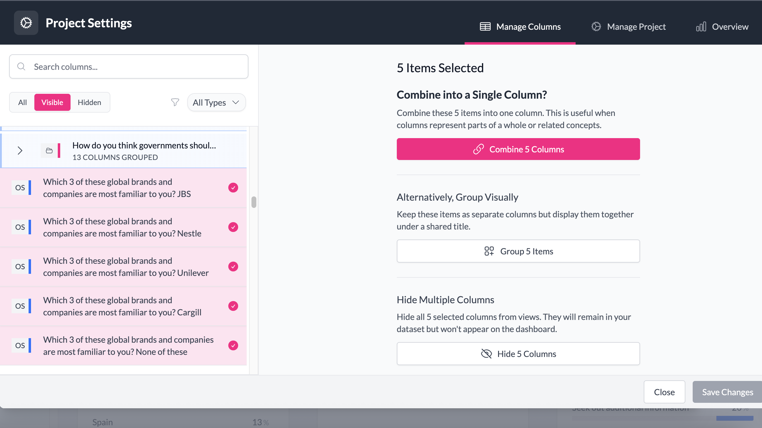
- Combine columns from multi-select questions — combine columns that belong to the same “choose all that apply” question.
- Group columns like Opinion Questions, together to visualise as one chart — see how answers to related questions align on one Likert Scale chart, grouped box plots, dot plots, and fine-tune how individual labels appear within the group.
- Group similar column types from across your dataset — for example, group questions where you used the same values across multiple columns, e.g. 1–5 rating questions, yes/no, numerical questions, such as 'What is your salary' to compare responses as a group.
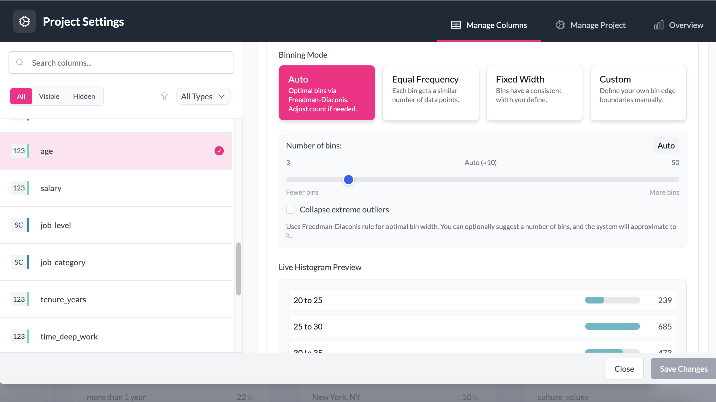
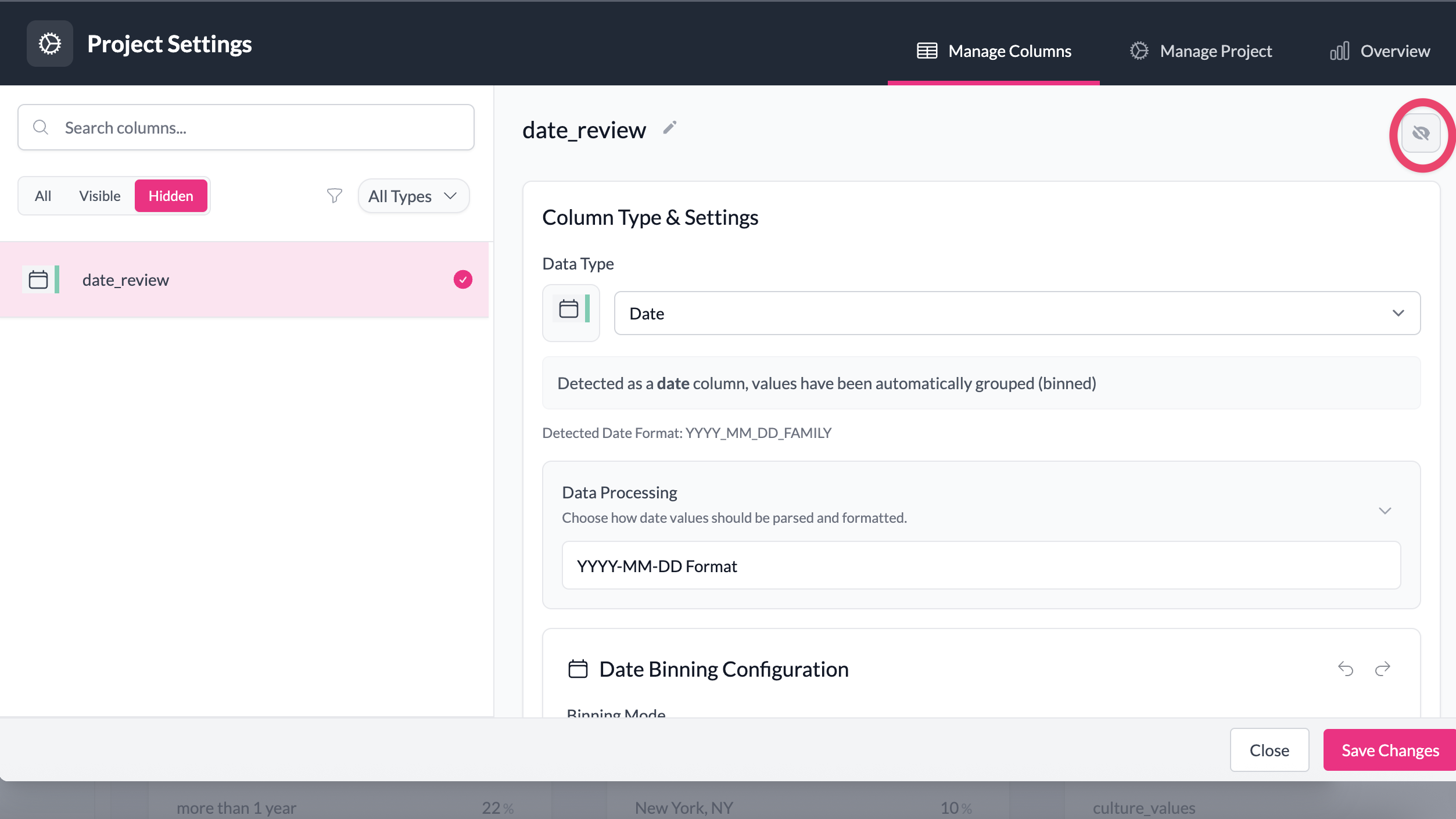
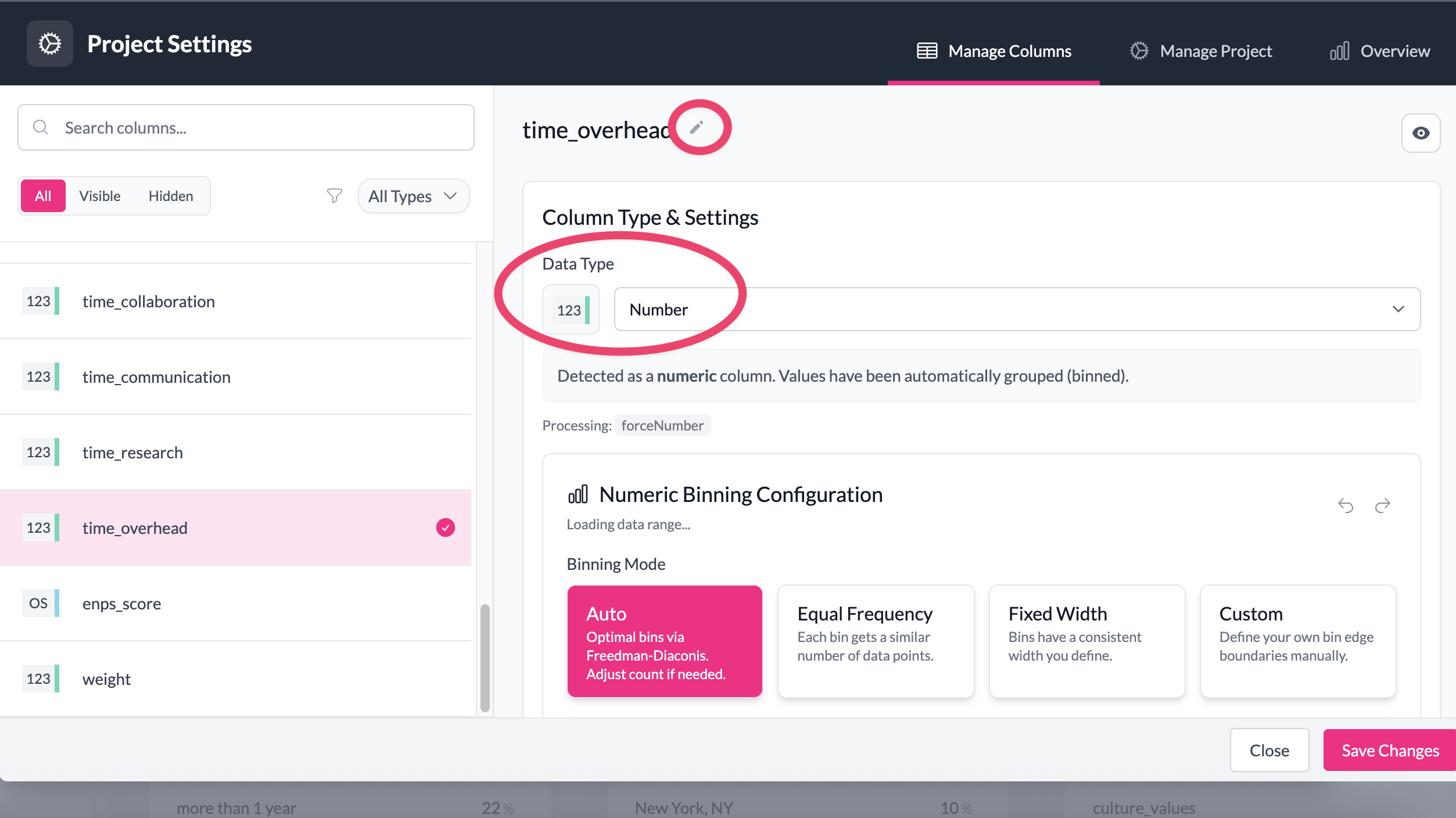
- Adjust how numeric and date values are displayed — create custom bins (e.g. age ranges, time periods) that make analysis easier.
- Use AI to clean and reorder categories — let AI reorder implied scales (e.g. most agreement to least agreement) or classify inconsistent responses (like region or country names).
- Merge categories or values - merge similar categories, or merge long-tail categories into an 'Other' category
- Reorder and lock category order — override AddMaple’s default (most-to-least frequency) and keep categories in your preferred order.
- Change category colours for a specific column — useful for colouring certain segments consistently (e.g. Segment A = yellow, Segment B = green). To apply brand colours project-wide so all charts and exports respect chosen colours, use Manage Project.
You can open Manage Column(s) in four ways:
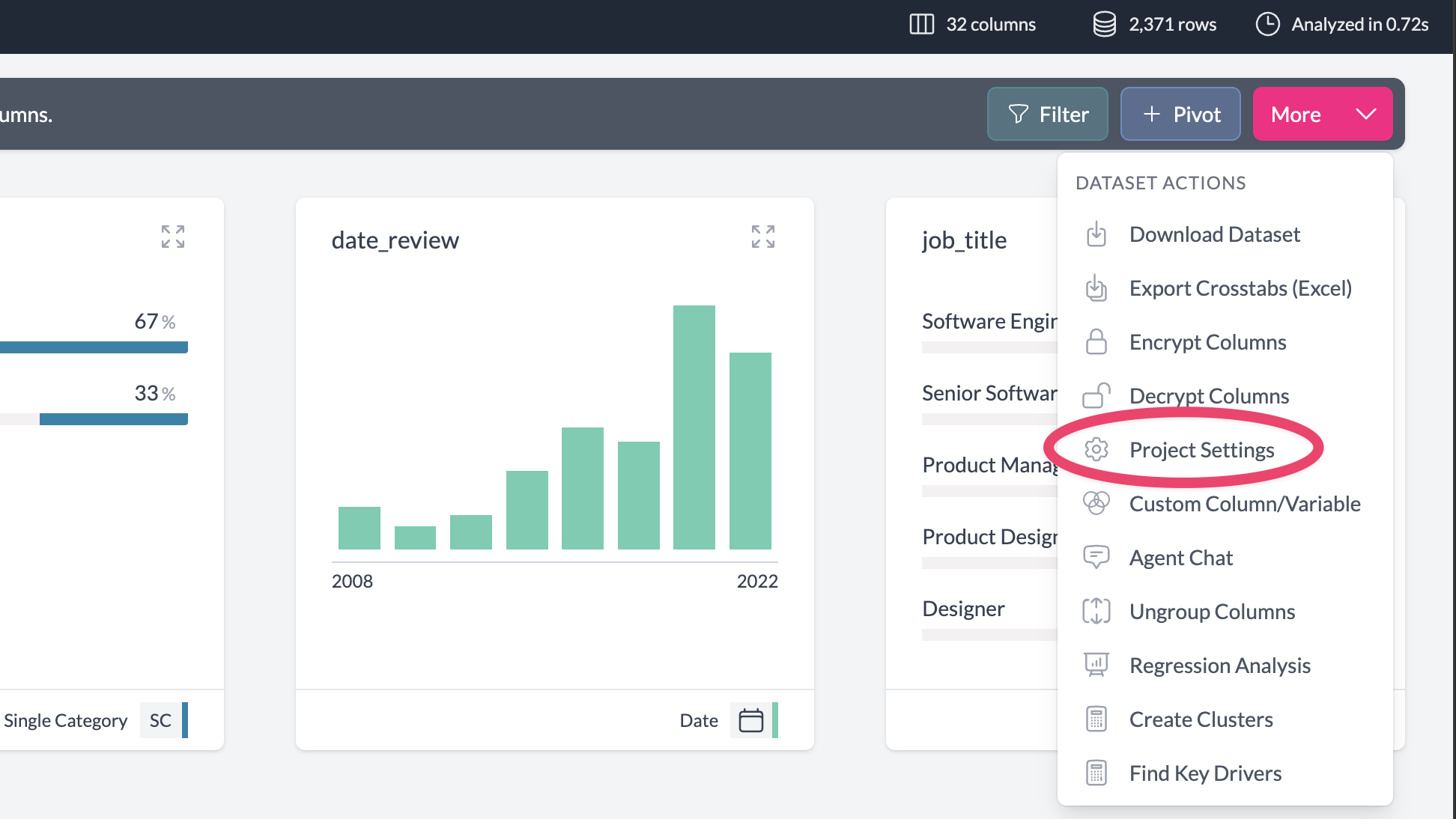
- From the dashboard: More → Project Settings
- From the dashboard: hover over a column tile and click the cog icon in the bottom-left corner to be taken to that column's settings
- From a pivot table or chart: click the cog icon in the legend tab on the right of the chart
- From a pivot table or chart: More → Column Settings
Once open, you can:
- Change the name or type of a column
- Hide or unhide columns
- Adjust the legend
- Combine columns or split them
- Group columns or ungroup them
- For numeric or date columns: set custom binning options
- For groups: set the group title and the titles displayed for each column inside the group
When you're done, click Save in the bottom-right. All changes apply across your project immediately. You can undo or adjust them anytime.
Examples
1. Combine multiple columns into one variable
Suppose you've imported survey data where a multi-select question has been split into separate columns. In Manage Column(s), you can combine these into one multi-select variable. Charts and tables across the project will then treat it as a single question, and PowerPoint exports will reflect the combined structure.
2. Apply custom binning
For a numeric column like "Age," you might want to view responses in ranges (e.g. 18–24, 25–34, 35–44) instead of every unique number. In Manage Column(s), you can set custom bins to group numeric values or dates into ranges.
3. Hide metadata columns
Survey exports often include metadata columns (e.g. response ID, timestamps). These aren't useful for analysis but clutter your dashboard. In Manage Column(s), you can hide these columns. They remain in the dataset but won't appear in charts or pivots.
4. Change type and title
Sometimes survey exports label variables unclearly (e.g. "Q5_1" instead of "Satisfaction with product"). In Manage Column(s), you can rename the variable and change its type (for example, from text to categorical) so that it displays correctly in charts.
Key points
- Changes affect every chart, pivot table, and export in your project.
- The raw data is never modified.
- You can always undo or adjust settings.