Create pivots, then build the story
AddMaple creates pivots and continues with charts, filters, and shareable dashboards. Explore sample datasets first.
- ★Begin with an explore-ready dashboard
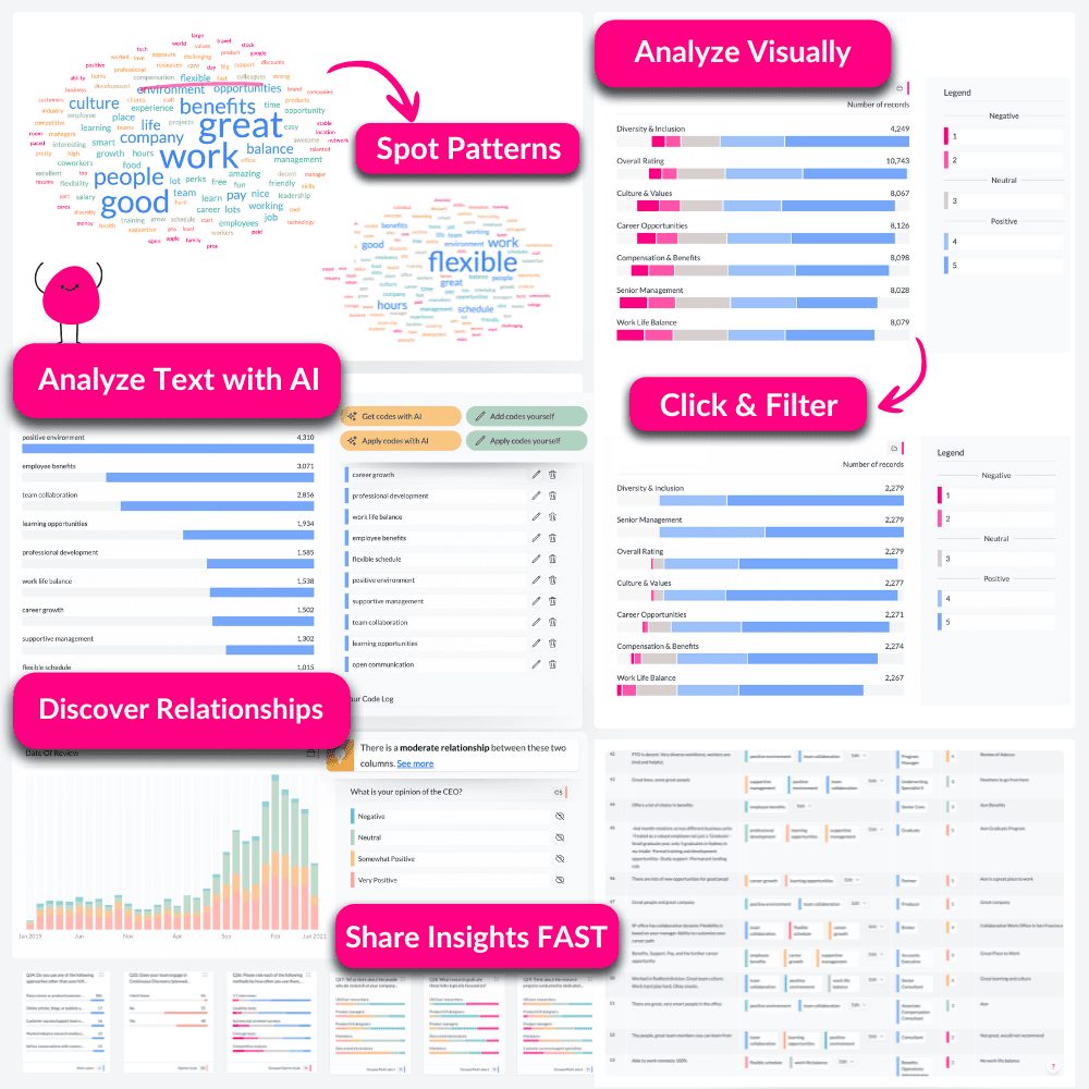
- ★Analyze text with AI
- ★Discover statistical relationships
Our music video explains why we're different
★ Perfect for Beginners and Pros
★ No cloud uploads
★ Transparent Pricing
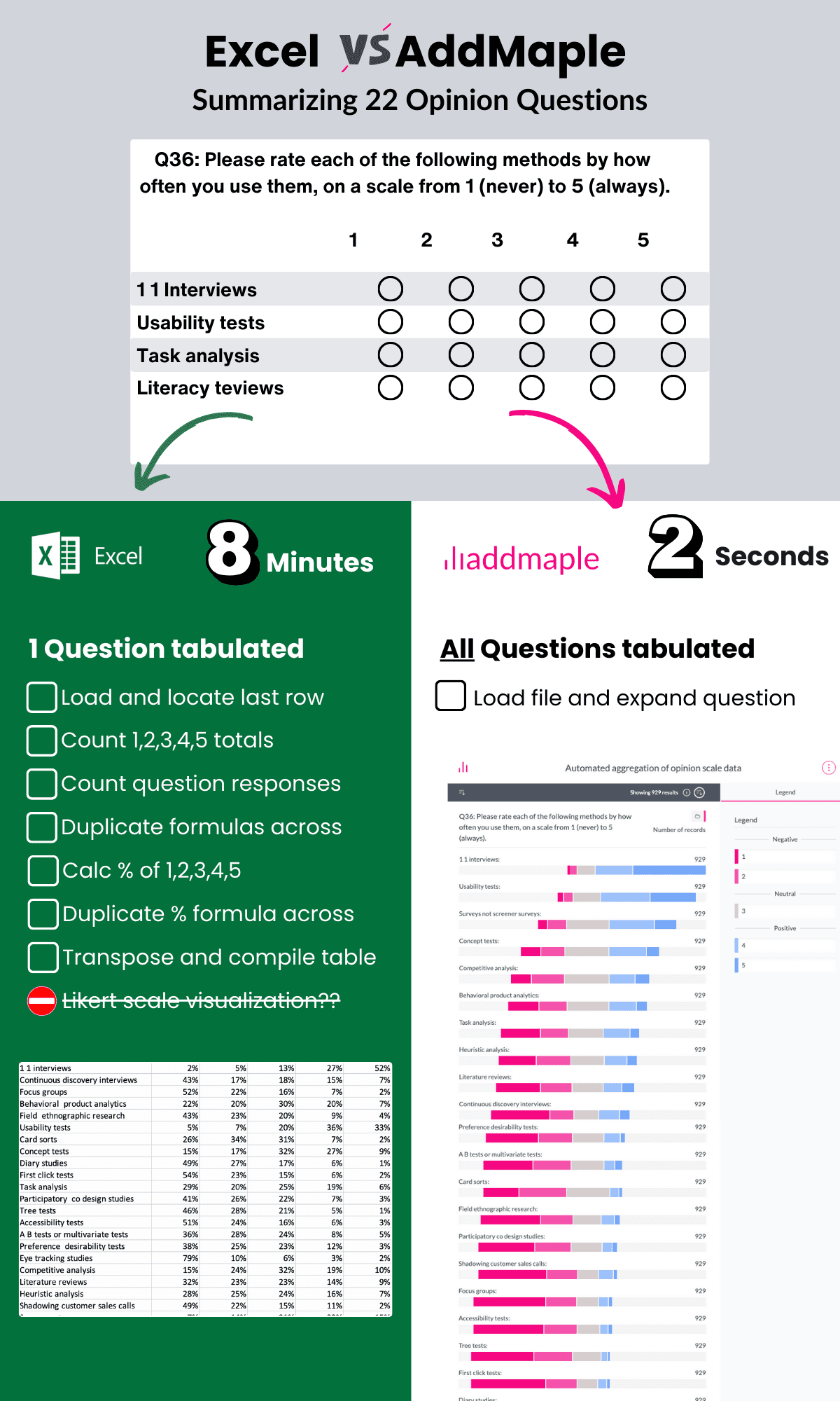
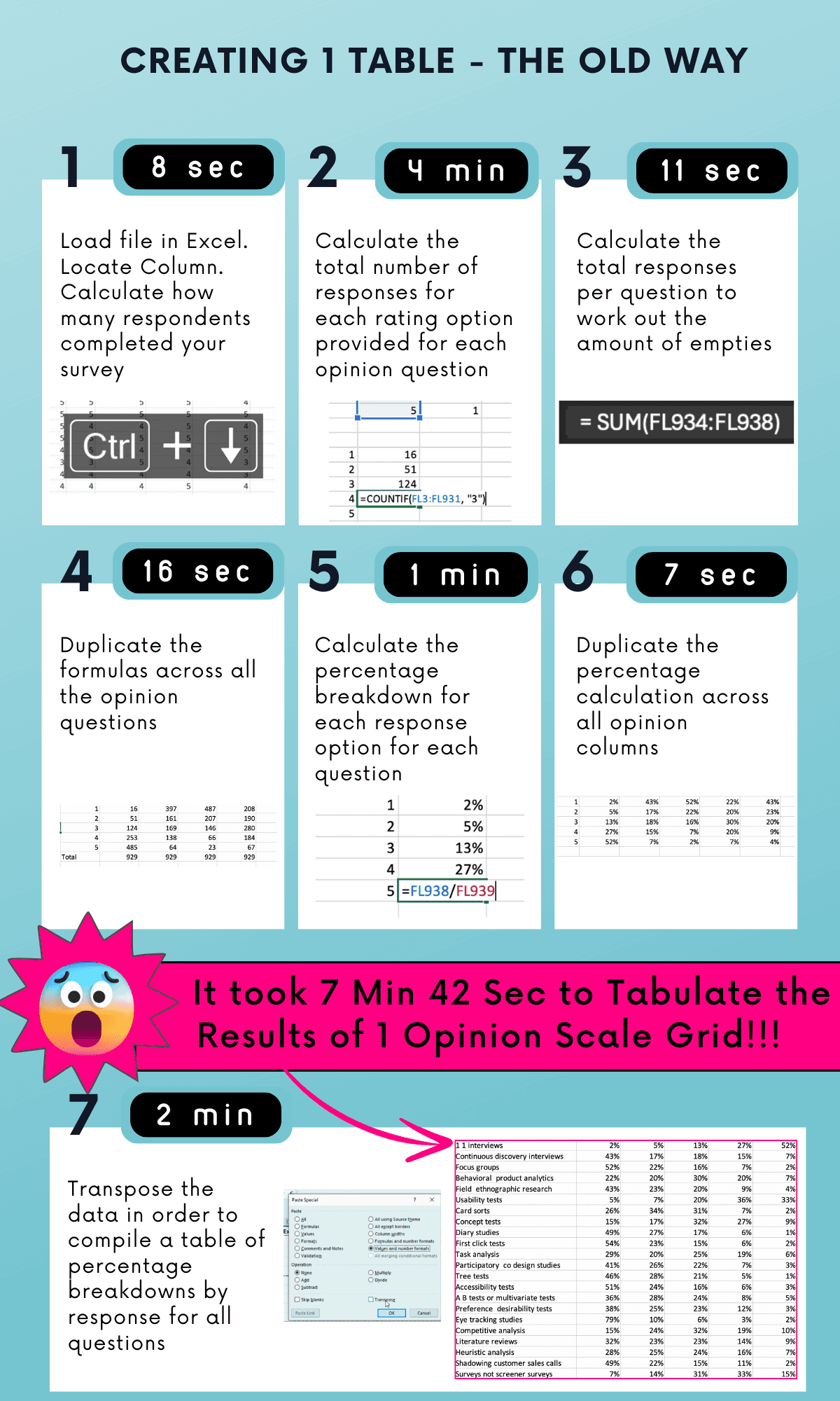
Getting answers shouldn't take this long
Most tools create extra steps. AddMaple brings analysis, stats, and storytelling into one fast workflow.
Too much time spent on prep
Slow analysis of open-ends
Too many tools
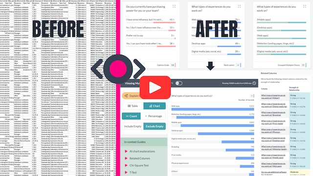
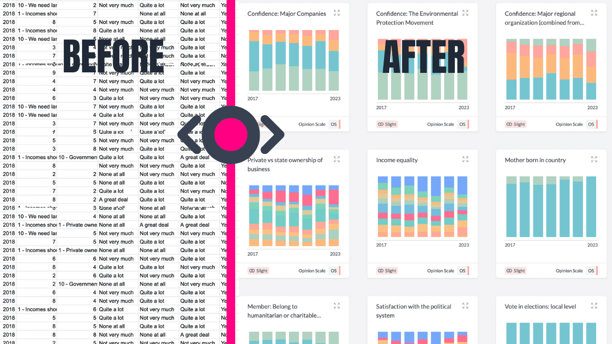
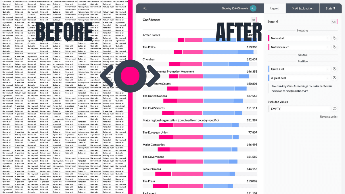
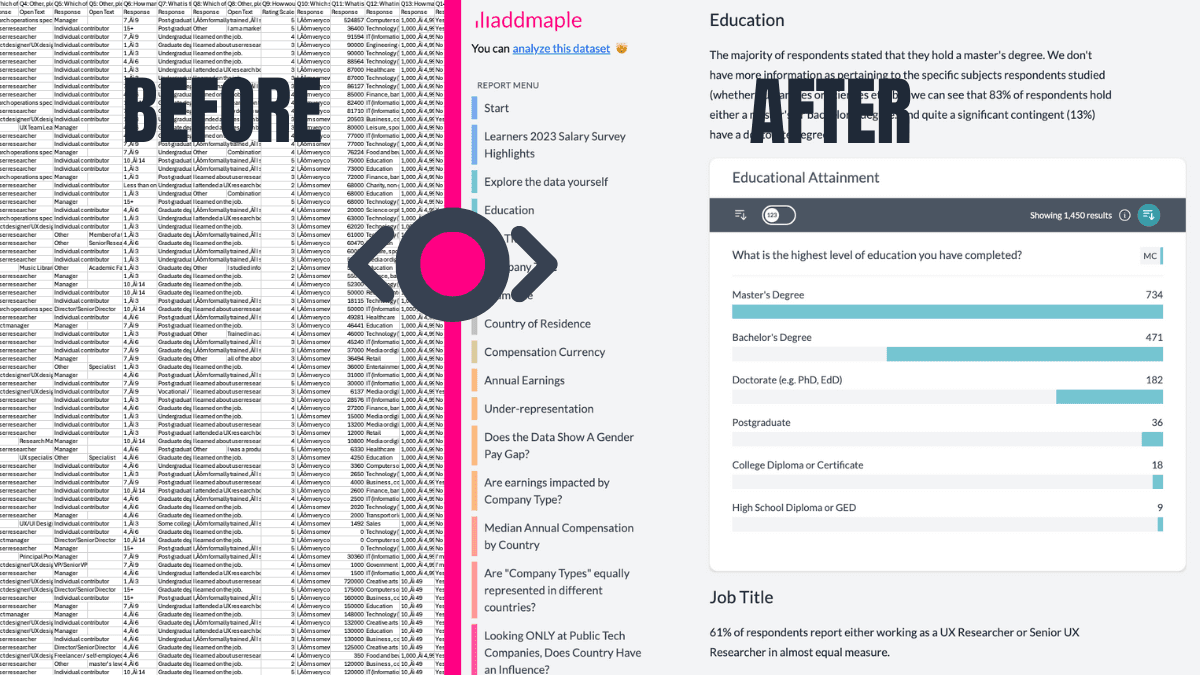
Starts You with Summarised Data
Forget starting with raw columns. AddMaple instantly summarises your data into tables, pivots, and charts. Begin exploring your results with answers, not setup tasks.
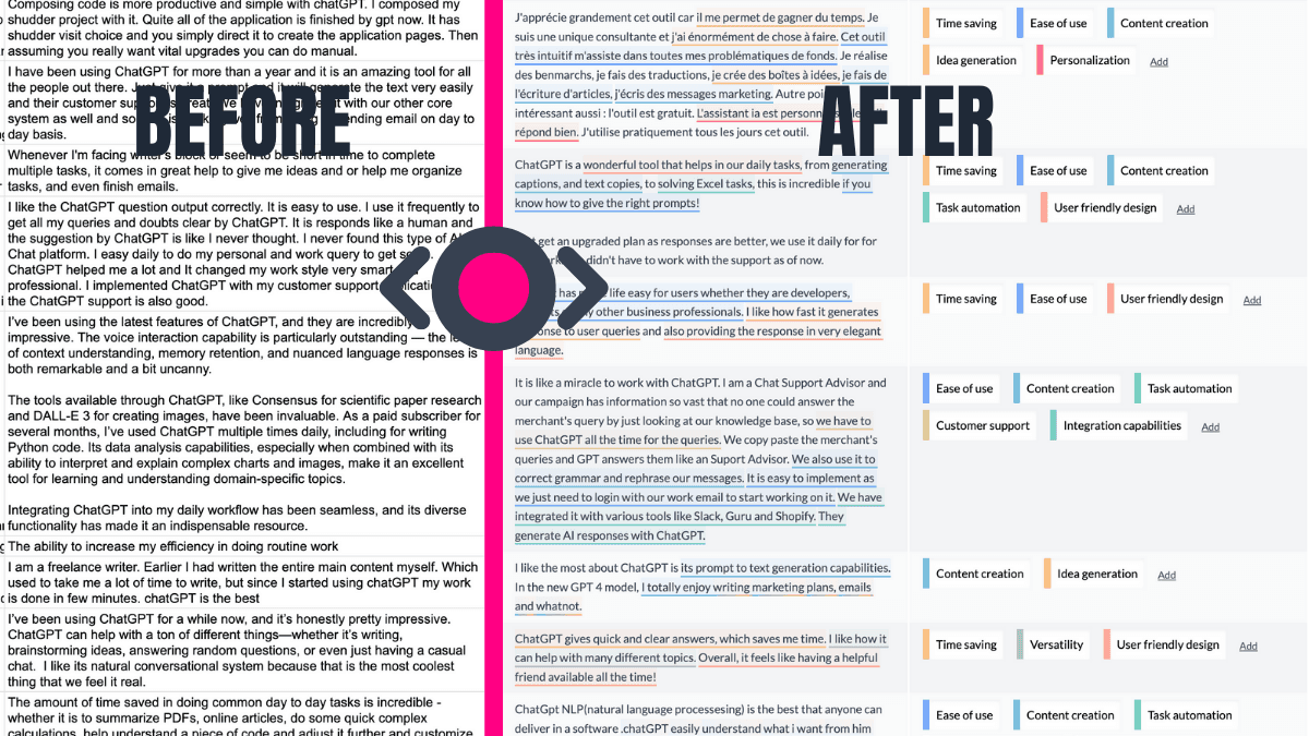
AI-Powered Thematic Coding
Transform open-ended responses into themes, fast. AddMaple's AI not only categorises text but highlights the exact phrases behind each theme.
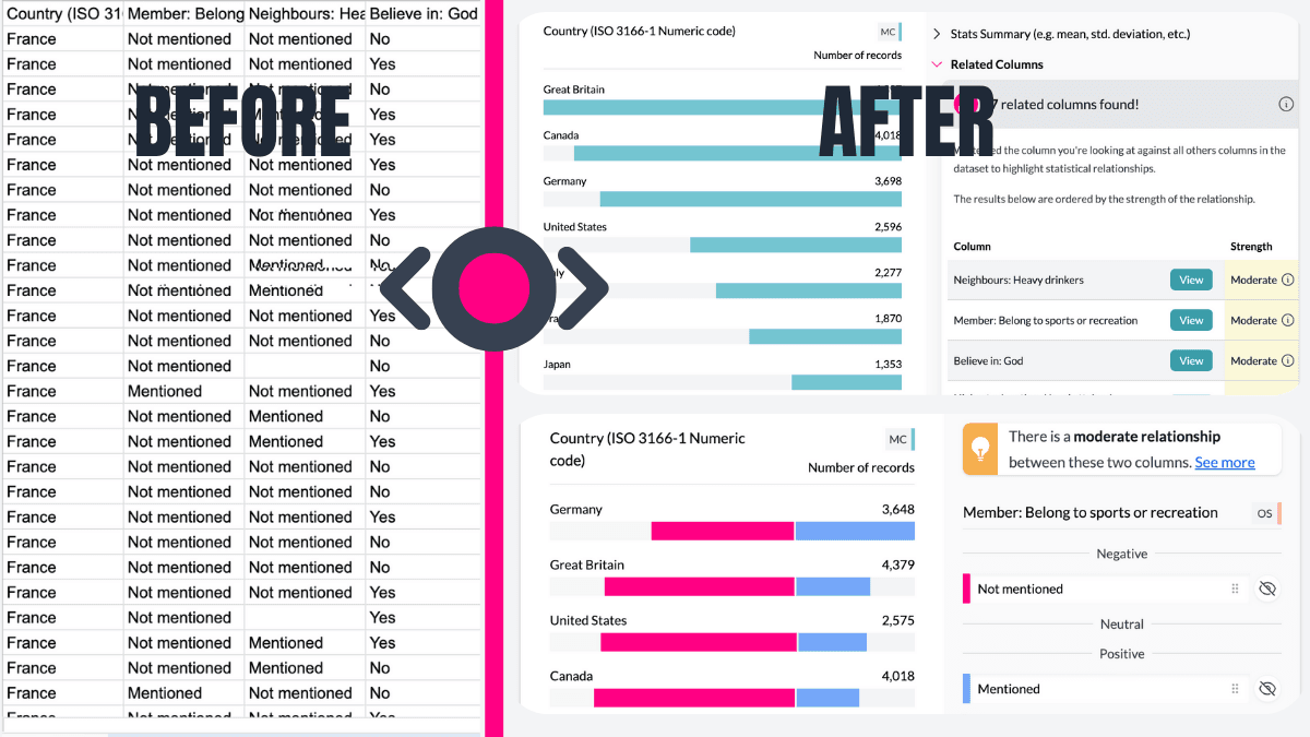
Automatically Reveals What Matters
AddMaple runs statistical significance tests across columns and ranks relationships by importance, so you can focus on the patterns that matter.
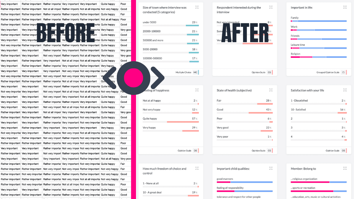
Handles Dates and Numbers with Ease
AddMaple detects date ranges and creates histograms and grouped ranges for numeric data automatically.
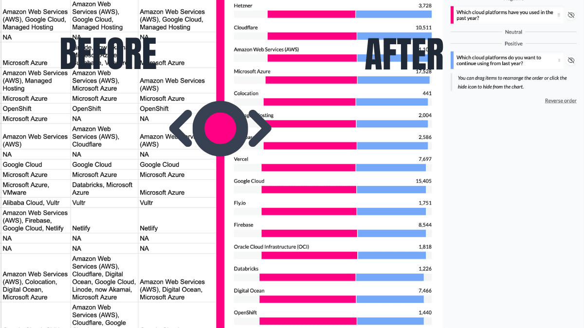
Automates Multi-Tag Analysis
Handling "Select all that apply" or multi-tag columns? AddMaple automatically detects these and summarises them into clear visual charts.
Turns Likert Scales Into Pivot-Ready Visuals
AddMaple turns Likert data into neutral-aligned charts and lets you pivot by any other column to go deeper.
Shares Insights That Live On
Create interactive dashboards, shareable reports, and charts your team can explore without extra setup.
Integrations
Bring your data to us from any platform and get an instant explore-ready dashboard


AddMaple creates instant chart dashboards that let you analyze your survey data visually and is one of the best ways I've found to conduct AI-powered thematic analysis of open-ended results.


AddMaple: From raw data to insights in seconds
Cut the time from raw data to insights you can share.
AddMaple combines an explore-ready dashboard, a powerful stats engine, and explainable AI to help you make data-driven decisions.
Analyze open-ended questions with AI
Theme thousands of responses in minutes, then explore those themes alongside your metrics.
Qual and quant in one place
See numbers, themes, and sentiment together to understand the full picture.
No data wrangling needed
Bring data from anywhere and get an explore-ready dashboard instantly.
From Raw Data to Explore Data
Secure by design
Your data stays on your system, with all analysis happening instantly in your browser, not in the cloud.
We support cloud based chart and report sharing - but this is optional and fully within your control. Read more about our approach to security and privacy here.
The fastest data analysis tool out there
Built from the ground-up to be super speedy. No more loading spinners, crashing spreadsheets or scrambled sorting.
Don't believe us? Try this Afrobarometer dataset with over 20 million data points fully loaded and summarized in 2.84 seconds
A few of the 20,000+ people cruising from data exports to reports


Ready to Make Your Data Work for You?
See how AddMaple can speed up your survey analysis and help you uncover meaningful insights.
Receive tips for your next data project