AddMaple AI analysis agent
See how the AddMaple AI agent answers questions using key driver analysis, the stats engine, and chart engine—and adds charts to your dashboard or editable PowerPoint.
Also on: AI data analysis
Show transcriptHide transcript
AddMaple AI analysis agent
I have a super duper exciting update that we are working on that I would love to share with you. It is our upcoming AddMaple analysis agent. It sits on top of all the modules we've built. It can use our key driver tool. It can use our stats engine. It can use our chart engine so that when you ask a question, it's able to answer the question, pull up relevant charts that you can edit, add to your dashboard, add to an editable PowerPoint download, and because it sits on top of our stats engine, it's able to answer questions without noise and fluff because it can reveal the patterns that are already evident in the data.
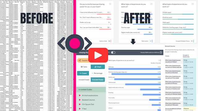
So, I'm going to show you how it works. But before I do that, you might be wondering, how do I get the data looking like this? When I've got data that looks like this—rating for company benefits, would you recommend working at your company?—this is what the data looks like in its raw format. We've got open ends. We've got rating scale questions. Got some empty cells. Here we have multi select. So this is the raw data. Get it into AddMaple. What does it look like?
So I'm going to quickly show you that. Exit this project. Create a new project. Find the file. I've selected the CSV. And this is it. This is the default color palette. In 0.29 seconds, all your columns are turned into charts for you that you can then analyze. So that Likert scale question set that we saw—where we were looking at overall company rating, rating for work life balance, culture and values, rating for diversity and inclusion, rating for career opportunities, compensation and benefits, senior management—all of these are already turned into a Likert scale chart for us. But then we've got configuration where you can change the ordering and we have project settings. You can add in your custom palette so that all your data reflects your brand or you could switch to this palette and then your data looks like this.
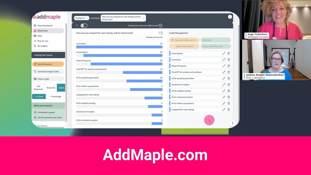
But I'm going to open the other project now and show you our AI agent. This is just to show you how you get your data into AddMaple. All you need to do is connect that data and we detect the type of columns and give you charts in 0.29 seconds. And this is 42 columns, 2,371 rows. Exit this project. Open my live project. I've actually done some coding here. But AI agent—I'm going to ask it what is the biggest driver behind overall ratings.
It's calling our key driver analysis tool because it sits on top and it's going to interpret the results from the key driver analysis tool into language that we understand.
Biggest driver of overall company rating. The strongest driver is your rating of culture and values. In a multivaried key driver model random forest test, it has the highest relative importance edging out other factors. So top drivers: culture and values, followed by career opportunities, senior management. Would you recommend working here? What this means: the improvements that most reliably move the overall rating tend to be those that shift employees' perception of culture and values and secondarily growth, career opportunity and leadership. Demographics, company job level were comparatively small drivers in this model. Note in one-at-a-time association tests, career opportunities also show the strongest relationship with overall ratings. So culture and career are the two most consistently influential levers.
I am working on a dashboard at the moment. So I'm going to click add summary to my dashboard. It's given me some charts here. Compare overall rating by culture and values rating or compare overall rating by career opportunities. I've just done the other one. So I'll click on this one and it's opened up for us: career opportunities by overall company rating. This is an active chart and in AddMaple we can add—we can show numbers on our charts but we can also click on our configuration here if we want to change the titles or something else or the colors as I showed you earlier. But I'm quite happy with the titles for both of these. You can edit the title if you wish. And from here you can download this as an editable PowerPoint chart. And we from here can add this to our dashboard.
New insights. I can ask it to please interpret the drivers behind overall rating but in language my team will understand.
Think of the overall rating as an employee summary judgement. In this data set, the judgment is shaped most by a few big people-experience levers, not by demographics. Culture and values is the biggest overall lever. When people rate culture and values well, they tend to rate the company well overall. When they don't, the overall rating also drops. In the key driver model, culture and values was the number one driver, highest relative importance. HR translation: day-to-day environment, how people are treated, whether values feel real, psychological safety and do I feel proud to work here.
Two: Career opportunities is the clearest make-or-break factor. This is the most obvious step change. Perceptions of growth track tightly with overall rating. People who rated career opportunities a five were overwhelmingly positive overall—83% gave overall a five. People who rated career opportunities a one skewed strongly negative overall. HR translation: promotion clarity, internal mobility, development, manager support for growth, fair performance review processes.
Senior management is a major trust signal. Perceptions of senior management are a top driver, top three in the model and strongly tied to overall ratings. HR translation: confidence in leadership, clarity of strategy, consistency, leaders listen and credibility of decisions.
So I'm able to ask good questions and then from here I'm able to add text to my dashboard, which I'll show you in a second.
How to use this in HR planning. If you want the biggest impact on overall ratings, focus first on culture, manager effectiveness, and career growth systems. Next, tackle leadership trust, communication, and workload norms. Treat compensation as table stakes—important, but in this data set less likely to be the main reason overall sentiment swings. And this Kaggle data set is based off of Glassdoor reviews. So the ratings themselves were given by people who reviewed their company on Glassdoor.
I'm going to add the summary to my dashboard. View my dashboard. I'm working on this page. Got lots of charts that I've added. And you can go and add bits of commentary, edit it, refine it, add charts, drag them around. But this is what we've got coming in AddMaple. See you soon.