How to change project color presets
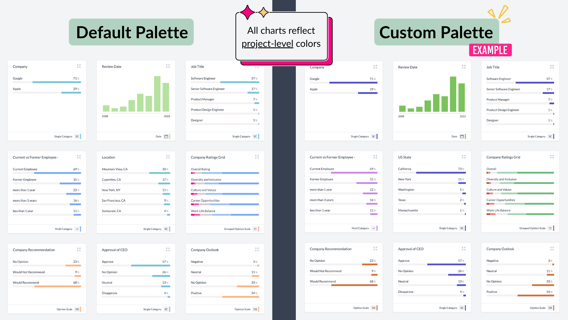
By default, all charts in AddMaple use our standard AddMaple color palette.
You can customize colors in two different ways, depending on whether you want to update them across the whole project or lock in colors for specific variables.
1. Project-Wide Color Changes (Global)
What it does: Updates the default color palette across the entire project, so all chart types automatically use your chosen colors.
When to use it:
- You want to apply your brand colors consistently across every chart and data type.
- You want all visualizations to follow a single unified palette.
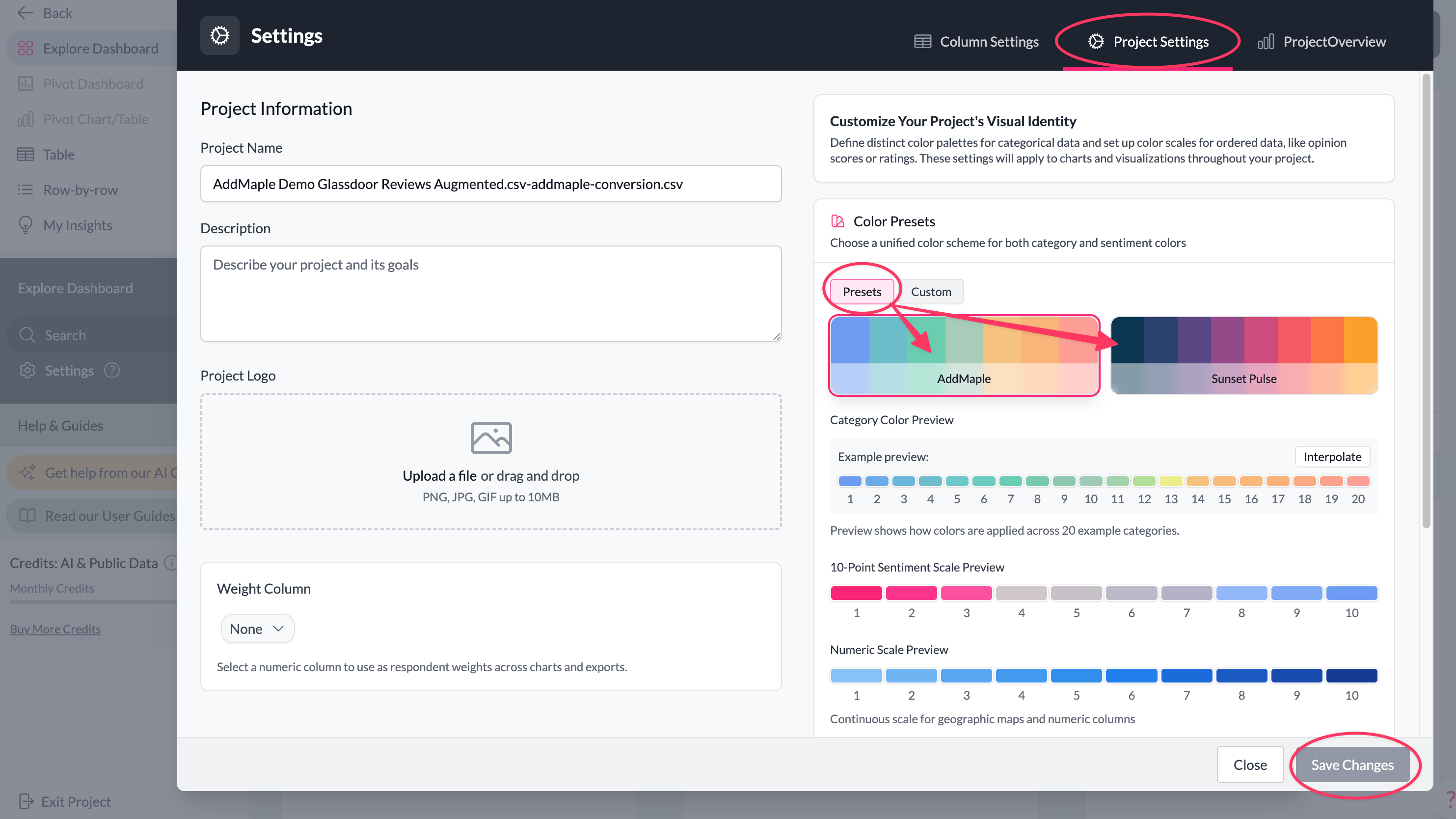
How to do it: Go to Settings → Project Settings, and select a preset or define your own 'custom' palette, to update the project color settings. See detailed steps below.
NOTE: After updating, every chart in the project (bar charts, maps, word clouds, dot plots, box plots, stacked pivot charts, etc.) will reflect the new palette.
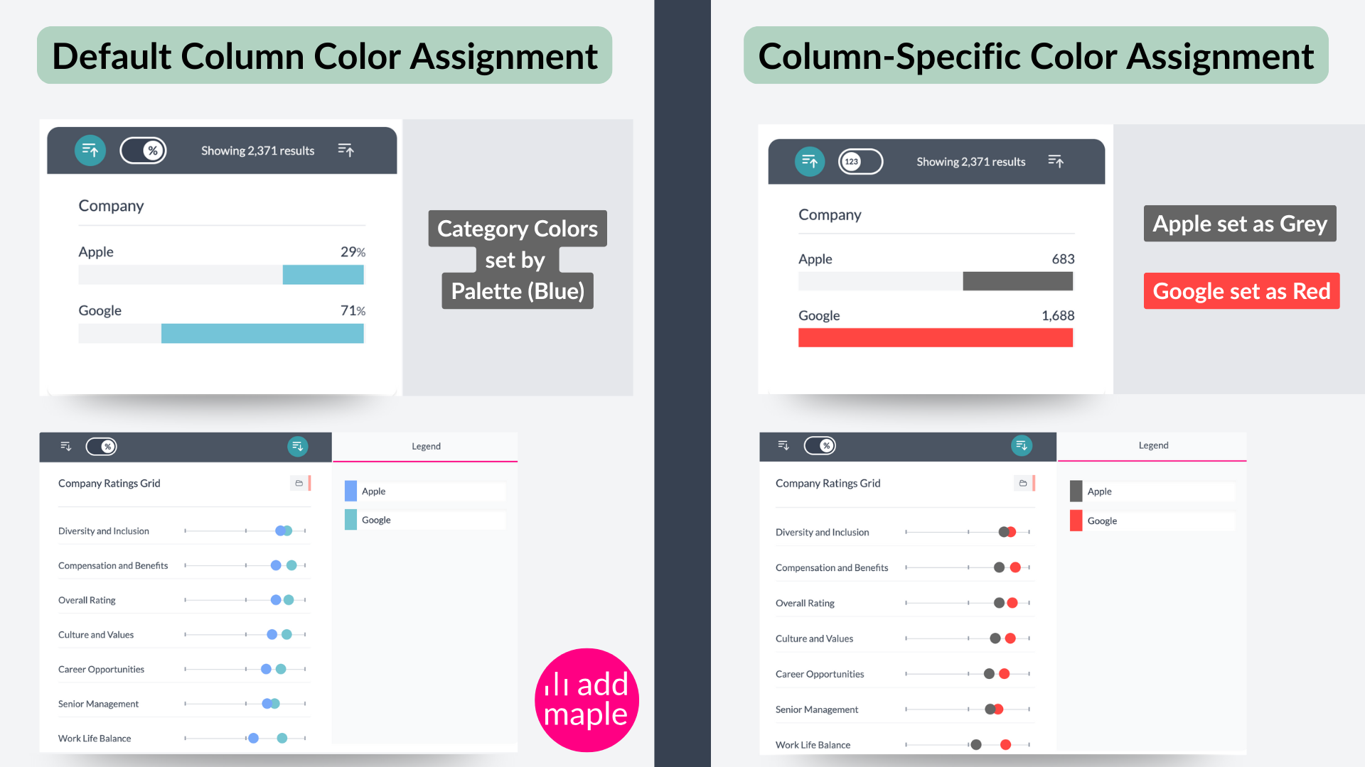
2. Column-Specific Color Assignments (Locked to a variable or specific categories in a chart)
What it does: Assigns fixed colors to specific variables so they are always represented consistently, no matter which chart they appear in. If you're viewing two columns, make sure the chart with the set colors is in the legend's side on the right. Then you'll see the colors reflected, even when viewing this column by another one.
When to use it:
- You want Segment A to always appear pink, Segment B always blue, etc.
- You are comparing charts side by side and need colors to remain stable for clarity.
How to do it: See Managing individual column colors.
Note: Once you have locked colors in for a variable, they remain the same across all charts, even if the global palette changes. If you pivot that variable with another one, make sure the color-specific variable is on the right side, with those color-locked categories under the legend, to see the colors when pivoting two or more charts. If you're viewing a sentiment scale view, the sentiment colors will be visible though.
Recap
Project-wide changes = update the overall theme/palette for all charts in your project.
Column-specific changes = lock in consistent colors for particular variables (segments, categories, etc.), making comparisons easier and more reliable.
How to set Project-Wide Colors
There are two ways to adjust project-wide colors: using a preset or defining a custom palette.
Option 1: Switch Preset
What it does: Applies one of AddMaple’s built-in presets across the project.
When to use it: If you want ready-made palettes where categorical, numeric, sentiment, word cloud, and other chart types are already tuned to work correctly.
How to do it:
- From the Explore Dashboard, open More menu → Settings → Project Settings.
- Under Colors, select a preset.
- Click Save (bottom right).
All charts in the project will update (except those with locked column-specific colors). PowerPoint exports will also follow the chosen preset.
Option 2: Create a Custom Palette
If you select Custom, you’ll see three configuration sections that you need to pay attention to:
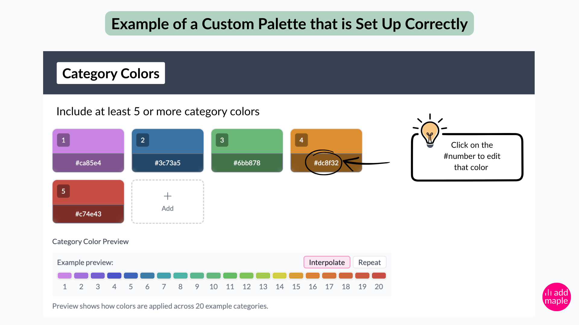
1. Define Category Colors
- Used for categorical data (multiple choice and other categories, etc.).
- Add 8 or more colors to give us a broad palette for charts such as word clouds, bar charts, stacked bar charts, etc.
- If a column contains more categories than the colors provided, we will use the settings below to determine appropriate colors:
- Interpolate (Recommended) (stretches colors across all categories)
- Repeat (cycles through your palette and repeats colors where the categories in a column exceed the palette options you provided in the custom settings).
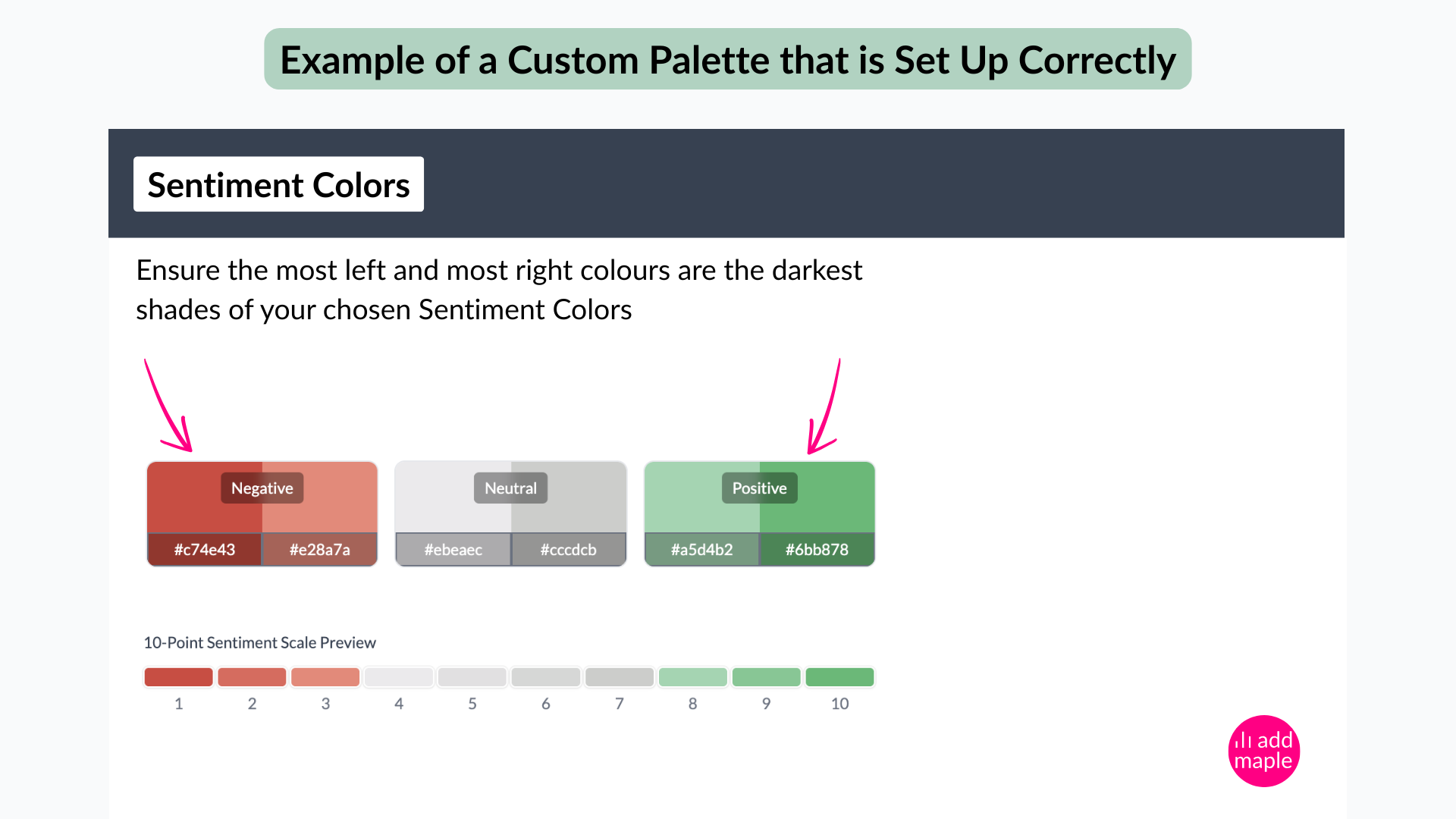
2. Define Sentiment Colors
- Used for ordered scales (e.g., Likert, satisfaction, sentiment, ranking).
- Define most negative, neutral, and most positive ranges.
- Add darkest shades for the strongest ends of the scale.
- Example: If using green for positive → darkest green = most positive.
- If using red for negative → darkest red = most negative.
Tip: Even on an 11-point scale, AddMaple auto-generates intermediate colors accordingly. You only need to specify the most negative and most positive color choice.
3. Define Numeric Scale Colors
- Used for numbers and map visualizations.
- Add 3 colors:
- Light Color → auto-allocated to smallest counts (lowest values)
- Middle Grey Color → auto-allocated average counts (mid-range values)
- Dark Color → auto-allocated to largest counts (highest values)
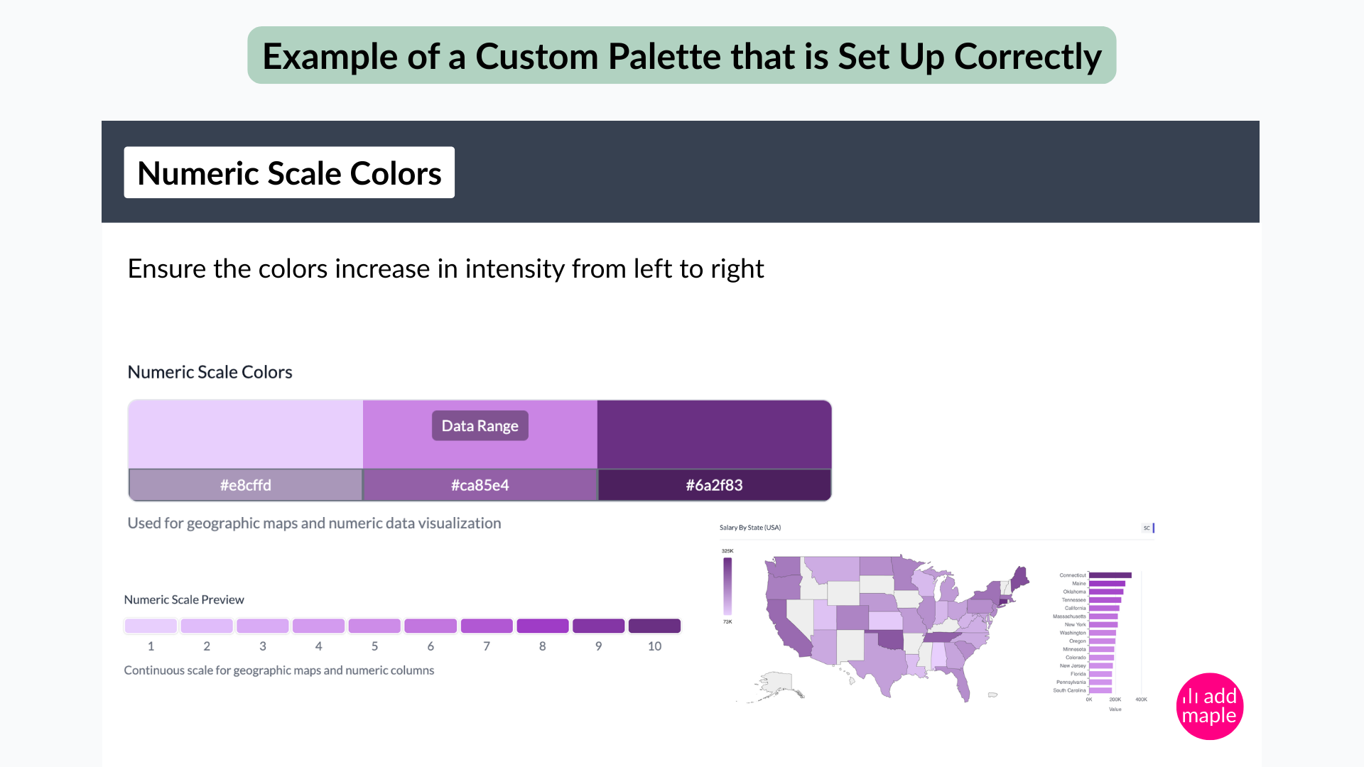
What we mean by counts: "Counts" are simply the number of people or responses that fall into a particular category, range, or location.
Sometimes you need to distinguish between larger and smaller numbers, for example:
- If you’re showing a map of survey respondents by state, a state with fewer respondents will be shaded in the lightest color.
- A state with a lower number of respondents will use the light color.
- A state with the highest number of respondents will be shaded darkest.
- If you show average salaries by state, the shading of the states will reflect comparative average salaries, with low salary averages reflected by light shades and higher salary ranges shown with darker shades of color.
When you set the color settings correctly, darker shades will quickly help you see where 'more responses' lie, or 'bigger values' sit on your map or other visualizations. In essence: the darker the color, the bigger the number, value or count.
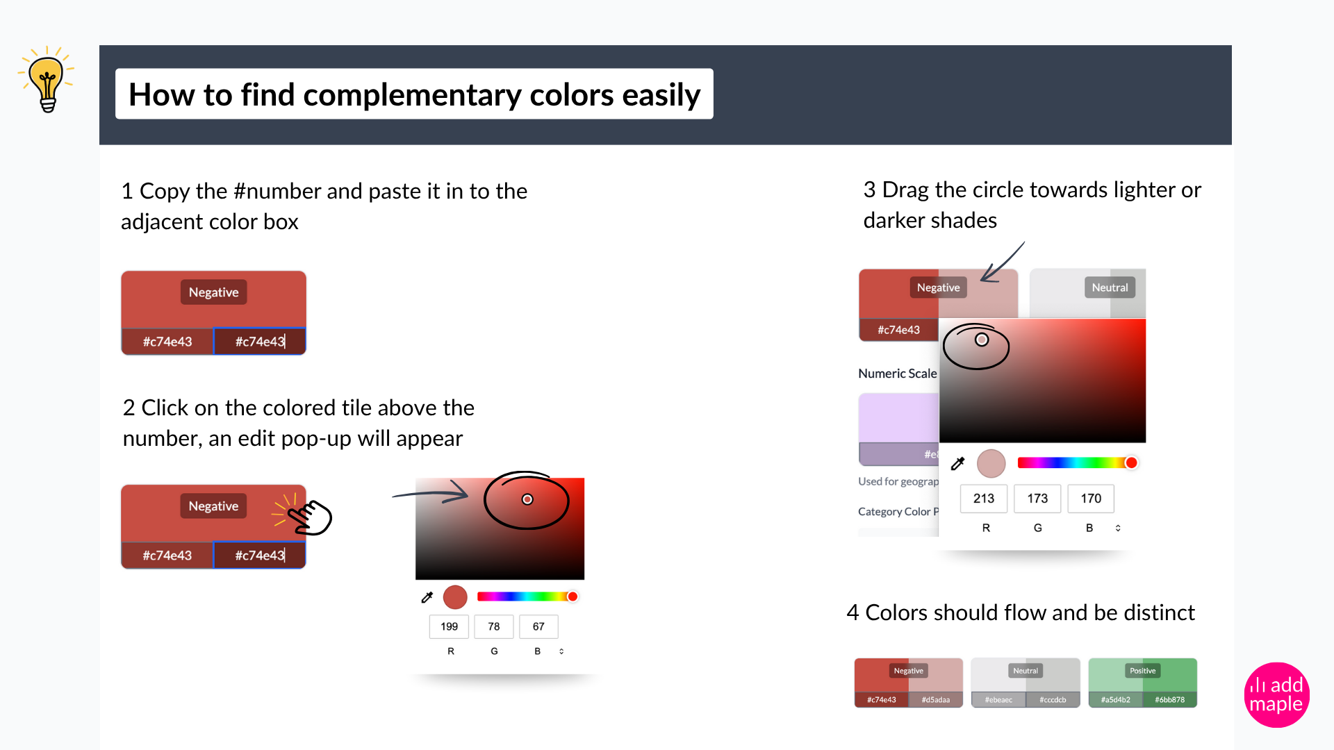
Previews below the editor show how your chosen palette looks, distinguishing how the three configuration settings will be interpreted, Category Colors, Sentiment Colors and Numeric Scale Colors. Once satisfied, click Save on the bottom left of the modal, to apply it.
Quick Summary
- Presets → Fast, built-in palettes tuned for all configuration settings and chart types.
- Custom palette → Full control; need to define brand colors for categories, sentiment, and numeric data.
👉 For chart-specific exceptions, you can override project-level colors in the chart's legend tab. Learn more: Managing individual column colors.