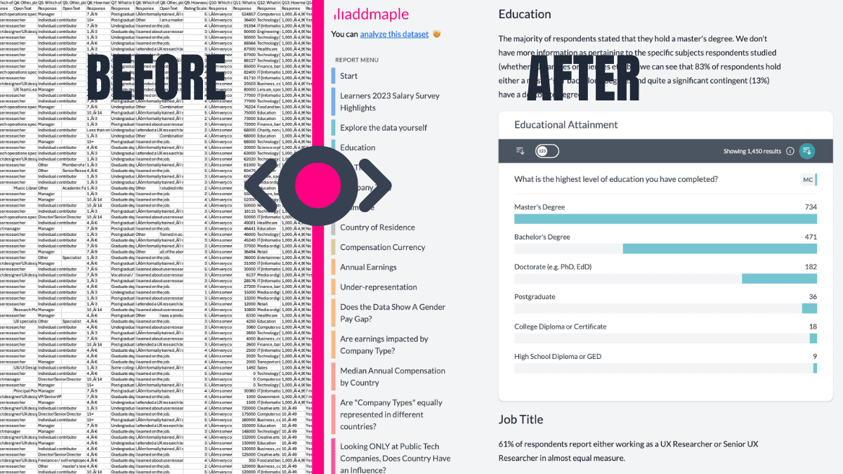
Capability 01
See every form clearly, the moment responses land
Every question is automatically summarised into modern charts and tables - no setup, no exports.


Connect your Typeforms. See all questions as charts and tables the moment responses land. No exports, no preparation.
See how segments differ statistically across opinions, ratings, rankings, and code open ends with AI into themes.
Already have an account? Sign in here

“AddMaple creates instant chart dashboards that let you analyze your survey data visually and is one of the best ways I've found to conduct AI-powered thematic analysis of open-ended results.”

“We have shaved a full month off our project timeline in terms of analysis and visualization of our data. Clients love being able to root around in their data.”

“When I saw that you could do the analysis of open-ended data, it just blew my mind.”
Capability 01
Every question is automatically summarised into modern charts and tables - no setup, no exports.
Capability 02
Compare, and break results down across audiences, campaigns, or answer selections
Capability 03
Choose the visual view that makes differences clear - from distributions to proportions.
Capability 04
Add branding colours, flip between bar, pie, donut, or rose charts to highlight proportions, comparisons, or distributions - without rebuilding a thing!
Capability 05
Go beyond one-filter-at-a-time with flexible logic, ranges, and multi-select filters.
Capability 06
Expand a summary chart, or compare two questions (for example, job title by satisfaction), and get a clear, plain-English explanation of what you're seeing. Explanations are generated by AI on top of AddMaple's calculation engine, so they're grounded in the actual data and results - not guesswork.
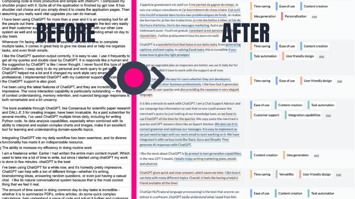
Capability 07
Spot what's consistent, what's changed, where segments differ and more.
Capability 08
Move straight from exploration to a clean, shareable dashboard your team can explore themselves.