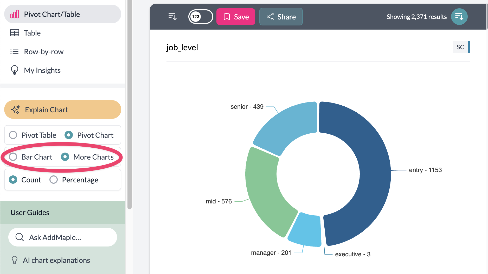
Additional Charts
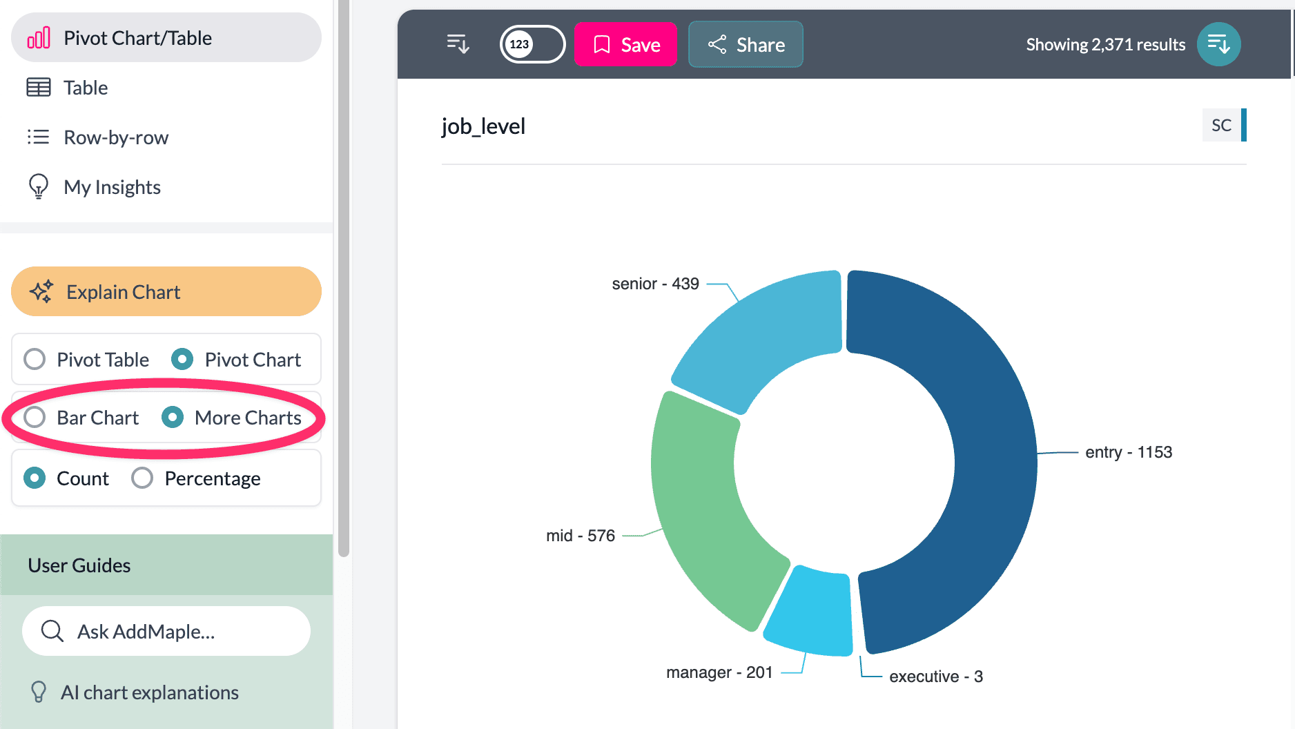
When viewing a single column, you can open more chart types via More Charts on the left. See why AddMaple uses horizontal bar charts for default behavior.
Accessing Additional Charts
- Select a single column — Only one column in the pivot.
- Click "More Charts" — On the left side of the screen.
- Choose your chart type — Pie, donut, rose, vertical bar, bubble, or map (when geographic data is detected).
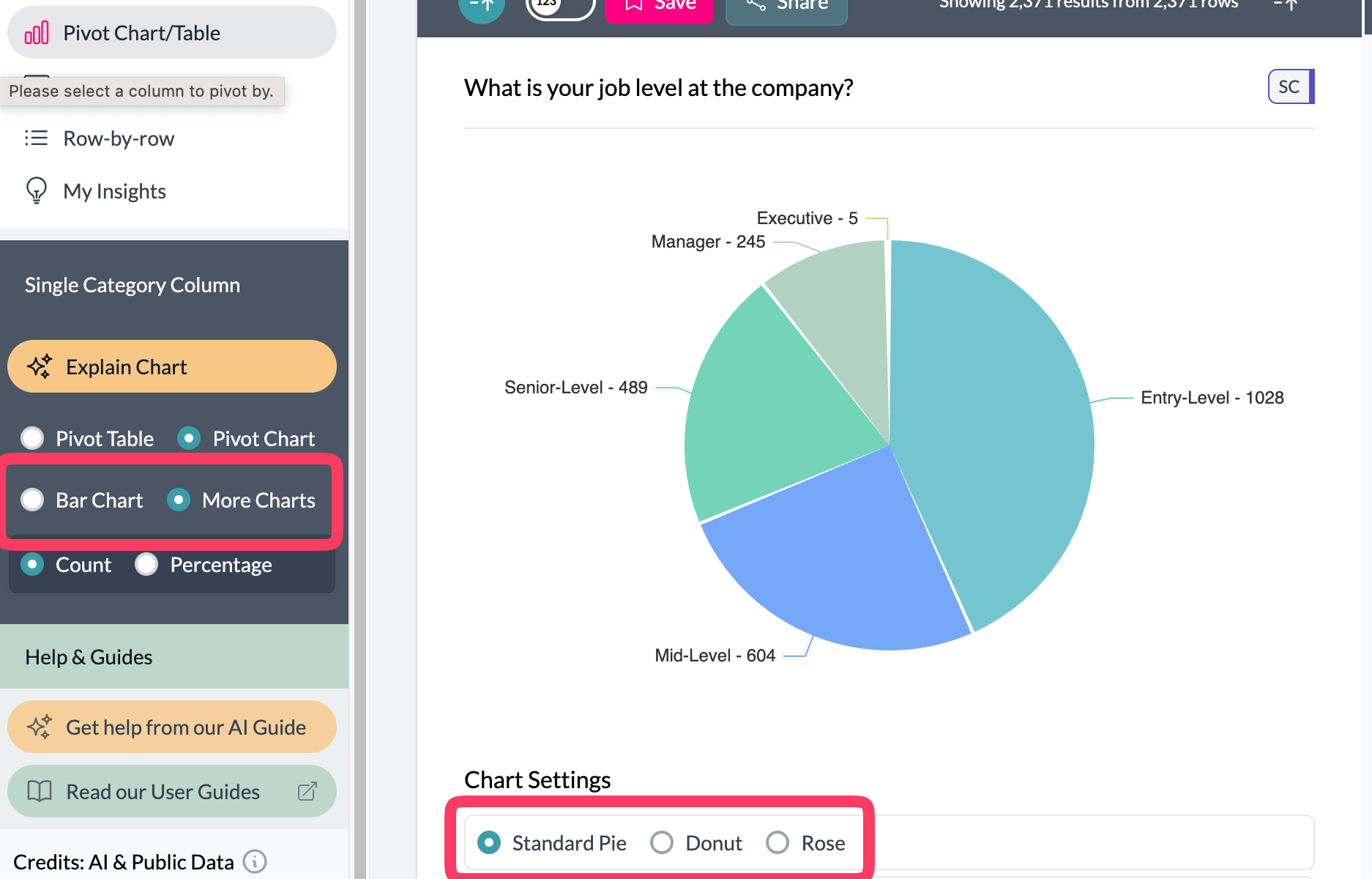
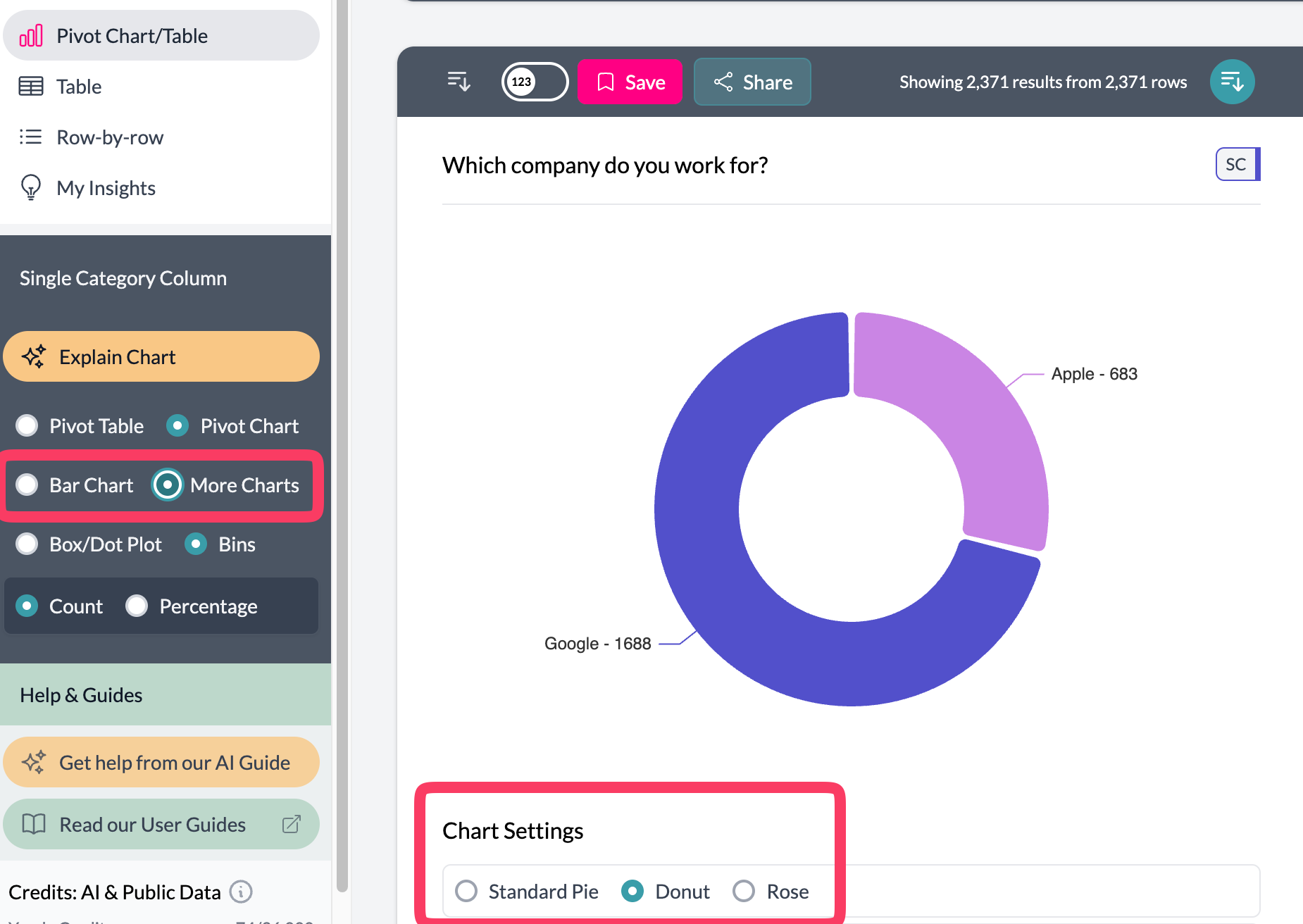
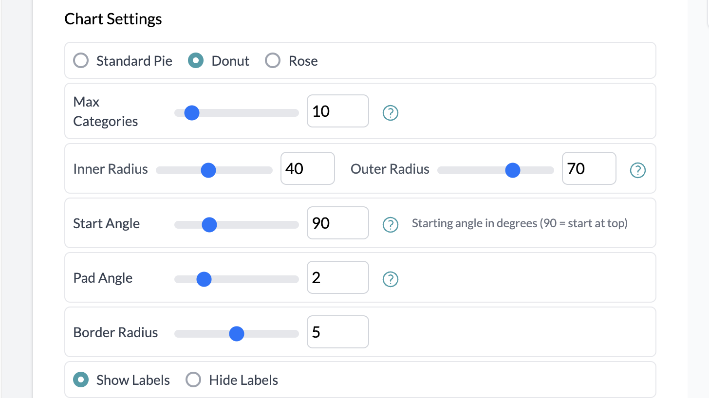
Pie, Donut, and Rose
For proportions: Pie, Donut, Rose. Best with categorical data; small categories merge into "Other."
Word cloud is also available from More Charts when applicable; it shows frequent terms from text data.

Aggregation
Use aggregation with these charts: set Total, Average, Median, or Count Unique via "Number of," pick the column, then choose the chart type from More Charts. Example: median salary by department (pie), or total sales by country (map).
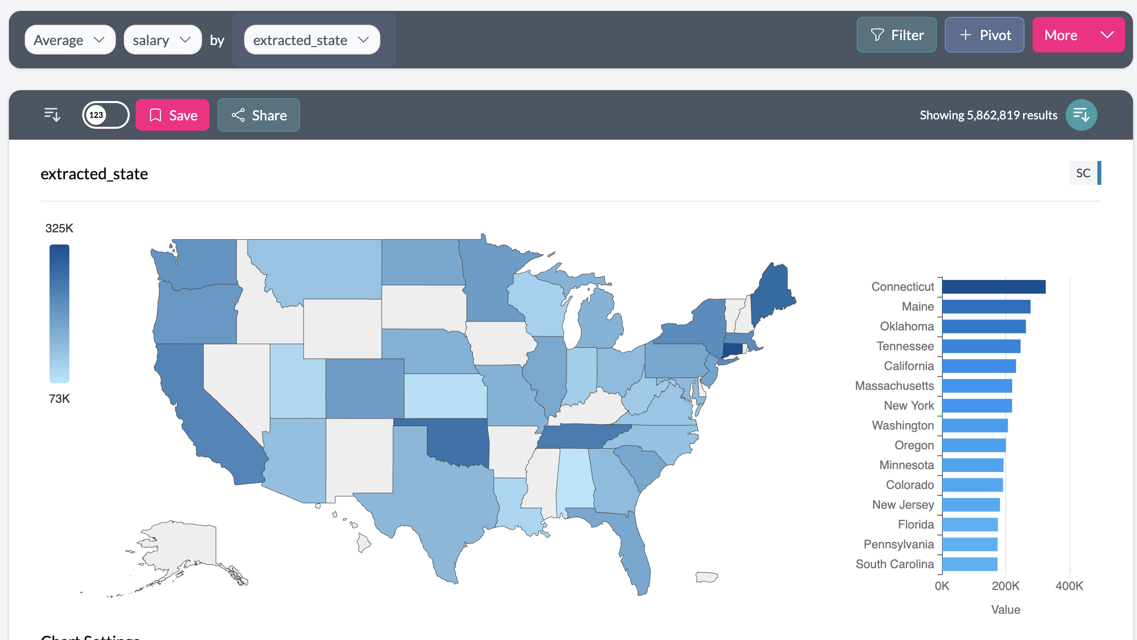
Geographic Maps
When AddMaple detects geographic data (countries, states, provinces), a map option appears. It detects scope, shows data on the right region, and includes a bar chart of top locations with your project colors.
Key points
- Additional charts (pie, donut, rose, vertical bar, bubble, word cloud, map) require a single column; open via More Charts.
- Use aggregation to show totals, averages, or medians by category on these charts.
- Maps appear when geographic data is detected; all charts use project color settings.