Dot Charts
Dot charts (bubble charts) show numeric data as points on a scale so you can see distributions, compare categories, and spot outliers. AddMaple supports several variants: count or percentage-based, and column or sample percentage.
When to Use Dot Charts
- Numeric exploration — See spread and distribution of numeric values
- Comparative analysis — Compare values across categories or groups
- Statistical insights — Identify patterns, outliers, and trends; hover for details
How to Get a Dot Chart
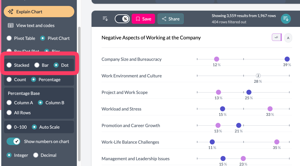
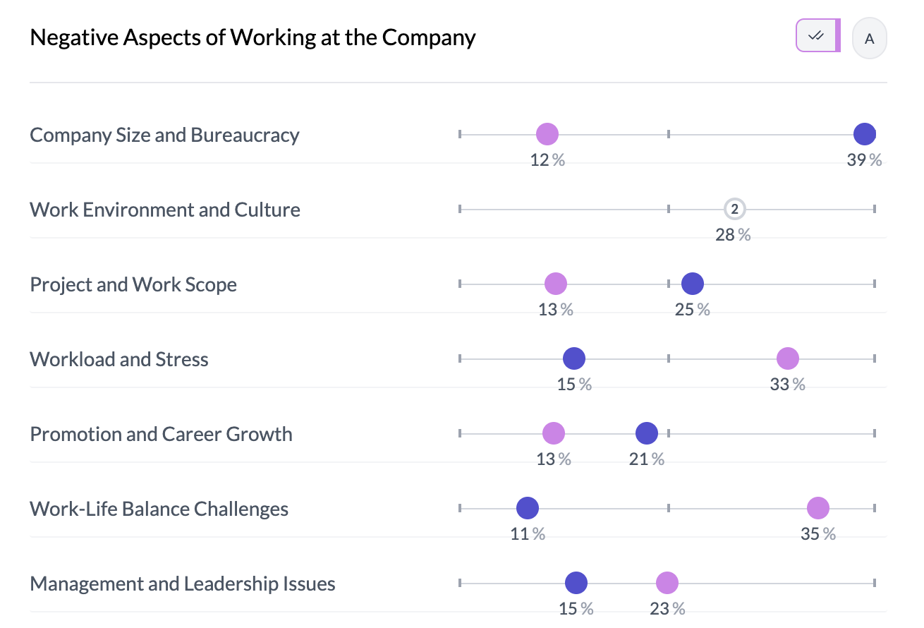
Two-column pivot (category vs category or category vs numeric): Select Percentage in the left controls, then Dot in the Stacked | Bar | Dot control. The bubble scale control (0–100 | Auto Scale) appears when in Percentage + Dot mode with two pivots.
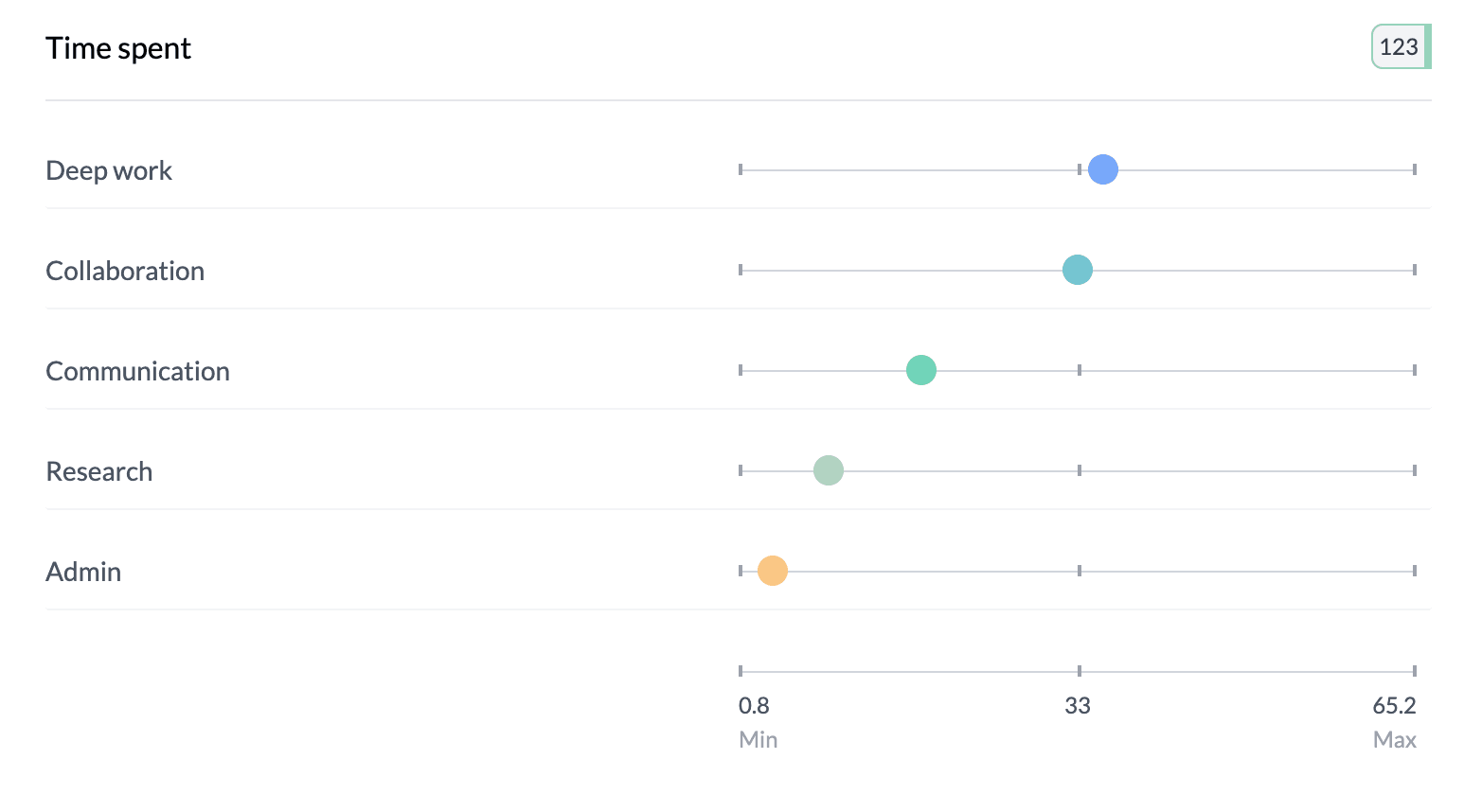
Grouped numeric columns: Use Box Plot | Mean on the left; choose Mean for a dot chart of means. Grouped pivot (opinion scale): Enable group pivot, choose Mean or Median, then switch to dot view—no bubble scale. Single numeric column: Key Stats → Box Plot | Mean → choose Mean.
Bubble Scale
- Fixed (0–100) — Dots on a fixed 0–100 scale; best for comparing multiple charts.
- Auto scale — Scale fits your data; best for exploring one chart in detail.
Switch via "0–100 | Auto Scale" in the left sidebar when the control is visible.
NPS (0–10): If the column is detected as NPS, the scale uses -100 to 100 (fixed) or the observed range (auto); no % on the scale; legend hidden.
The bubble scale control appears only when you're in Dot mode, Percentage (or Proportional), and have two pivots; it is hidden for single-pivot, count mode, and grouped pivot dot charts.
Tips
- Scale not visible? Confirm Dot + Percentage and two columns in the pivot.
- Use fixed scale to compare several dot charts; use auto scale to see full distribution in one chart.
Key points
- Dot charts: two-column pivot (percentage + dot), grouped numeric (Mean), grouped pivot (opinion scale), or single numeric (Key Stats → Mean).
- Bubble scale: fixed 0–100 for comparison; auto for data-driven range. Only in percentage + dot mode with two pivots.
- NPS uses -100 to 100 or data range; no bubble scale for grouped pivot dots.