Time Charts
Time charts show how data changes over time. AddMaple offers column and line views so you can spot trends and seasonal patterns.
When to Use Time Charts
- Trend analysis — See how values change across time periods
- Seasonal patterns — Identify recurring patterns or cycles
- Comparative time series — Compare trends across categories (e.g. product, region, sentiment)
- Period-over-period — Understand growth or decline over specific timeframes
Creating a Time Chart
- Select a date column — Use it as your primary pivot.
- Optional: Add a category — Add a second column to compare multiple series (e.g. sentiment, product type).
- View your chart — AddMaple generates a time chart. Single date = one series; date + category = multi-series.
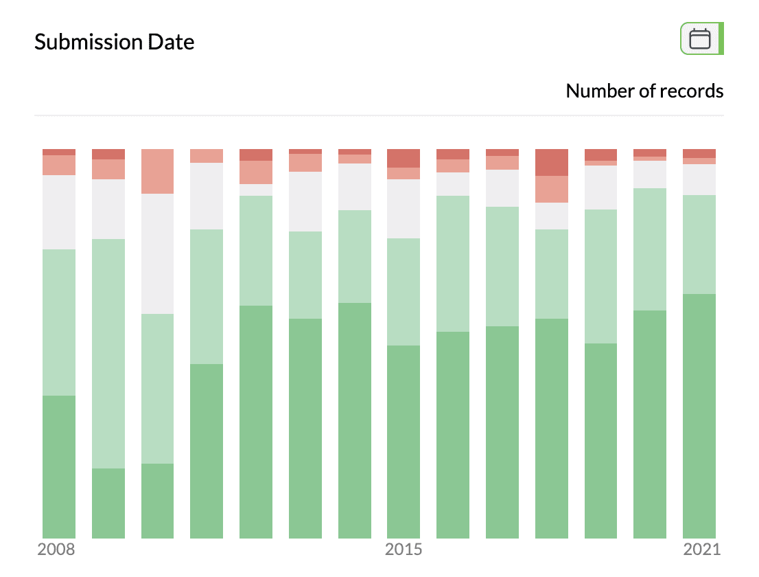
1Time chart with stacked columns
Chart View Modes
Column view (default) — Vertical bars, one per time period. Best for comparing magnitudes and reports.
Line view — Connected lines tracing trends. Best for seeing direction of change and reducing clutter with many periods.
To switch: Use the view toggle in the chart controls (top right); choose "Columns" or "Line".
Controls and Options
- Aggregation — Click "Number of records" in the sentence bar to show Total, Average, Median, or Count Unique for a numeric (or categorical) column instead of counts.
- Count vs Percentage — With multiple categories, select "Percentage" to see each category as a share of the total per time period.
- Sort — By time (default) or by value; ascending or descending.
- Filter — By date range or category to focus on specific periods or series.
Hover for exact values; in column view, click a bar to filter to that time period.
Tips
- Use line view when you have many time periods or multiple series.
- Use standard date formats (e.g. YYYY-MM-DD) and consistent dates in the column.
- Too many periods? Filter the date range or switch to line view.
Key points
- Time charts need a date column; add a category column for multi-series.
- Toggle between column view (value comparison) and line view (trends).
- Aggregation, percentage, sort, and filter work as in other pivots.
- Hover for details; click bars to filter.