Two Column Line / Trend Chart
A two column line/trend chart shows how a value changes over time or across an ordered dimension. One column (usually date or an ordered category) is on the x-axis; the other is the measure (count or aggregated value). You can display it as columns (vertical bars) or lines (connected points); both use the same data and controls.
When to use it
- Date + value — e.g. count or total by day, week, month, quarter, year.
- Date + category — Multiple series over time (e.g. sentiment by month, product by quarter); one line or set of bars per category.
- Ordered category + value — Any ordered dimension (e.g. age band, satisfaction level) on the x-axis.
How to create it
- Add two columns — First: date column or ordered category. Second (optional): category for multiple series, or rely on count/aggregation.
- View the chart — With a date column as the first pivot, AddMaple typically shows a time chart with column or line view.
- Switch view — Use the chart control (e.g. Columns | Line) to choose:
- Columns — Vertical bars per period; good for exact values and comparisons.
- Line — Connected points; good for trends and many time periods.
1Line view example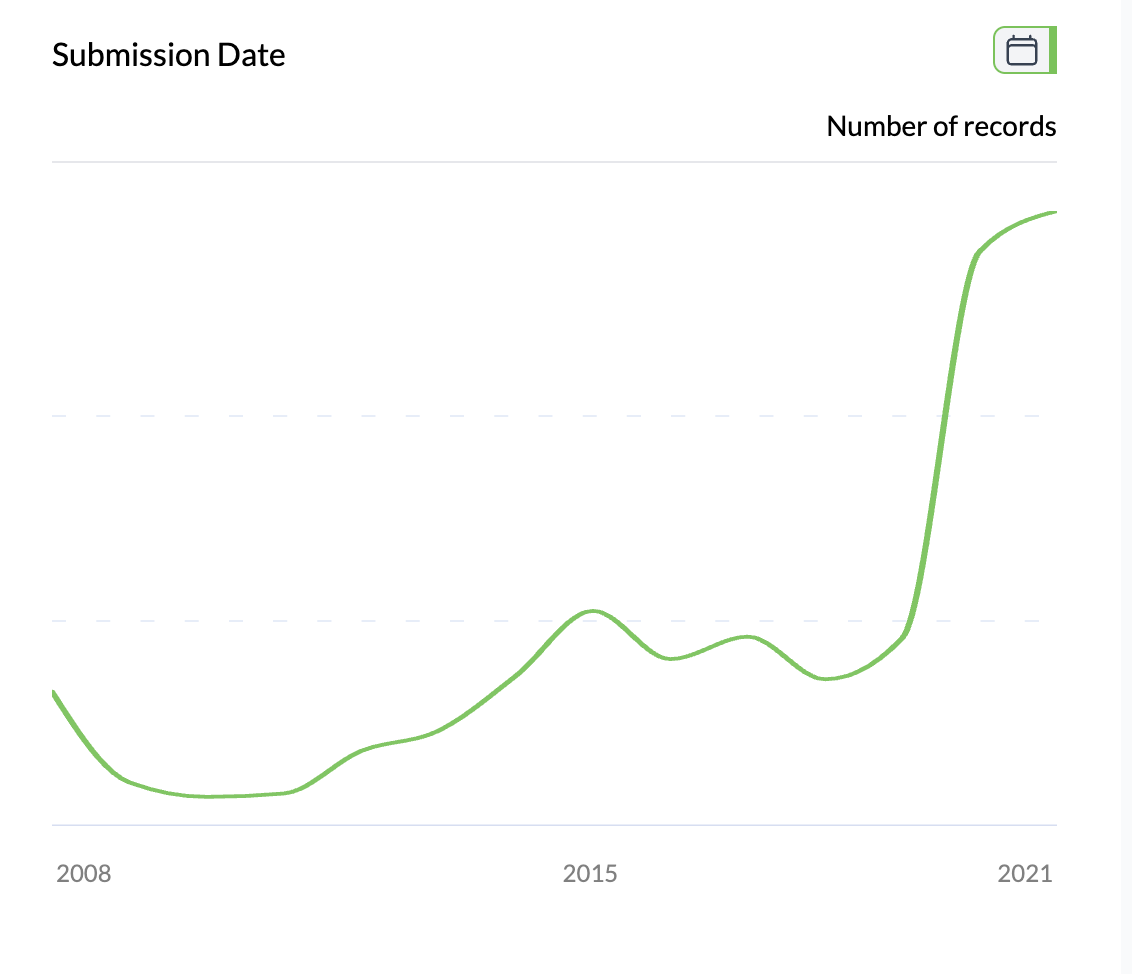
What you see
- X-axis — Time periods or ordered categories (formatted by date granularity if applicable).
- Y-axis — Count or aggregated value (Total, Average, Median, Count Unique).
- Single or multiple series — One line/bar set for a single measure; multiple series if you added a category column.
- Hover — Value, period, and (if applicable) category.
Aggregation is set via Number of; see time charts for full detail.
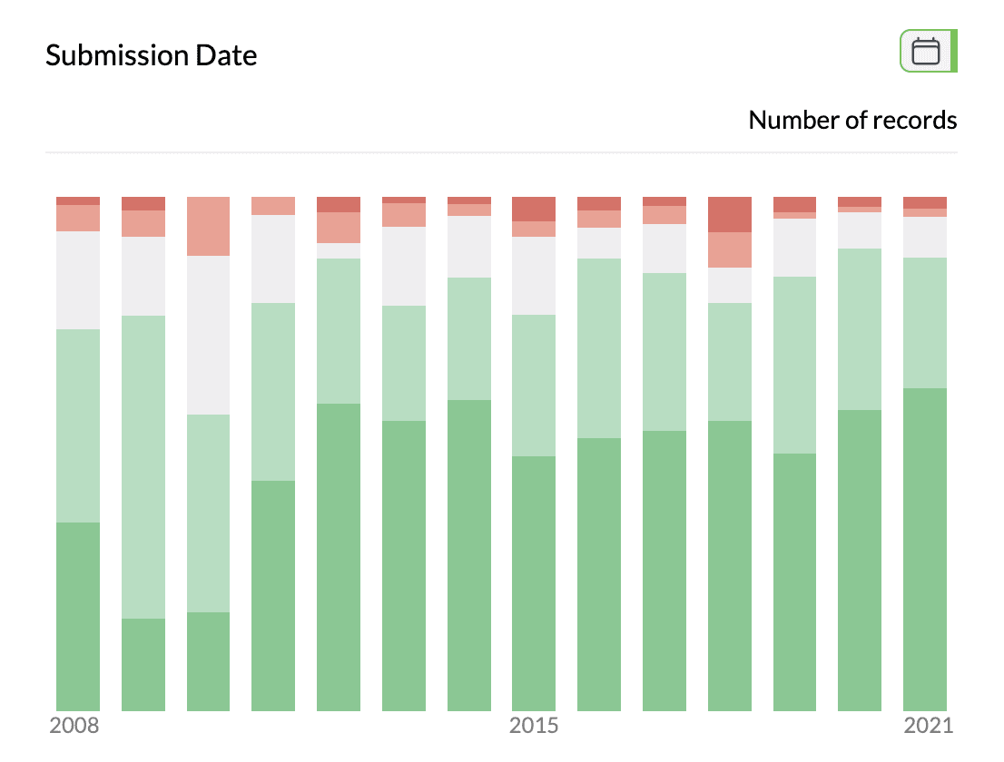
2Two column line / trend chart
Key points
- First column = time or order; second = category (optional). Display as columns or lines.
- Use Columns for value comparison, Line for trend; aggregation set via Number of.
- Same controls as time charts: aggregation, percentage, sort, filter.