Single Column Vertical Bar Chart

A single column vertical bar chart shows one categorical column as vertical bars: each category is one bar, and height represents count (or an aggregated value). It’s an alternative to the default single column horizontal bar when you prefer a vertical layout (e.g. time periods, short labels, or dashboard layout).
When to use it
- One categorical column — Same data as horizontal bars, different orientation.
- Short labels or time — Categories like months, quarters, or short names fit well on the x-axis.
- Dashboard or report layout — When vertical bars fit better in a grid or next to other charts.
How to create it
- Select a single categorical column — Only one column in the pivot (e.g. month, product name, region code).
- Access More Charts — When viewing a single column, use More Charts on the left.
- Choose vertical bar — Select the vertical bar chart option. The same data is shown with bars growing upward.
If vertical bar is the default for date/time columns in your setup, you may see vertical bars as soon as you select a single date column; otherwise use More Charts.
What you see
1Single column vertical bar chart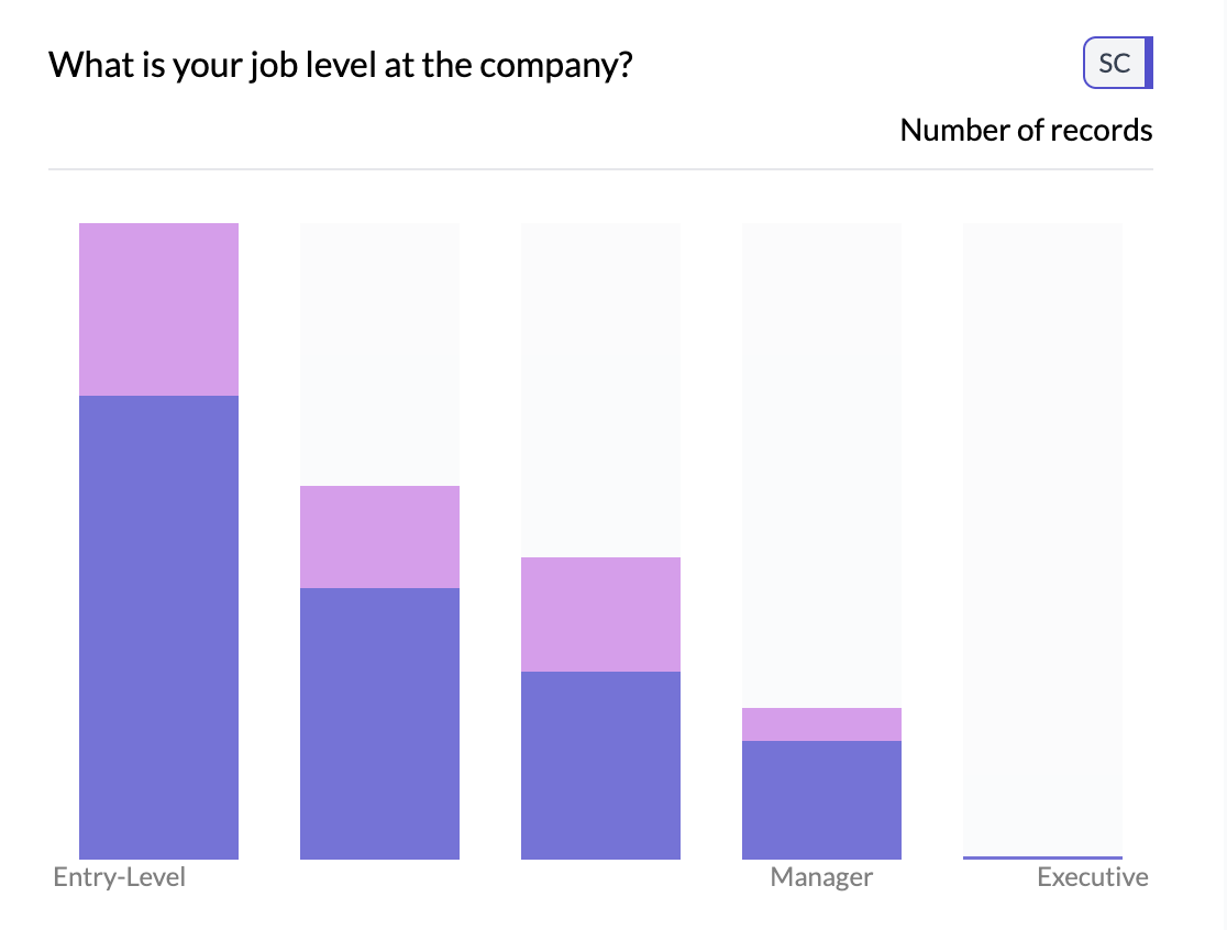
- Vertical bars — One bar per category; height = count or aggregated value.
- X-axis — Category labels (may be truncated for long names).
- Y-axis — Scale for count or aggregated value.
- Colors — One color per bar or single color, depending on chart settings.
Tips
- Prefer horizontal bars when category names are long or there are many categories; they stay readable.
- For time data with a second dimension, see two column line/trend chart for column or line view over time.
Key points
- One categorical column as vertical bars; access via More Charts when viewing a single column.
- Best for short labels or time; use horizontal bars for long labels and many categories.
- Height = count or aggregated value; same aggregation options as horizontal bars.