Single Column Rose Chart

A rose chart shows one categorical column as proportions in a radial layout: each category is a segment, but radius (not angle) represents value. That makes relative sizes easier to compare than in a standard pie chart. It's available when you're viewing a single column via More Charts.
When to use it
- One categorical column — Same data as a single horizontal bar or pie chart, shown as proportions.
- Part-of-whole — When you want to emphasize share of total (e.g. market share, response mix).
- Easier size comparison — Radius represents value, so larger values have larger "slices" and are easier to compare than angle-based pie segments.
How to create it
- Select a single categorical column — Only one column in the pivot.
- Open More Charts — On the left, click More Charts.
- Choose Rose — Select Rose. The chart updates to show segments by count or percentage; radius reflects value.
Small categories may be merged into "Other" to keep the chart readable; you can adjust Max categories to collapse long tail in settings.
1Choose rose from More Charts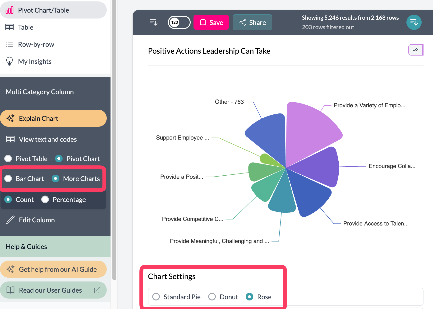 2Adjust max categories for rose chart
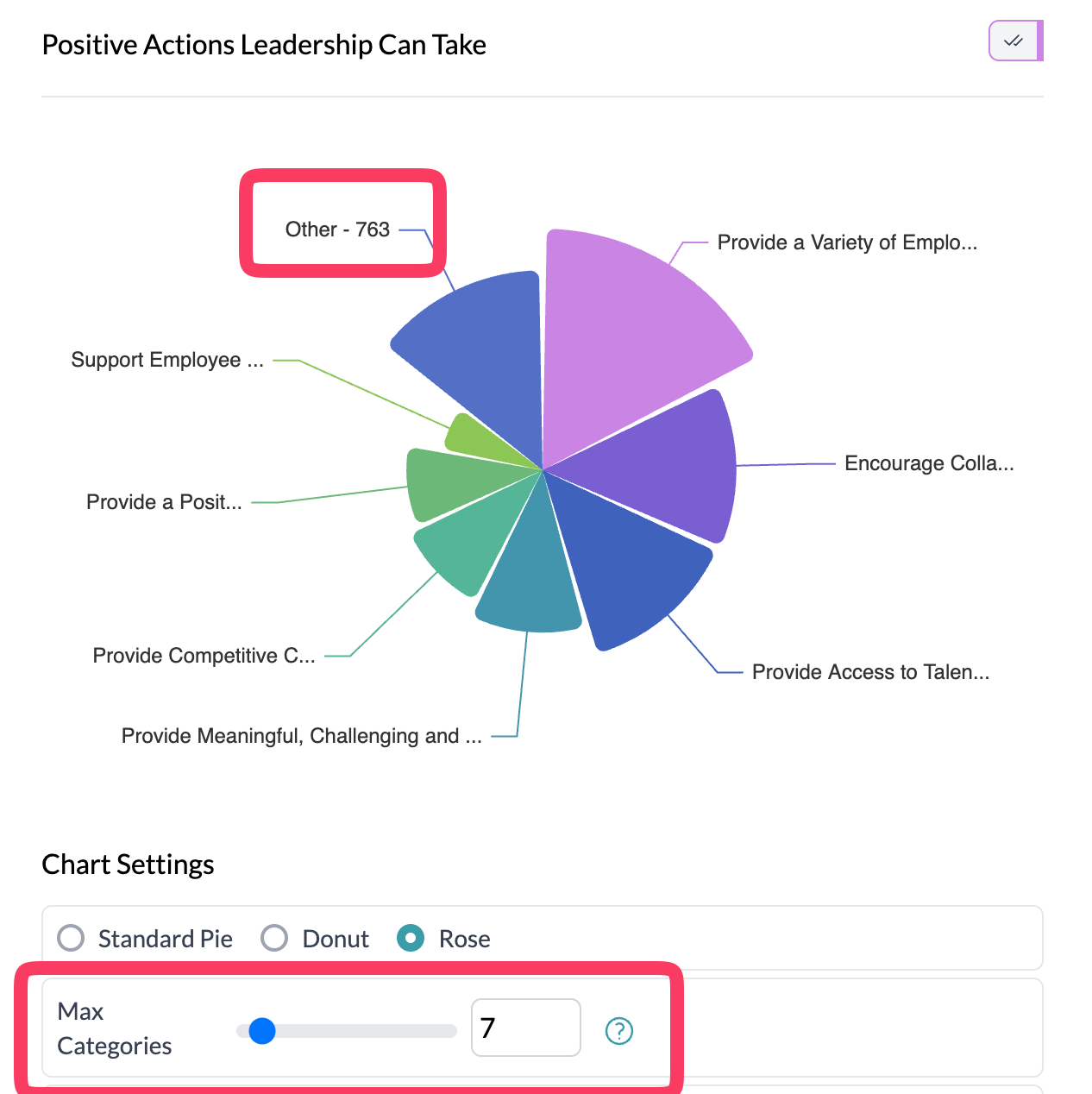
3Rose chart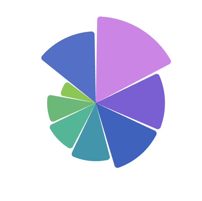
What you see
- Rose — Segments arranged radially; radius (not angle) represents value, so larger values have larger segments.
- Legend — Category labels and colors; project colors apply.
Use aggregation to show Total, Average, or Median by category. See pie, donut, additional charts.
Key points
- One categorical column; access via More Charts → Rose.
- Rose uses radius for value, making relative sizes easier to compare than pie/donut.
- Works with aggregation (Total, Average, etc.) for aggregated proportions.