Likert Chart

Likert charts in AddMaple are built for opinion scale data: they show response options (e.g. Strongly agree … Strongly disagree, or 1–5) in a scale layout. AddMaple supports two main ways to build them: group of opinion columns (several scale questions together) or opinion column vs category column (one scale broken down by a category like region or segment).
When to use it
- Opinion scale columns — Columns detected as Opinion Scale or grouped Likert (numeric or text scales).
- Comparing scale questions — Same response scale across multiple questions (group of opinion columns).
- Scale by category — One scale question broken down by segment, region, or other category (opinion vs category).
Two ways to create a Likert chart
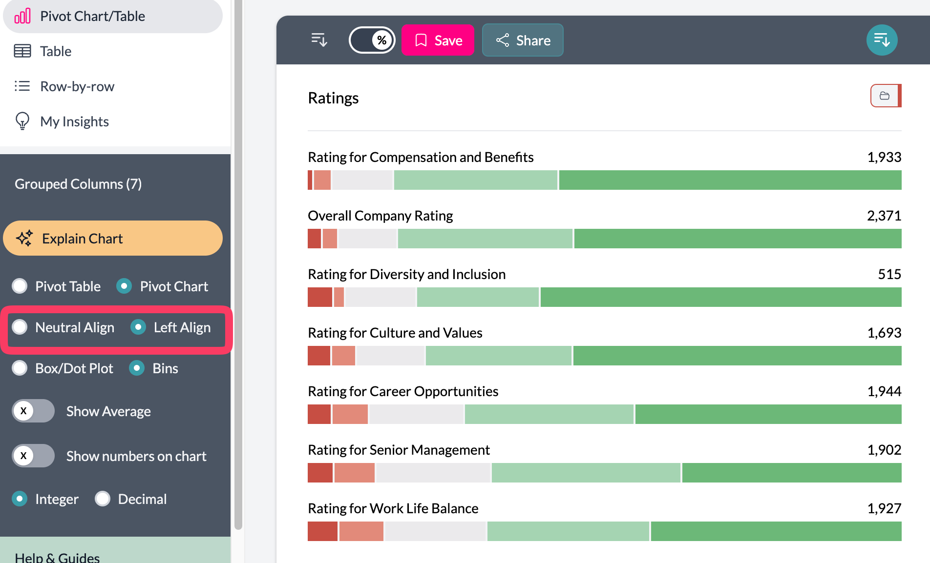
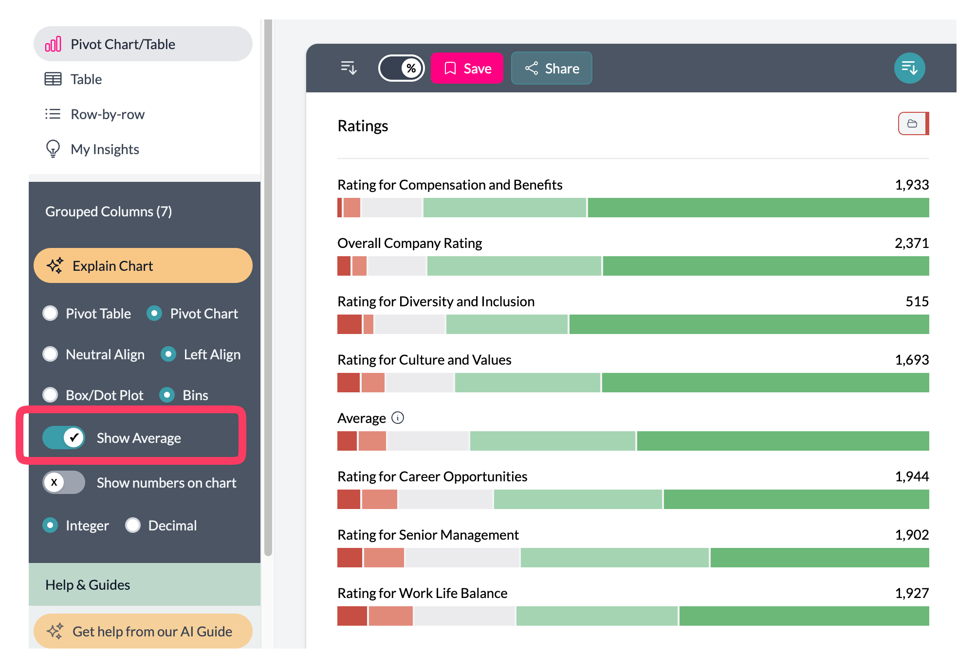
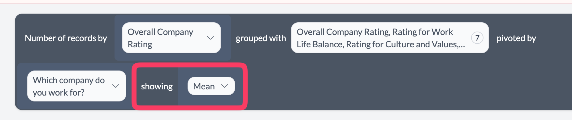
1. Group of opinion columns
Use this when you have several questions that share the same response scale and you want to compare them side by side.
- Group the columns — In the sentence builder, use Group Columns to select the opinion scale columns that share the same categories.
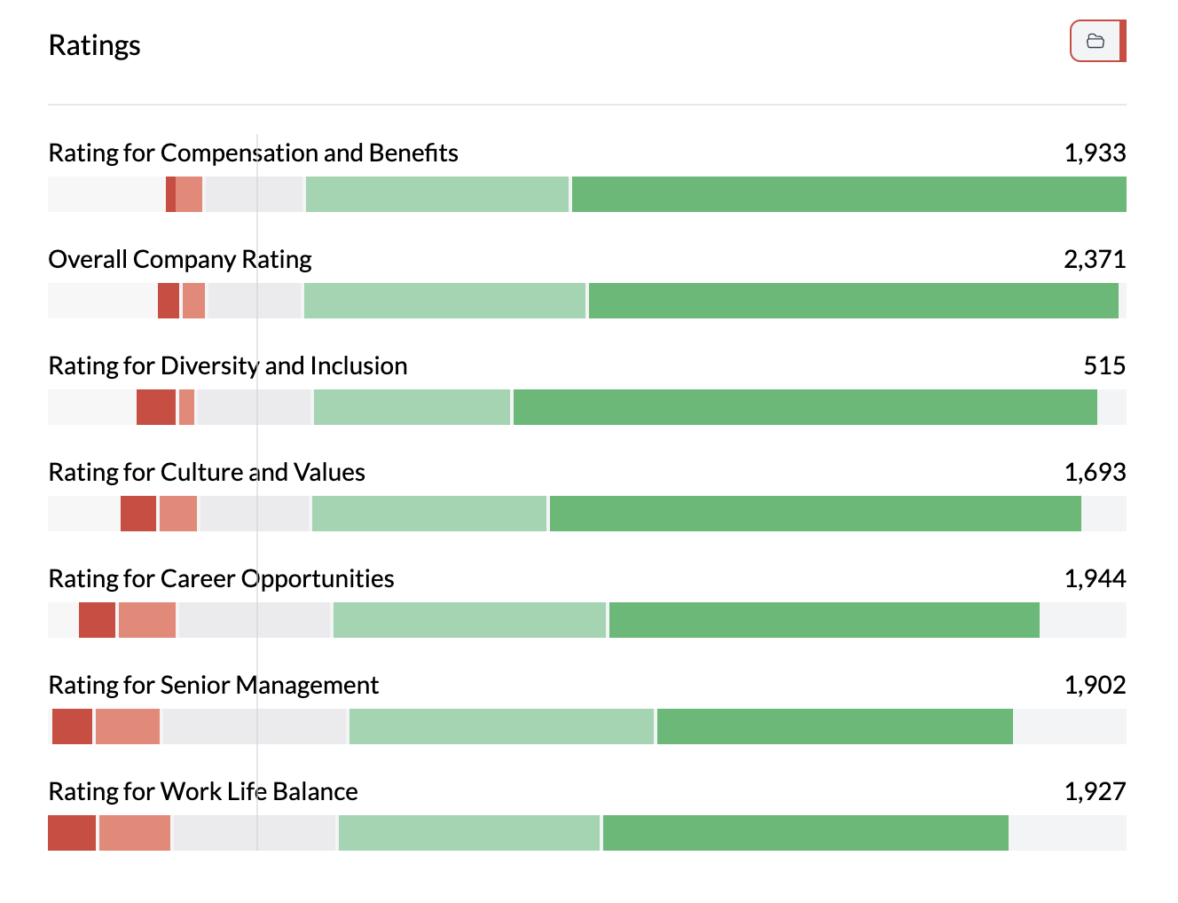
- View the chart — AddMaple shows one grouped bar (or stacked bar) per question, with segments for each response option. Response options are aligned across questions.
- Optional: swap rows and columns — Use Swap Columns and Rows on the left to put questions on the vertical axis and response scale on the horizontal, or vice versa, depending on what’s easier to read.
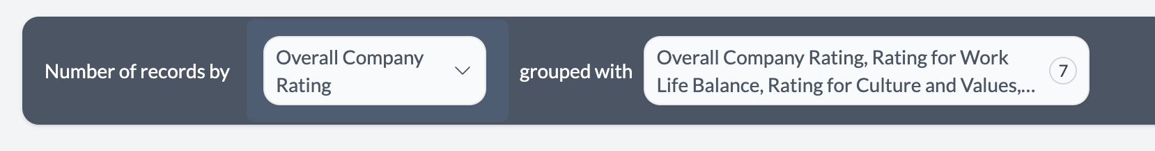
Categories must overlap for grouping; AddMaple will only offer columns with compatible response options.
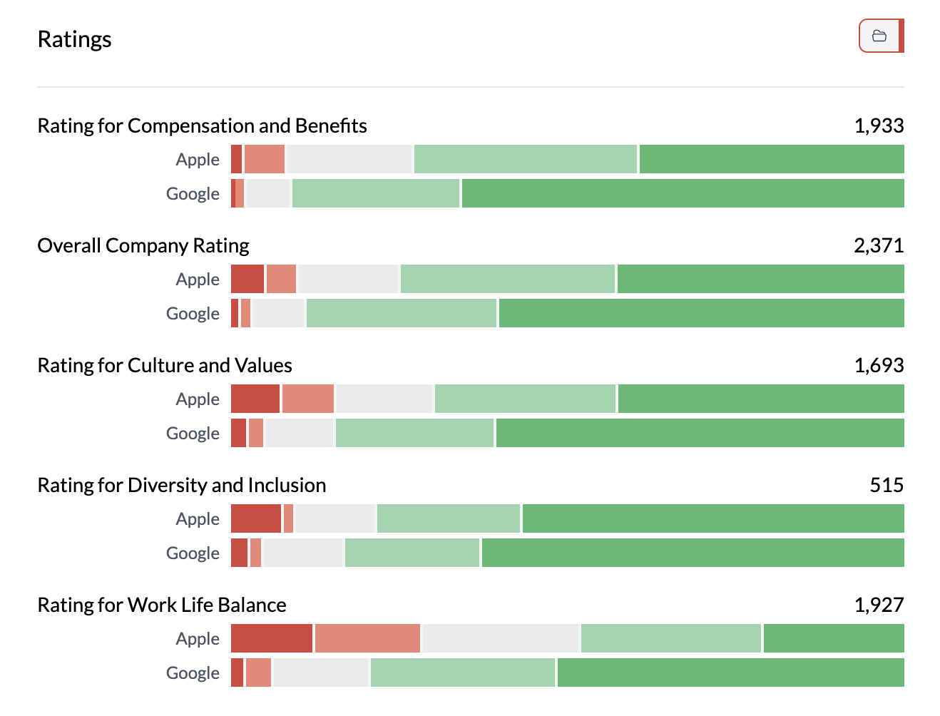
2. Opinion column vs category column
Use this when you have one opinion scale question and want to see how responses differ by a category (e.g. region, age group, product).
- Add two columns — First column: your opinion scale. Second column: your category (e.g. region, segment).
- Choose layout — Rows can be the scale or the category; use Swap Columns and Rows to get the clearest view (e.g. categories as rows, scale as stacked segments).
- Stacked or grouped — Use Stacked | Bar | Dot to get stacked bars (composition) or grouped bars (comparison). Percentage is often useful so each bar sums to 100%.
What you see
- Aligned scale — Response options appear in a consistent order (e.g. Strongly disagree → Strongly agree).
- Colors — One color per response option; project colors apply.
- Counts or percentages — Raw counts or percentage within row/group, depending on Count | Percentage | Proportional.
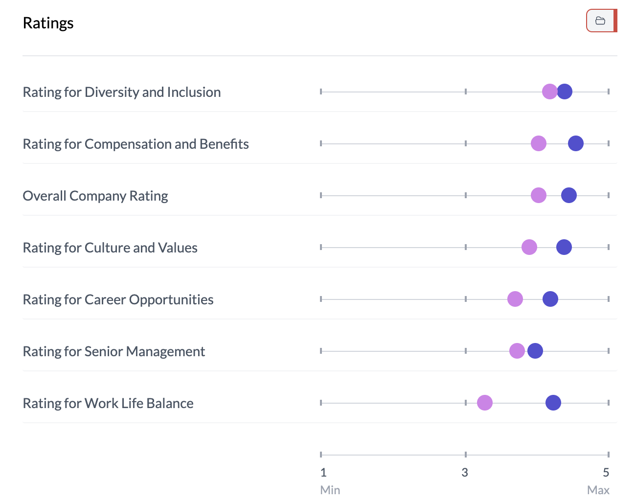
Other views: You can pivot a grouped Likert by a categorical column (mean by category) or show it pivoted by category; the chart updates to show those variants.

See grouping columns, Likert data types, two column horizontal stacked bar.
Key points
- Two patterns: (1) group of opinion columns, or (2) opinion column vs category column.
- Use Group Columns for multiple scale questions with the same response options.
- Use Stacked | Bar and Percentage to show composition; swap rows/columns for readability.