Grouped Box Plot
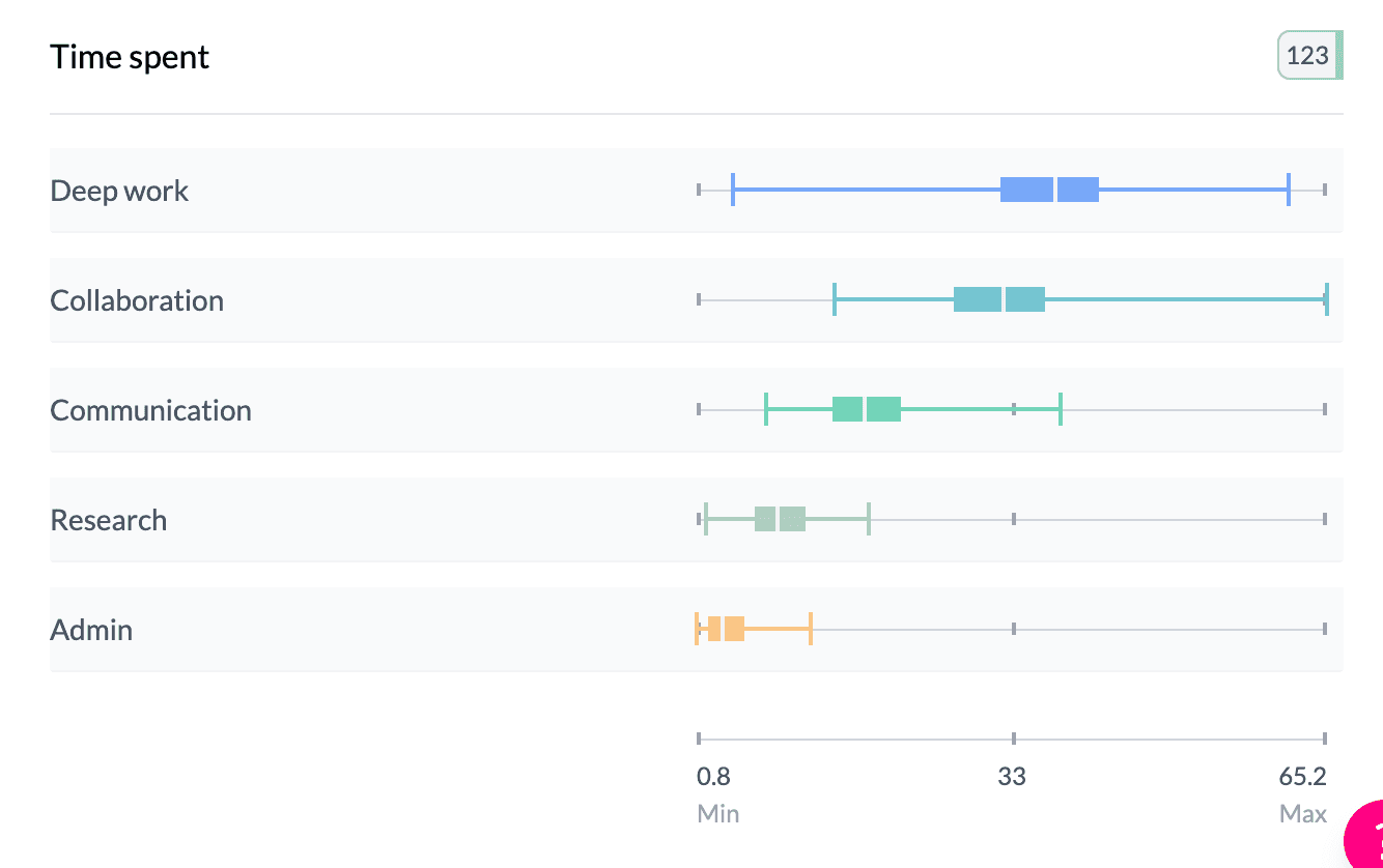
A grouped box plot shows several box plots side by side so you can compare the distribution of a numeric variable across categories (e.g. age by region) or across several numeric columns (e.g. Q1, Q2, Q3 scores).
When to use it
- Categorical vs numeric — One category column (e.g. region, segment) and one numeric column; one box per category.
- Grouped numeric columns — Several numeric columns in the pivot; one box per column.
- Comparing distributions — Medians, spread, and outliers across groups at a glance.
How to create it
Categorical vs numeric
- Add two columns — First: categorical (rows). Second: numeric (values).
- Key Stats — Set Key Stats | Ranges to Key Stats.
- Box Plot — In Box Plot | Mean, choose Box Plot. You get one box per row category.
1Find numeric column and select box plot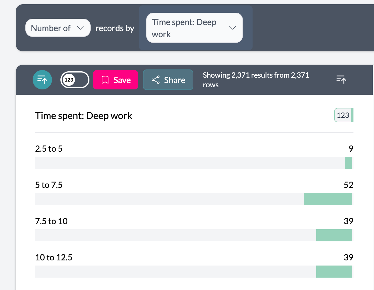 2Select box plot from More menu
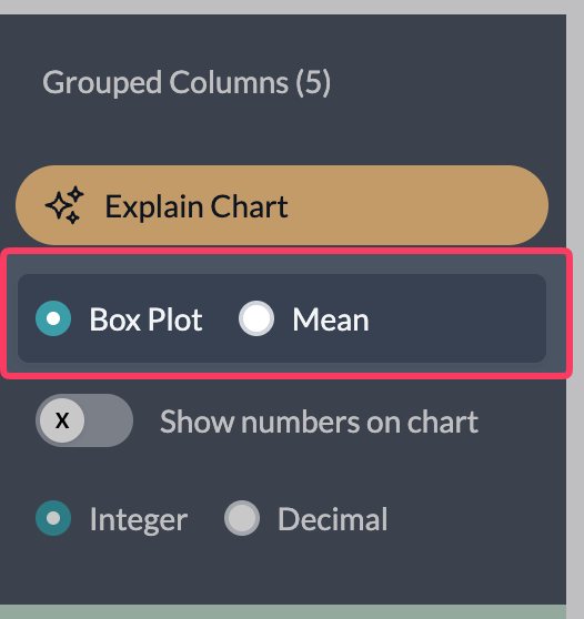
Grouped numeric columns
- Add multiple numeric columns — Use the sentence builder to pivot by several numeric columns (e.g. “Score Q1”, “Score Q2”, “Score Q3”).
- Box Plot — Box Plot | Mean is available directly on the left; keep Box Plot selected. One box per numeric column.
3More menu – Group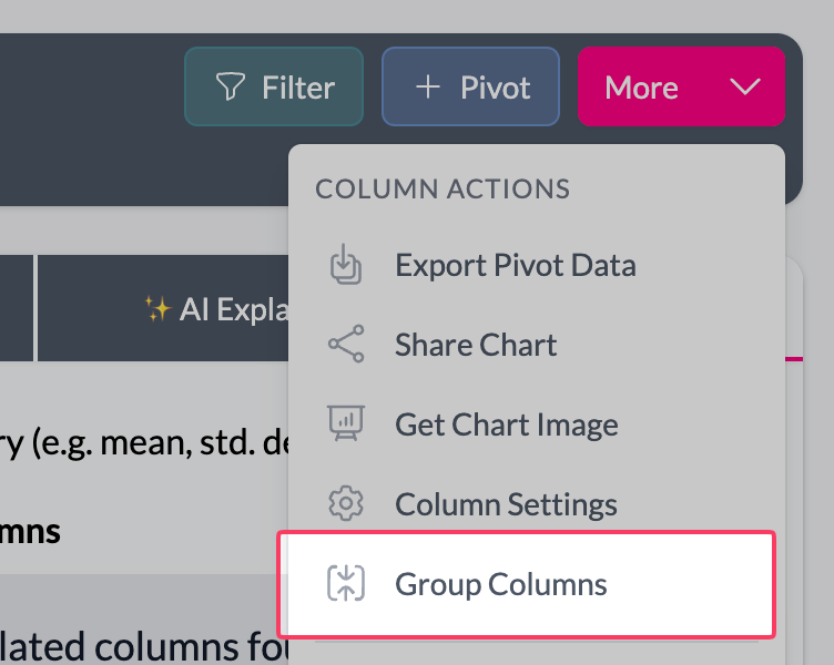 4Select other numeric columns
 5Grouped box plot result
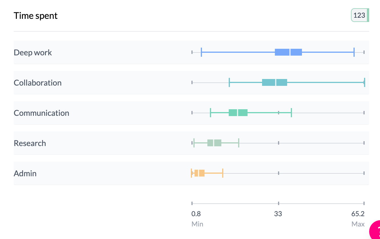
What you see
- One box per group — Each box has the same elements as a single box plot: IQR box, median line, whiskers, end caps.
- Same scale — All boxes share the same horizontal scale for direct comparison.
- Sorting — Sort by label or by median/value to order groups.
- Hover — Same detailed stats (mean, median, quartiles, count) per box.
For full detail on components and controls, see Box plots and mean dot plots.
See single box plot, box plots and mean dot plots.
Key points
- Compare numeric distributions: use category vs numeric or multiple numeric columns.
- One box per group; same scale for all; sort by median or label.
- Switch to Mean for mean dot plots instead of full distribution.