Box Plots and Mean Dot Plots
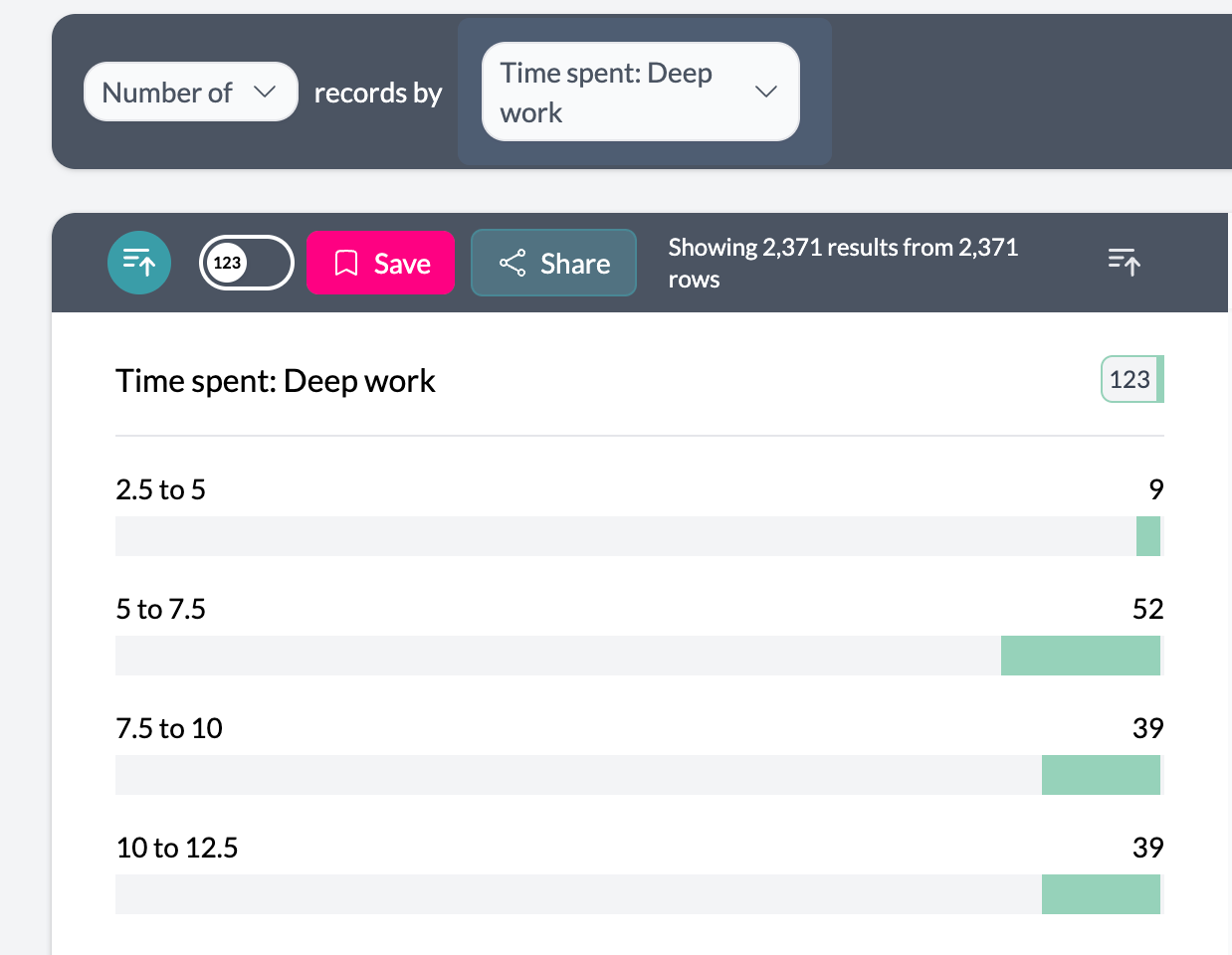
Box plots show full distributions (quartiles, median, whiskers, outliers); mean dot plots show average values per group. Use them for single numeric columns, grouped numeric columns, or categorical vs numeric.
When to Use
- Single numeric column — One variable’s distribution
- Grouped numeric columns — Compare several numeric variables (e.g. Q1, Q2, Q3 scores)
- Categorical vs numeric — Compare distributions across categories (e.g. age by region)
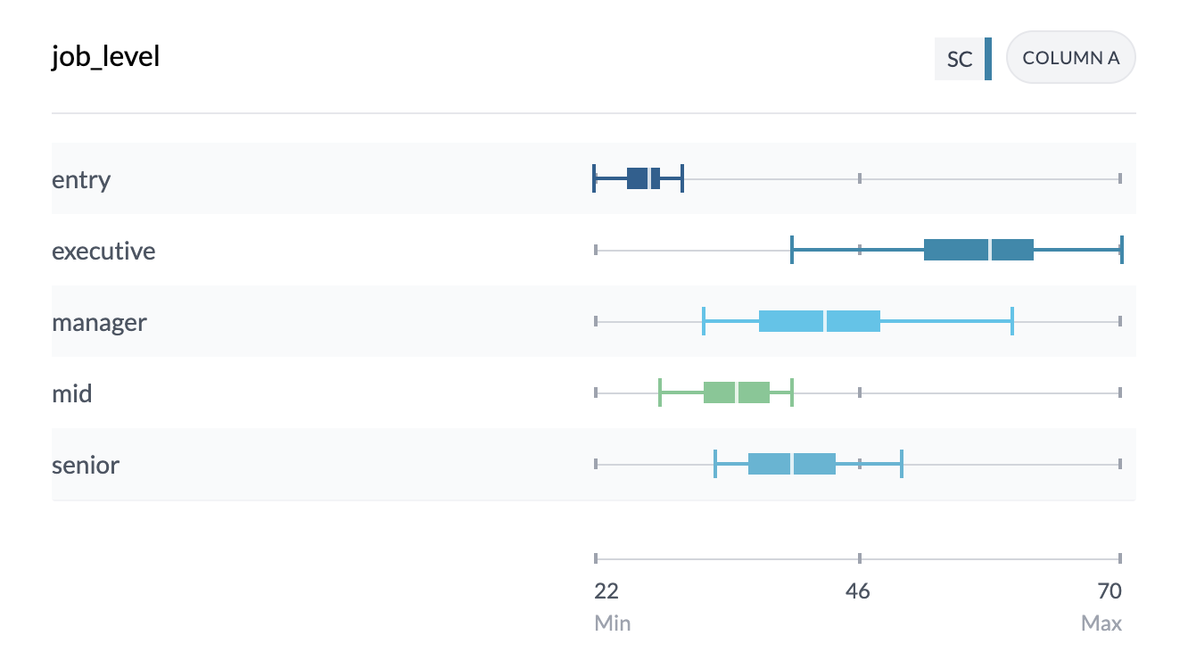
Box Plot Components
- Box — Interquartile range (Q1–Q3), middle 50% of data
- Median line — White line inside the box
- Whiskers and end caps — Min and max values
Hover for detailed stats: mean, median, min/max, Q1/Q3, standard deviation, count.
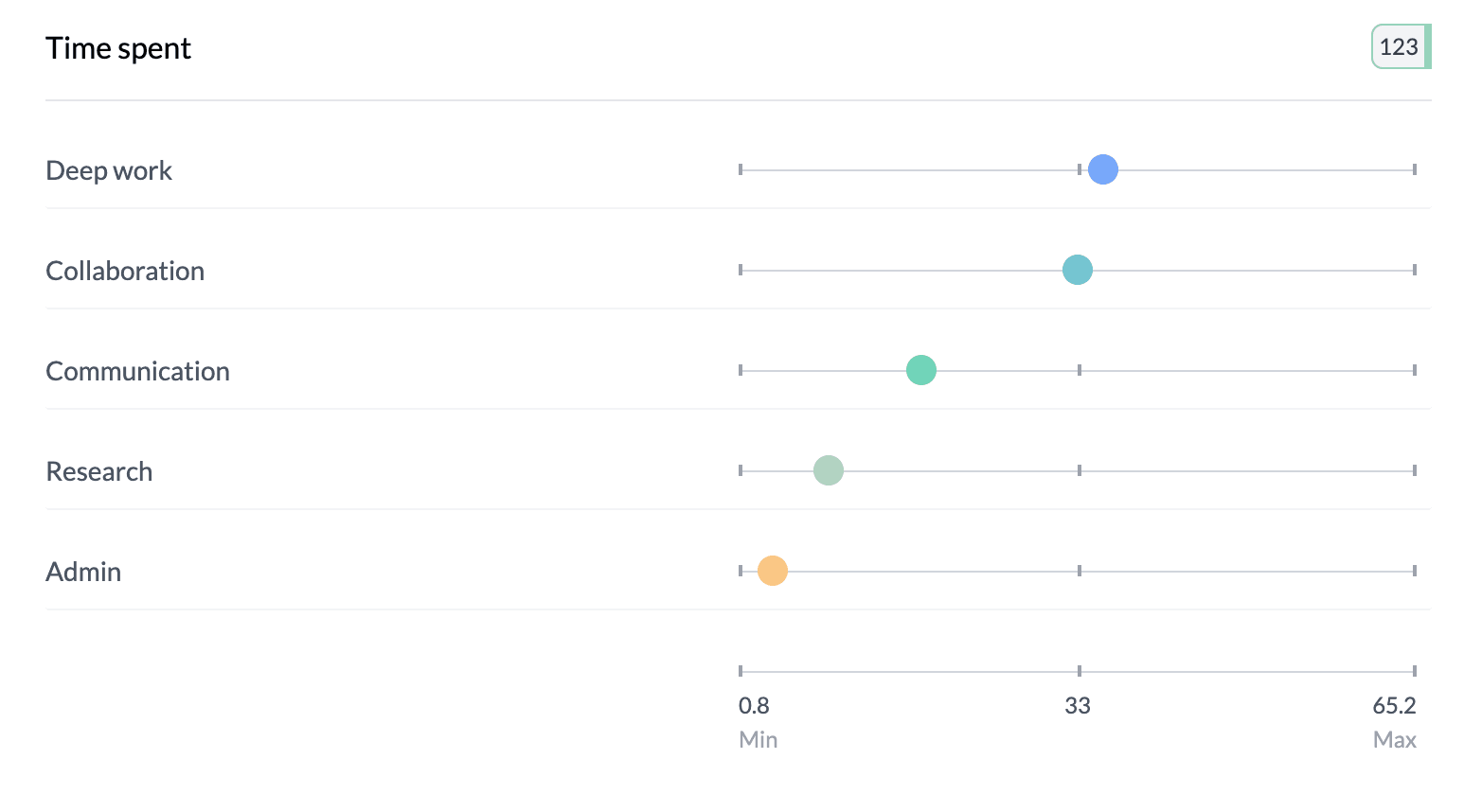
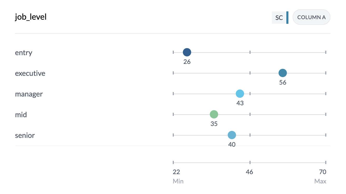
Mean Dot Plots
Each dot is the mean for that category or column; position shows the value. Uses your project’s color scheme.
How to Access
Categorical vs numeric or single numeric: Set Key Stats | Ranges to Key Stats, then choose Box Plot or Mean in the Box Plot | Mean control.
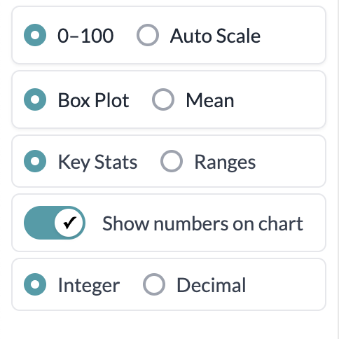
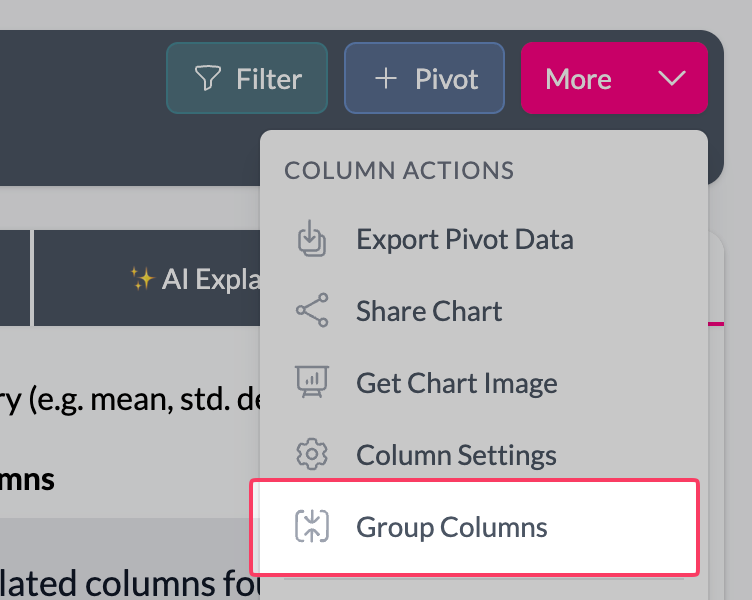
Grouped numeric columns: Add multiple numeric columns (find the first numeric column, use More → Group, then select the other numeric columns). Box Plot | Mean is then on the left; default is Box Plot, or choose Mean for dot chart of means.

Display: Integer | Decimal and “Show numbers on chart” control how values appear. Sort by label or value (median/mean); ascending or descending.
Key points
- Box plots: full distribution (quartiles, median, outliers). Mean dot plots: averages per group.
- Single column, grouped numeric, or category vs numeric: use Key Stats then Box Plot | Mean (or Box Plot | Mean directly for grouped numeric).
- Hover for full statistics; use sort and display format as needed.