Single Column Horizontal Bar Chart

The single column horizontal bar chart is AddMaple’s default view when you select one categorical column. Each category is shown as one horizontal bar; the length of the bar represents count (or an aggregated value if you use aggregation).
When to use it
- One categorical column — Multiple choice, multi-select, or other category columns.
- Long category names — Horizontal layout keeps long labels (e.g. country names) readable. See why AddMaple uses horizontal bar charts.
- Many categories — Easy to scan and sort when there are lots of options.
How to create it
- Open the Chart Dashboard and select your dataset.
- Choose a single categorical column — Click one column so only that column is in the pivot (one column in the sentence builder).
- The chart updates automatically to a horizontal bar chart.
No extra steps are needed; this is the default for a single categorical column.
What you see
1Single column horizontal bar chart
- Bars — One horizontal bar per category.
- Length — Represents count of rows (or Total/Average/Median/Count Unique if aggregation is set).
- Sorting — Use the left-hand controls to sort by label or value, ascending or descending.
- Colors — Bars use your project’s color scheme.
Options
You can aggregate by another column (Total, Average, Median, Count Unique), and toggle sort, decimal display, or percentage via the left controls.
2Aggregate by a different column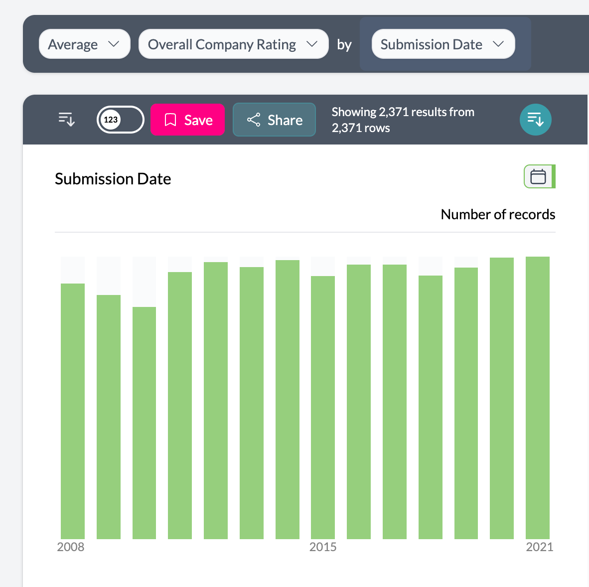 3Toggle decimal
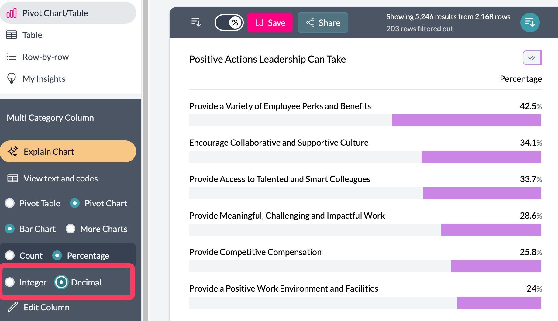 4Toggle percent
 5Toggle sort
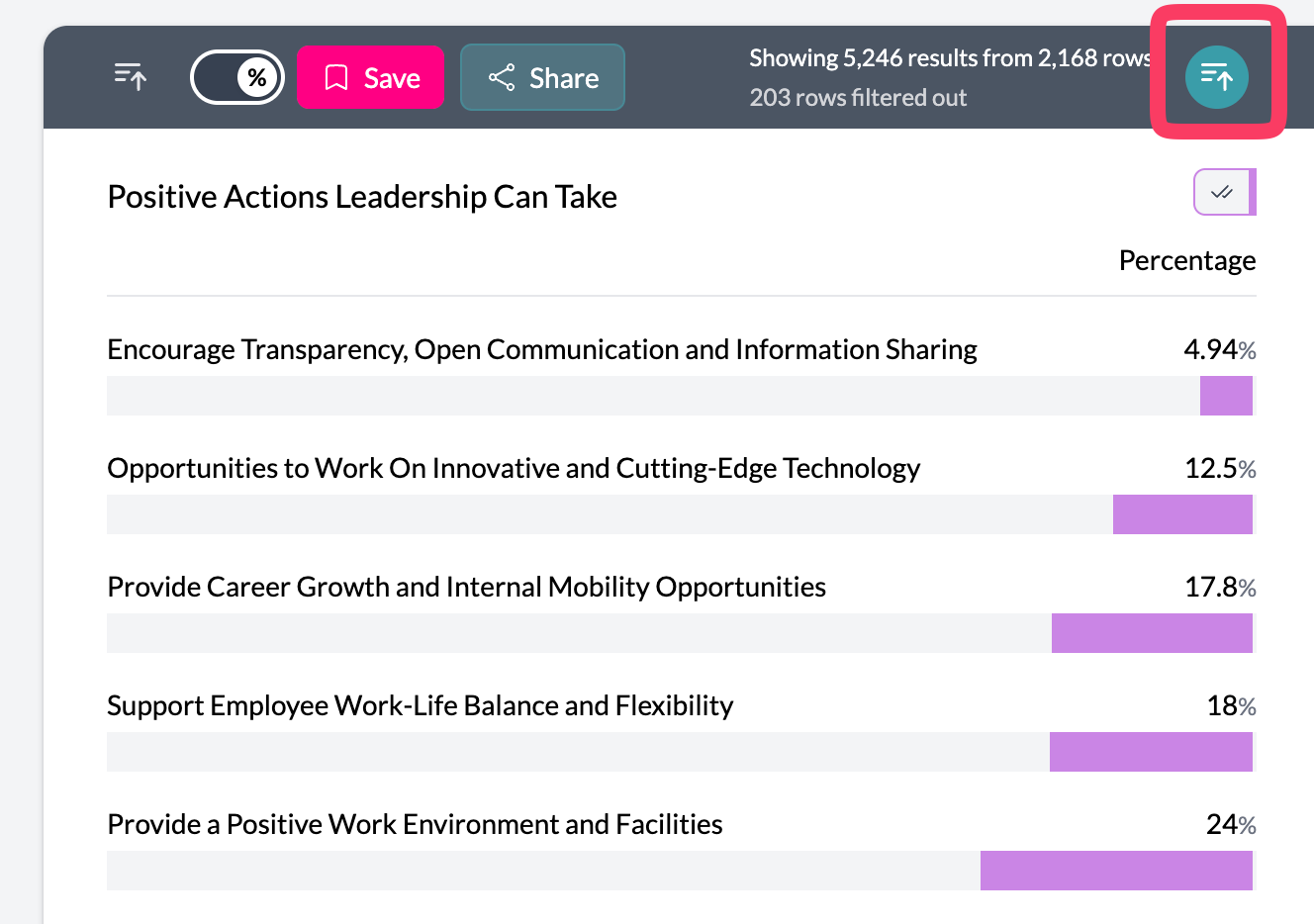
Tips
- Use Number of (aggregation) to show Total, Average, Median, or Count Unique for a chosen column instead of row count.
- Click a bar to filter the dataset to that category.
- Combine with filtering and legend merging to simplify and focus the chart.
Key points
- Default chart when viewing one categorical column.
- One horizontal bar per category; length = count or aggregated value.
- Best for long labels and many categories; sort and filter via left-hand controls.