Single Box Plot
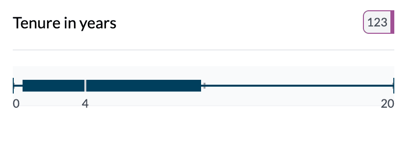
A single box plot shows the distribution of one numeric column in one compact chart: the box is the interquartile range (IQR), the line inside is the median, and the whiskers and end caps show the range and outliers.
When to use it
- One numeric column — Explore spread, center, and skew without binning.
- Distribution at a glance — See median, quartiles, and extremes in one view.
- Outliers — Points beyond the whiskers are often outliers.
How to create it
- Select a single numeric column — In the Chart Dashboard, choose one numeric column so it’s the only pivot column.
- Switch from Ranges to Key Stats — On the left, find Key Stats | Ranges. The default is often Ranges (binned histogram). Select Key Stats.
- Choose Box Plot — In Box Plot | Mean, select Box Plot. The chart becomes a single horizontal box plot.
1Single box plot
What you see
- Box — Middle 50% of the data (Q1 to Q3).
- Median line — White line inside the box (50th percentile).
- Whiskers — From box to min and max (or to 1.5×IQR in some conventions).
- End caps — Mark actual min and max (or adjacent values).
- Hover — Tooltip with mean, median, min, max, Q1, Q3, standard deviation, count.
For more detail on reading box plots and when to use Mean (dot plot) instead, see Box plots and mean dot plots.
Tips
- Use Display format (Integer | Decimal) and Show numbers on chart to tailor the view.
- Sort is less relevant for a single box; useful when you add a category and get a grouped box plot.
Key points
- One numeric column; use Key Stats then Box Plot.
- Box = IQR, line = median, whiskers = range; hover for full stats.
- See grouped box plot for comparing distributions across groups.