Geographic Chart
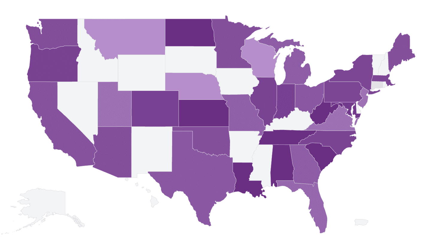
A geographic chart (map chart) shows your data on a map: regions (countries, states, provinces, etc.) are colored or sized by count or aggregated value. AddMaple turns on this option when it detects that a column contains geographic data.
When to use it
- Location columns — Country, US state, Canadian province, or other region names that AddMaple recognizes.
- Spatial patterns — See where responses, sales, or events are concentrated.
- One geographic column — Typically one column in the pivot (the geography); value is count or an aggregation.
How to create it
- Use a geographic column — Ensure the column has values AddMaple can match to regions (e.g. “United States”, “California”, “Ontario”). Column type may be detected as geographic or categorical.
- Select that column — View a single column (the geography) in the pivot.
- Open More Charts — When geographic data is detected, a map option appears in More Charts. Select it to see the map.
If you don’t see a map option, check that the column values match supported region names and that you’re viewing a single column.
1Select map from More Charts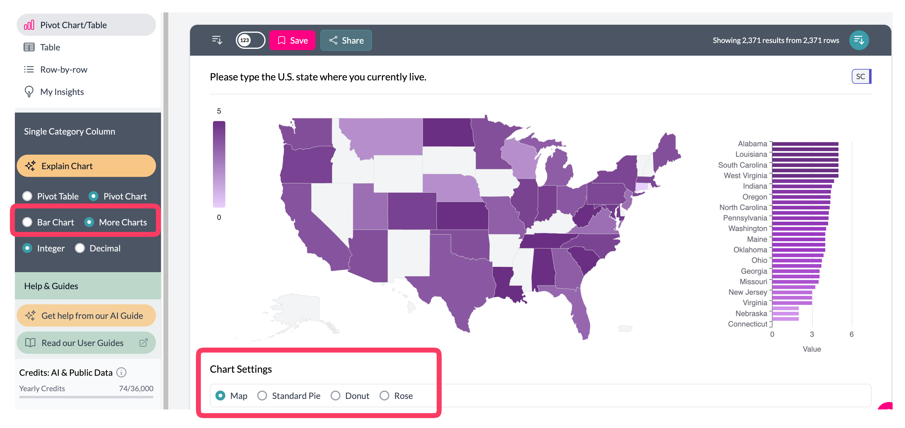 2Geographic chart
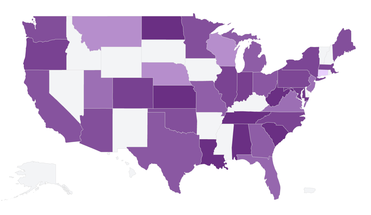
What you see
- Map — A map of the relevant scope (e.g. world, US, Canada, Europe) with regions shaded or sized by value.
- Bar chart — Often the top 15 locations are shown as a bar chart next to or below the map for quick comparison.
- Colors — Your project’s color scheme; intensity or size reflects count or aggregated value.
- Interactive — Hover (and sometimes click) for region name and value.
Use aggregation to show Total, Average, or Median by region. See additional charts.
Key points
- Available in More Charts when AddMaple detects geographic data in a single column.
- Map + top locations bar; color/size = count or aggregated value.
- Use aggregation to show Total, Average, etc. by region.