Single Column Donut Chart

A donut chart shows one categorical column as proportions: each category is a segment around a hollow center. It's the same as a pie chart but with the center blank, which can make the segments easier to read and leaves space for a total or label. It's available when you're viewing a single column via More Charts.
When to use it
- One categorical column — Same data as a single horizontal bar or pie chart, shown as part-of-whole.
- Part-of-whole — When you want to emphasize share of total (e.g. market share, response mix).
- Hollow center — Same as pie with a blank center; can improve readability or allow a central label.
How to create it
- Select a single categorical column — Only one column in the pivot.
- Open More Charts — On the left, click More Charts.
- Choose Donut — Select Donut. The chart updates to show segments by count or percentage.
Small categories may be merged into "Other" to keep the chart readable; this depends on AddMaple's settings.
1Donut chart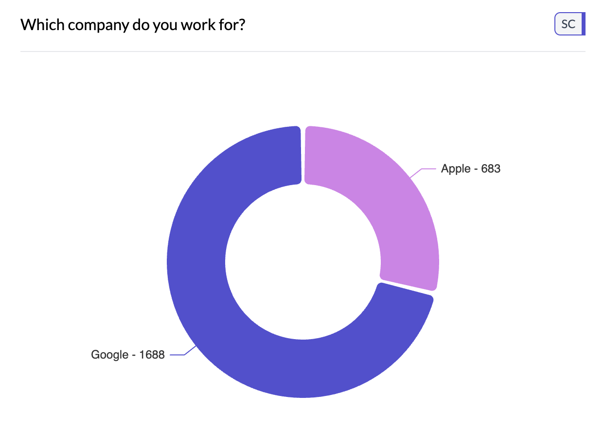
2Choose donut from More Charts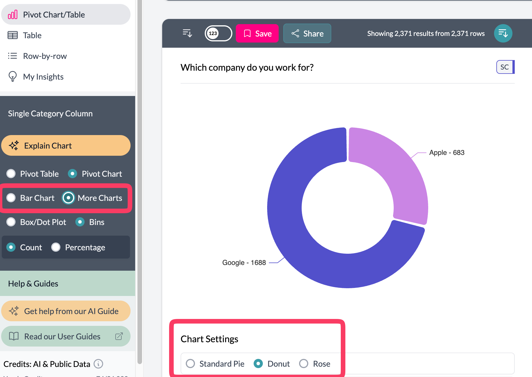 3Donut chart settings
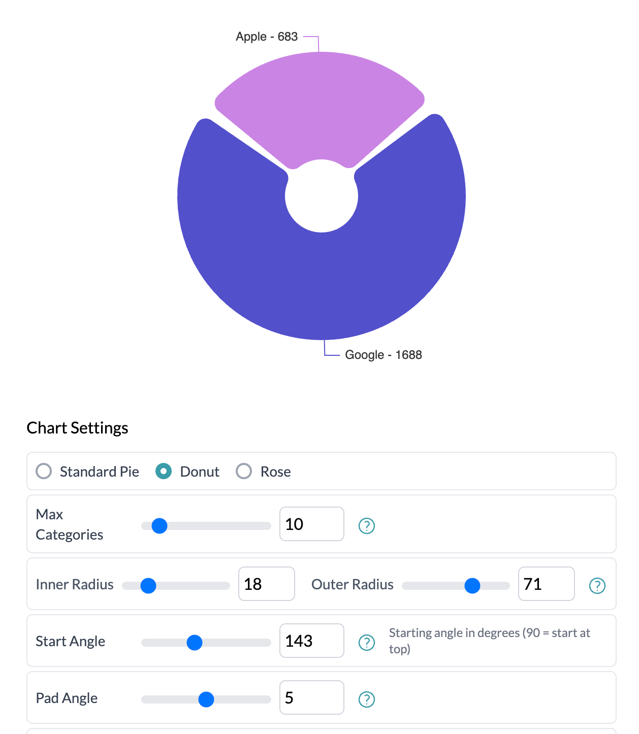
What you see
- Donut — Full circle with a blank center; each segment's angle = share of total.
- Legend — Category labels and colors; project colors apply.
Use aggregation to show Total, Average, or Median by category. See pie, rose, additional charts.
Key points
- One categorical column; access via More Charts → Donut.
- Same as pie with a hollow center; each segment's angle = share of total.
- Works with aggregation (Total, Average, etc.) for aggregated proportions.