Two Column Horizontal Stacked Bar Chart
A two column horizontal stacked bar chart shows two columns together: one set of categories (e.g. regions) as bars, and a second dimension (e.g. product type) as stacked segments within each bar. Each bar’s total length is the count (or aggregated value) for that row; the segments show how that total is split by the second column.
When to use it
- Two categorical columns — Row column (e.g. region, segment) and column column (e.g. response, product).
- Composition and comparison — See both the total per row and the breakdown inside each bar.
- Percentages — Use the Count | Percentage | Proportional control to show stacked percentages (each bar sums to 100%).
How to create it
- Add two columns to the pivot — In the sentence builder, choose a first column (rows) and a second column (segments).
- Set chart type — With two columns, the default is often stacked bars. Ensure the left-hand control is Stacked (not Bar or Dot) under Stacked | Bar | Dot.
- Optional: switch to percentage — Select Percentage (or Proportional) in Count | Percentage | Proportional so each bar shows proportions.
1Toggle percentage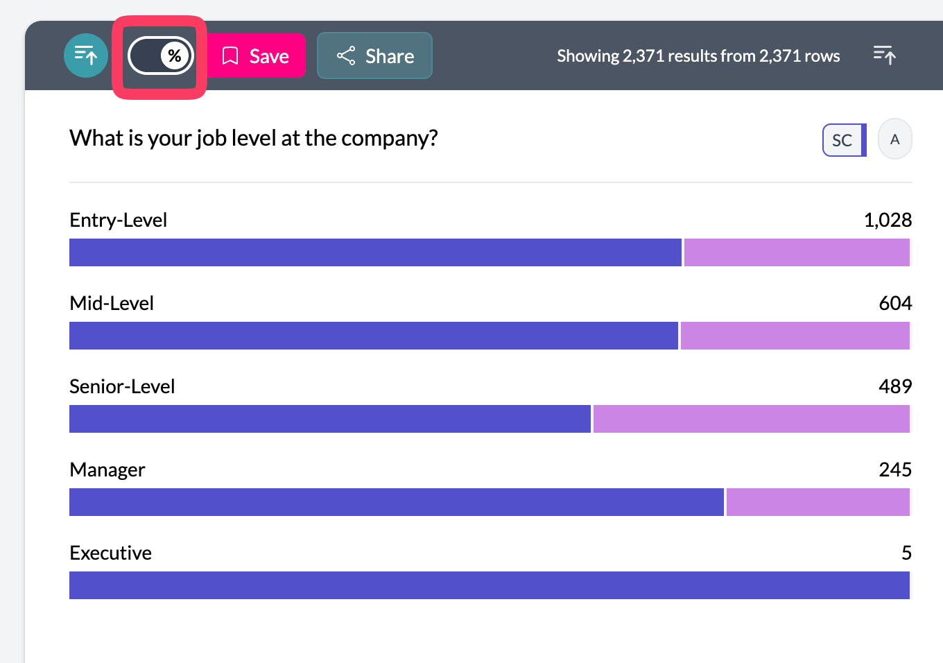 2Two column horizontal stacked bar
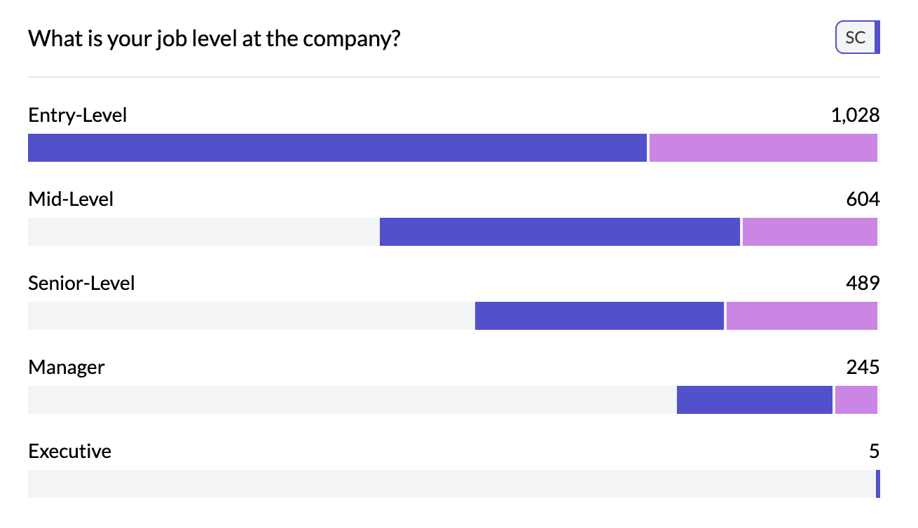
What you see
- One bar per row category — Each bar is one value of the first (row) column.
- Stacked segments — Each segment is one value of the second column; segments are stacked in one bar.
- Length — Total bar length = count or aggregated value; segment size = count or share of that total.
- Legend — Second column’s categories appear in the legend with colors.
Use Bar in Stacked | Bar | Dot for grouped (side-by-side) bars; see three column grouped stacked for three dimensions.
Key points
- Two columns: rows = bars, second dimension = stacked segments.
- Use Percentage mode so each bar sums to 100%.
- Control type via Stacked | Bar | Dot and Count | Percentage | Proportional.