


Discover
Data Table Studio
Build interactive banner tables and ranked crosstabs in-product — significance shading, bases and indices, subgroup ranking, crosstab-level AI, and formatted Excel tab books.
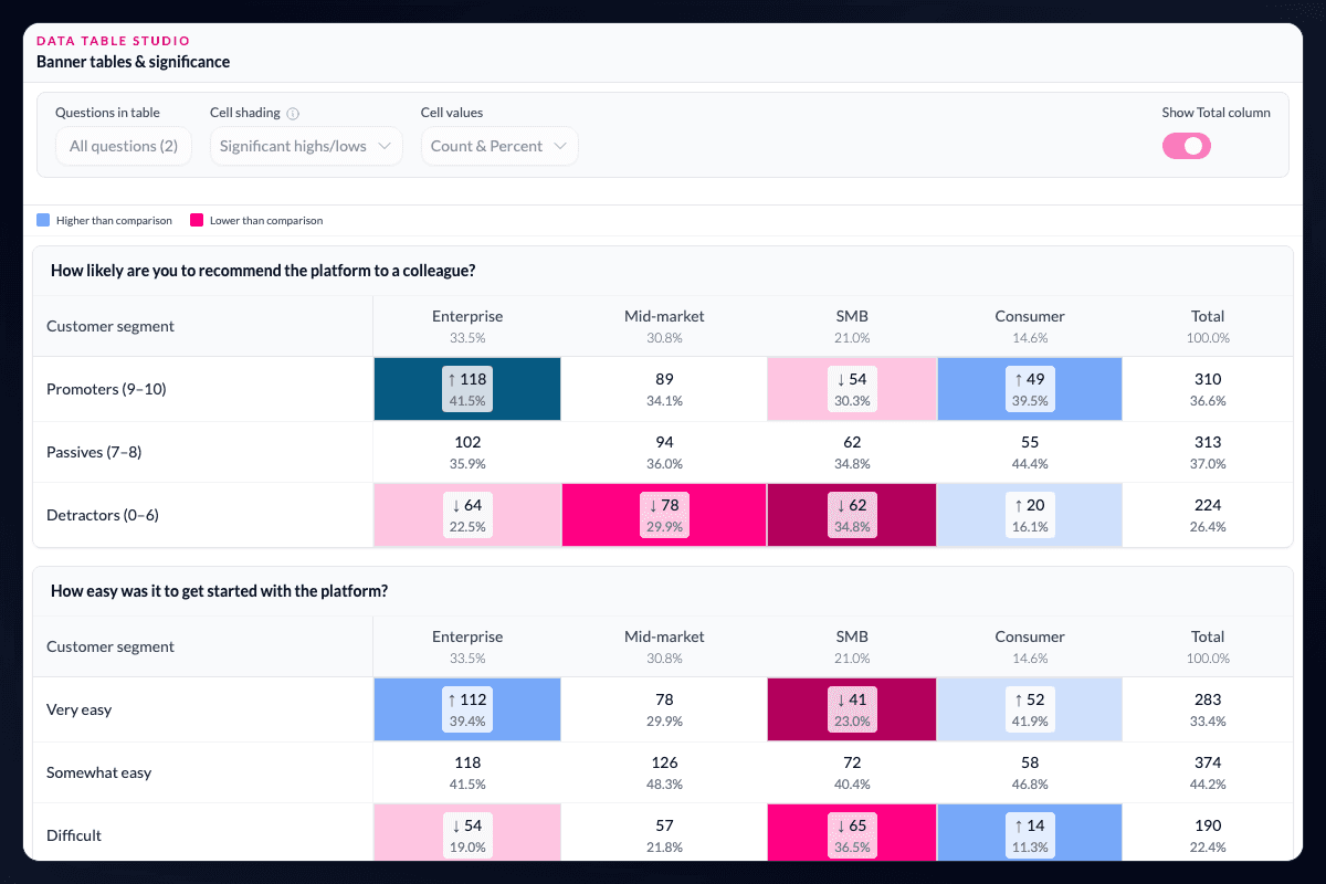
Banner tables and ranked crosstabs — without a separate tabulation return.
Data Table Studio is AddMaple's interactive table workspace for survey research. Choose banner points — segments, markets, waves, or any subgroup — and build crosstabs across every question in the project with significance shading, bases, column percentages, and column indices in one place.
Rank tables by where subgroups differ most.
Data Table Studio ranks crosstabs by statistical strength linked to your banners, so analysts start with the differences that matter instead of scanning a dense grid row by row. Quantitative variables and AI-coded qualitative themes can appear in the same ranked view.
Inspect in-product, then export a tab book.
Explore tables live inside AddMaple — toggle counts and percentages, apply filters, and open pivot follow-ups from any cell. When the cut is ready, export Export Crosstabs (Excel) or a formatted Data Table Studio workbook with per-banner or per-question layouts, highlight colours, table of contents, and brand styling.
Crosstab-level AI on the evidence you already built.
Ask what stands out across a banner table. The analysis agent reads crosstabs at the cell level from statistical profiling already on your data — so researchers connect the table and the interpretation in one motion.
Bases, percentages, and significance belong in the same table.
Z-score shading highlights cells that perform above or below expectation, with weighting applied consistently across every cut. Significance letters and Holm-adjusted p-values stay beside the numbers clients expect to see in a tab book.
Keep the follow-up in the same analysis.
A request for another age cut, market, wave, or category grouping does not need to become a new tabulation cycle. The banner, filters, weighting, significance settings, and underlying project remain together, so the next table is a continuation of the evidence rather than a separately reconciled file.
Questions teams ask
What can I use to build a banner in AddMaple?
You can build banners from segments, markets, waves, or any subgroup represented in the project, then cross-tab every question against those banner points.
What appears in an AddMaple crosstab?
Data Table Studio can show bases, column percentages, column indices, significance letters, z-score shading, and weighted results in the same project.
Can AddMaple export a tab book?
Yes. You can export Excel crosstabs and formatted Data Table Studio workbooks with layouts, a table of contents, and brand styling.
Read the evidence in context
Results depend on the study design, data quality, bases, weighting, and method settings. AddMaple calculates the statistical outputs; researchers review practical importance and interpretation. An association is not evidence of causation.
How it works
Step-by-step guides in the AddMaple help center.
- Data Table Studio
Build interactive banner tables and crosstabs with bases, column indices, and significance — then export Excel tab books with layouts and brand colors.
- Banner columns
Combine source fields into a reusable multi-select banner column, then cut by it across Data Table Studio and pivot views.
Part of AddMaple's feature areas
This capability sits within broader product areas on the features hub.
- Tables, banners & significance
Continue exploring
Follow the next step in the workflow or explore a related capability.
- Ranked subgroup differencesIn Data Table Studio, surface which questions differ most across a banner first — ranked by statistical strength, including quant variables and AI-coded themes.
- Statistical testing & significanceWhich differences are evidence, not noise? Named tests, effect sizes, and multiple-comparison correction — selected by variable type, with inspectable results.
See this capability on a real research workflow.
Bring one study or delivery workflow and we’ll show where AddMaple fits.