


Discover
Ranked subgroup differences
In Data Table Studio, surface which questions differ most across a banner first — ranked by statistical strength, including quant variables and AI-coded themes.
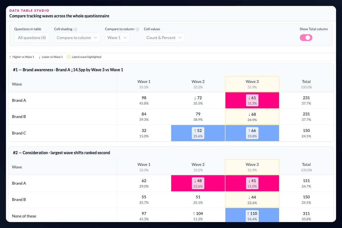
Which subgroup differences matter most?
In Data Table Studio, see which questions differ most across a banner, ordered by statistical strength. Quantitative variables and AI-coded qualitative themes appear in the same ranked view, so open-end themes compete fairly with scale questions for attention.
Start with the pattern, not a dense grid.
Effect size and significance are visible at a glance, helping analysts find the subgroup variation worth investigating rather than scanning every banner row with equal effort.
Inspect before you present.
Click through to pivot charts and examine the underlying pattern. The ranked view gives research teams an evidence-backed starting point for exploration and client storytelling — then export the tab book when the cut is ready.
Use ranking to focus judgement, not replace it.
Statistical strength is a way to decide where to look first. Researchers still need to examine bases, the size and direction of a difference, the study design, and whether the pattern matters for the decision at hand. AddMaple shortens the search through the table while leaving that judgement with the analyst.
Questions teams ask
How are subgroup differences ranked?
AddMaple orders variables across a banner by statistical strength, with effect size and significance available for inspection.
Can qualitative themes appear in the ranked view?
Yes. AI-coded qualitative themes can be considered alongside quantitative variables in the same ranked view.
Can I inspect a ranked difference before sharing it?
Yes. Open the related pivot chart to examine the underlying subgroup pattern before using it in a story or deliverable.
Read the evidence in context
Results depend on the study design, data quality, bases, weighting, and method settings. AddMaple calculates the statistical outputs; researchers review practical importance and interpretation. An association is not evidence of causation.
How it works
Step-by-step guides in the AddMaple help center.
- Data Table Studio
Rank crosstabs by subgroup difference strength, then inspect or export the tables that matter most.
- Exploring Related Columns
See which questions differ most across a banner or segment, ordered by statistical strength so you start with the differences that matter.
Part of AddMaple's feature areas
This capability sits within broader product areas on the features hub.
- Tables, banners & significance
Continue exploring
Follow the next step in the workflow or explore a related capability.
- Data Table StudioBuild interactive banner tables and ranked crosstabs in-product — significance shading, bases and indices, subgroup ranking, crosstab-level AI, and formatted Excel tab books.
- Relationship discoveryPick any column and AddMaple automatically runs the right statistical test against every other variable — chi-square, ANOVA, t-tests, Kruskal-Wallis, Pearson and Spearman correlation — ranking thousands of pairwise results by significance and effect size.
- Key driver analysisWhich factors are most strongly associated with an outcome? Rank drivers with target-appropriate models, then inspect the evidence before it becomes a recommendation.
See this capability on a real research workflow.
Bring one study or delivery workflow and we’ll show where AddMaple fits.